Branding • The Neighborhood Church • October 2016
Through a connection with the Sacred Grace church, we met the Neighborhood Church. They were in the middle of a rebranding project with a different company, but things weren’t clicking like they had hoped, and they wanted to achieve more meaning with a simpler brand.
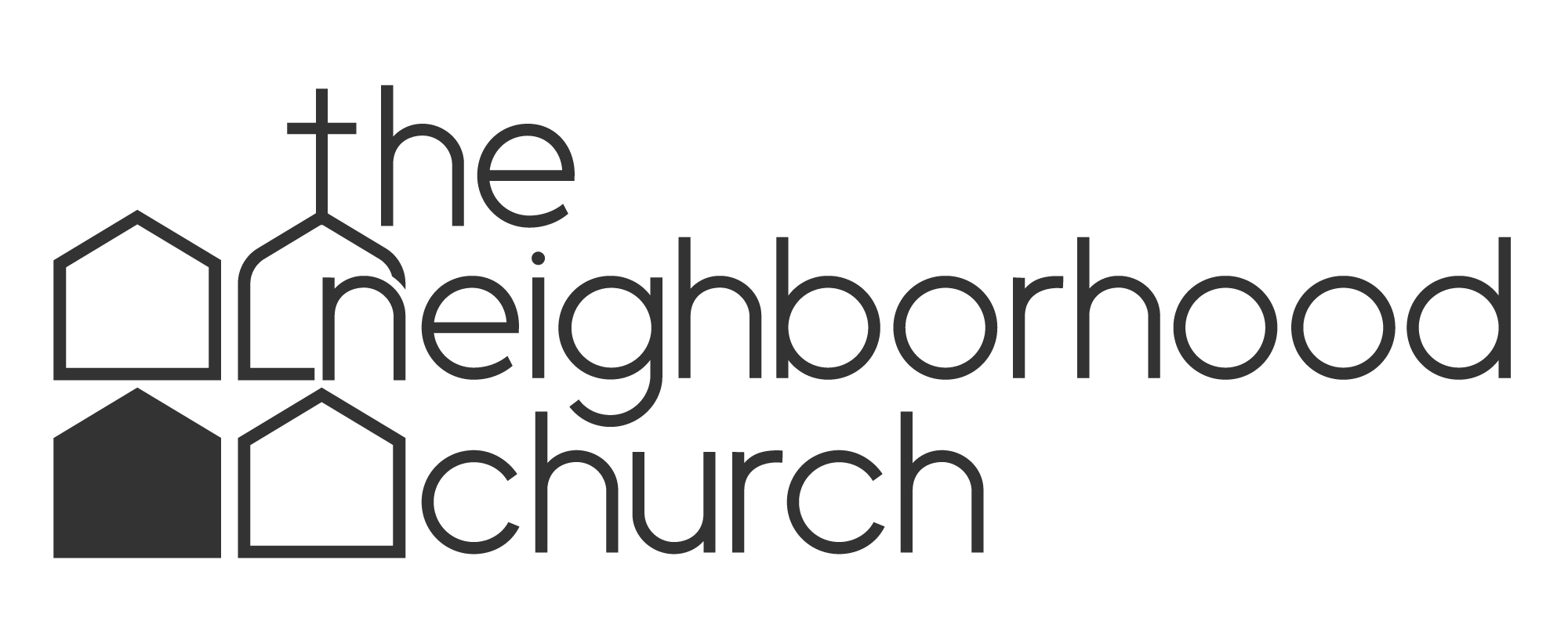
We loved our time working with them, and are proud of where the brand wound up! The big idea rhetorically is that the Neighborhood Church exists not on a separate “church” plane up away from society, but right in the middle of society in real neighborhoods, amongst real people and in the course of real lives. The logo depicts three houses and a church. The two houses directly “adjacent” to the church are either “lighter” or “open,” in comparison to the “darker,” closed house. This is to demonstrate that the proximity of a church in a neighborhood has a direct, actual effect on the neighborhood—precisely the vision of the aptly-named Neighborhood Church.


