Posted on

The Table Community Church

Branding • August 2016

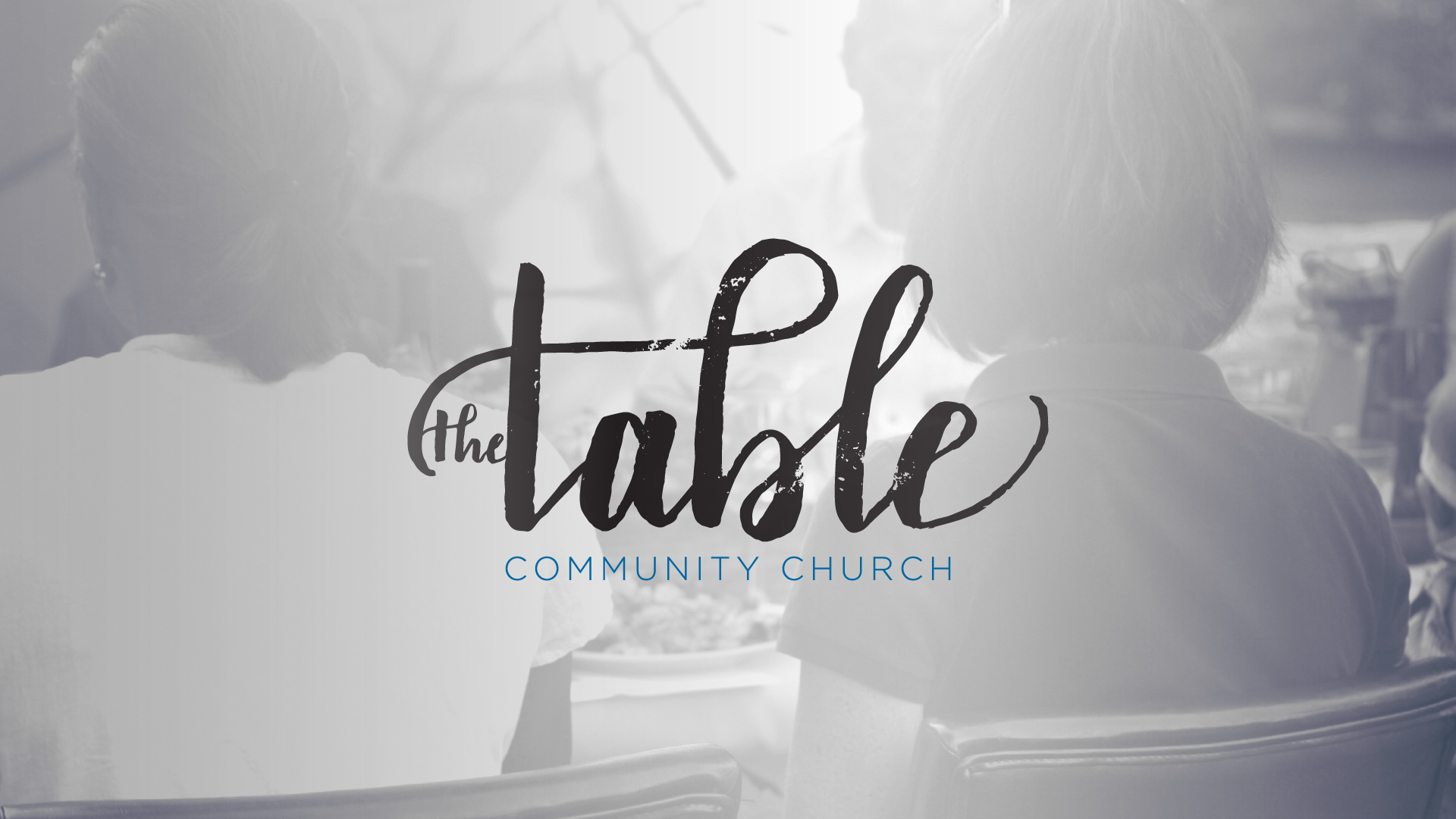
Formerly All Saints Church, the Table Community Church worked with us on branding for their new identity. The table is a place where stories are told—where people share their lives with one another. Following after Jesus’ example of setting a table, whether with tax collectors or for His closest friends on the night He was betrayed, the Table Community Church seeks to be based around devoted relationships, learning and teaching Jesus’ ways, and living lifestyles of service. Even before becoming the Table, table-centered events had been a common pracitce for them.

The idea of a script logo that played between soft and strong, messy and clean, and elegant and distressed was made possbile through a partnership with Becky Waggoner, an incredible Houston-based calligrapher who also happens to be our real-life sister. Art /Rhetor directed the project, adding the distressing, the fade, and the “Community Church” subtitle. The brand artwork shows an image of an actual Table event of theirs. We loved how the image illustrates their diversity, with young and old, black and white, gathered together to enjoy one another and revel in the goodness of God.

Posted on

All Saints Bulletin Redevelopment

Publication • All Saints Church • April 2016

The old bulletin at All Saints (which we did on contract for them, pre Art /Rhetor in 2013), had lots and lots of content, unused space, and a tear-off section for prayer requests and collecting visitor info. We realized that we were printing things in their bulletin every week that didn’t need to be distributed that way, and it was causing us to use a ton of paper—with an expensive perforation! We were basically printing a contact card with every individual bulletin, most of which were being discarded after each service. There was also a ton of static artwork for a welcome section, core values, and contact information that we felt could be done more efficiently.

Our cost-saving, efficiency-enhancing solution was a single half letter-sized sheet. One side has all the “data” that a bulletin exists for: service details, upcoming events with artwork, core values/mission, contact info, etc. The other side is entirely sermon series artwork. Why would we do that when we’re trying to save space and costs? We believe that a lot of rhetorical work happens through artwork, engaging the heart of the community with the presented Word. We invest a lot of time into that artwork, and sending everyone home with a 5.5×8.5″ print of it is an active, equipping thing! The artowork is scriptural, hopefully really beautiful, and definitely based on what their church is currently learning together. We hope these bulletins wind up on fridges and pinned up at desks where people work, etc. Additionally, this artwork changes roughly once a month, so it’s dynamic and often gives that “Oh this is new!” feeling.

To preserve prayer request and visitor info collection functionality, we developed a new, matching prayer/contact card (see below), which we now have to print much more seldomly.

Image loading
Image loading
Image loading
Image loading

Click here to see a sample of All Saints’ old bulletin.