Posted on

Matthew Study Journals

PUBLICATION • PARK CHURCH • JANUARY 2020

Over the last several years, each longer sermon series at Park Church has been accompanied by a study notebook. These have been thick, spiral-bound publications that serve individuals, small groups, and Sunday note-takers. Though we’ve designed, edited, and printed each of these projects for Park Church, the effort by the Park Church team to write that much material in the first place is kind of terrifying. Nonetheless, people are inseparable from their notebooks even late into each series, so the work keeps paying off.

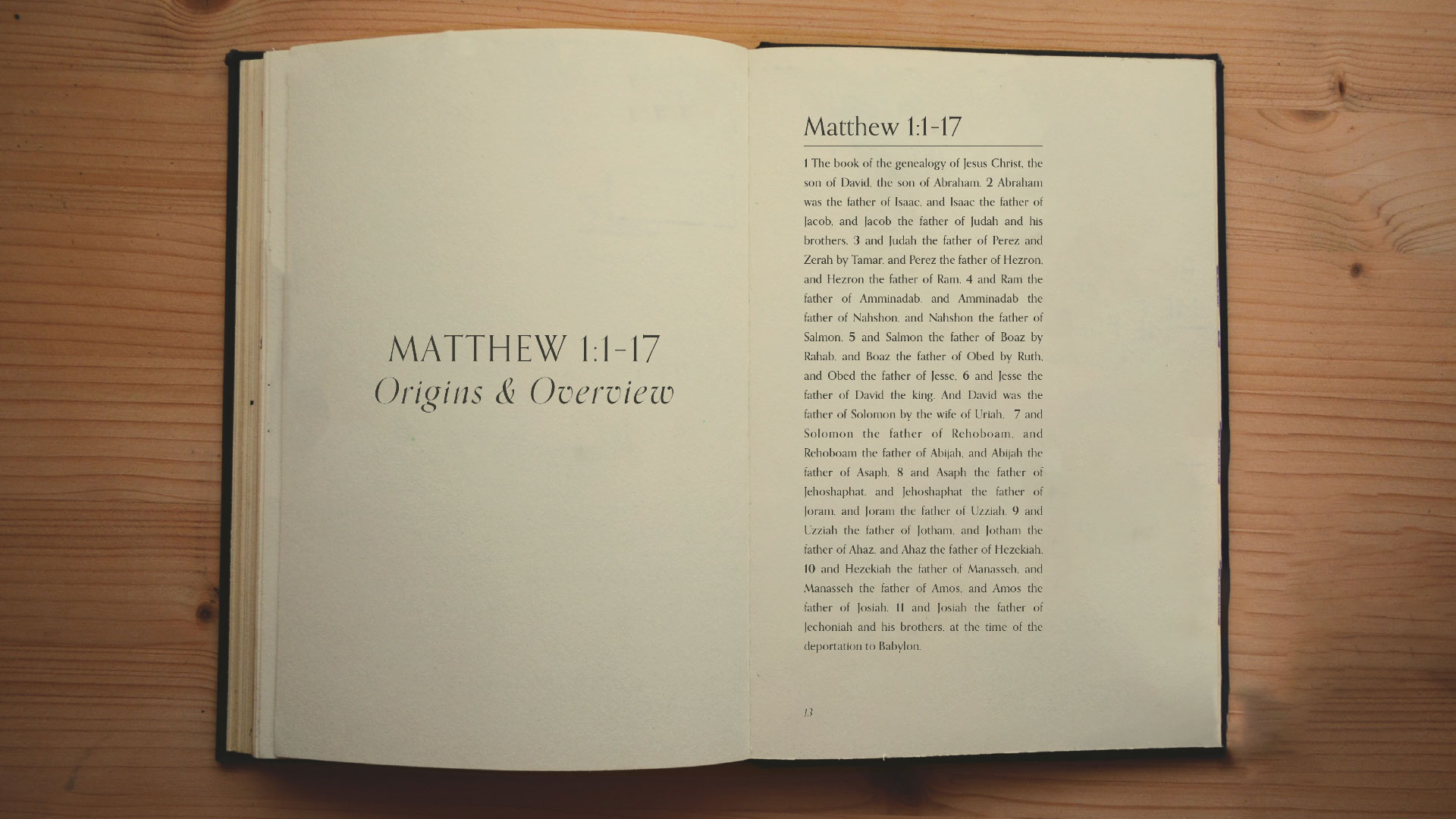
At the end of 2019 before Park began a long series in the book of Matthew, their team was inspired by the REAP Journals from the good folks at the Austin Stone Institute. These things are trim, beautiful, and simple, and provided a much better vision for the Matthew study materials at Park Church. They became Study Journals.

We set out with that dream and worked alongside our friends at YellowDog Printing here in Denver to make it possible. After a ton of conversation, paper sampling, metallic ink troubleshooting, etc., it all came into focus, and we’re so, so happy with these.

The crown artwork is from the amazing Lane Geurkink pieces we directed with her for the greater Matthew series.


Posted on

baileythurley.com 2019

WEBSITE • Bailey T. Hurley • June 2019

When we started Art /Rhetor a handful of years ago, one of our first opportunities was to build a custom WordPress site for Bailey T. Hurley. Bailey is one of our best friends, and she writes on Biblical Friendship for Christian Women. We’ve had the joy of growing alongside her as her design team for project after project, and in four years, we’ve seen her brand grow to a crazy degree of influence through her hard work.

85 features/interviews, a book deal, and 10K Instagram followers later, it was time for a new site. The research, wireframing , and development was an arduous and fun process, the photography and graphical elements came together, and what we wound up with is a really unique approach to a block-by-block website. We built mobile-first and optimized for tons of quick clicks on the many random places a user could enter the site. We learned a lot, and are really proud with what has become a major brand refresh for Bailey.

The site includes a gigantic blog, a sortable list of every feature and publication, a calendar of speaking events, and an online store with lots of Shopify optimization.

See the Site

Posted on

Advent Newspaper

Publication • Willow South Lake • December 2017

Over five weeks during the season of Advent, we worked with Willow Creek’s South Lake campus on a series of weekly newspapers to commemorate and celebrate the season. Leaders and staff members wrote articles and curated the photos. It was a real cool medium to explore, and all our text-formatting nerdiness got to run free.

To make things way cooler, we coordinated a series of kids’ coloring pages with lettering artist Rachael Medialdea and had just finished the church’s Christmas Eve artwork with designer Bruce Butler, which helped shape a lot of color and texture in the papers.

Who Are We?
Who Are We?
Photography from Willow South Lake on Instagram

Who Are We?
Who Are We?
Kids’ coloring pages by Rachael Medialdea

Posted on

Dwell Church Prospectus

Publication • Dwell Church • May 2017

Dwell is a Denver church plant in its early stages, seeking to make a home in the West Colfax neighborhood. This prospectus is a tool they’ll use to help meet their networking and funding goals, while introducing themselves to the Denver community.

Josh, the planting pastor, came to Sara and I with this during the early stages of their brand development with Badson Studio, who did some really lovely work for them. We think it’s nuts. Upon completion, they handed us the new design guidelines to us with a content outline for the prospectus and a handful of Josh’s own photos of Denver. We put this 16-page booklet together, and we’re showing it to you because we work hard to be great stewards of people’s brands and we think this project reflects that.

We’re thrilled about Dwell Church and their work on West Colfax. Click the image below to see the whole booklet.

Dwell Church Prospectus

Posted on

Summer Kids Club

Event Artwork • Fellowship Denver • March 2017

Summer Kids Club is a partnership between Fellowship Denver and Hope In Our City (a nonprofit that serves the refugee community in Denver). It’s a six-week activities program in the Sun Valley neighborhood for kids from Hope In Our City, Fellowship Denver, other churches, and the kids in the neighborhood themselves.

The artwork is fun, bright typography with a pattern of icons in the background, each representing one of the six weeks of Summer Kids Club. We aimed to catch the eyes of both the kids and their parents as the event is publicized leading up to its first week, starting in June.

Who Are We?

Posted on

The Gospel, Together

Event Artwork • Park Church • October 2016

The Gospel has an everyday impact on our relationships. It can be the basis for our relationships, but it can also be the hope for battered and broken relationships. We’re created as relational beings by a relational God, and His gracious work through the life of Jesus had not only reconciled us to himself, it has reconciled us to each other.

Preparing the artwork for Park Church’s Fall 2016 symposium on this topic, we wanted to illustrate this “tie that binds” us together in Christian love. The two colors in the artwork, contrasting but complimentary, represent two parties in relationship. This can be two people, two people groups, two churches, two family members, etc. The white lines represent the Gospel, the place where we connect. Although the Gospel is doing different work for different people, and although we’re different as people, herein is the only source of all relational beauty and reconciliation.

Art /Rhetor created the artwork, but also a small promotional postcard (front shown below), a larger “program” card (back shown below), posters, the event’s webpage, and all graphics to be used during the event itself. We’re also thrilled to partner with artist Alexandria Ladue of Lore (and many other creative ventures) for the stage design during the event. We can’t wait to show you what she does!

Posted on

Serve Denver

Event Artwork & Tee-shirt Design • The Heights Church • April 2016

Our first job for The Heights church was a branding and tee-shirt design project for Serve Denver, a service project happening in the Summer of 2016. Our goal was to avoid the standard “Denver” design tropes. while using something of the city in the artwork.

Walk in the Light Artwork

Posted on

All Saints Bulletin Redevelopment

Publication • All Saints Church • April 2016

The old bulletin at All Saints (which we did on contract for them, pre Art /Rhetor in 2013), had lots and lots of content, unused space, and a tear-off section for prayer requests and collecting visitor info. We realized that we were printing things in their bulletin every week that didn’t need to be distributed that way, and it was causing us to use a ton of paper—with an expensive perforation! We were basically printing a contact card with every individual bulletin, most of which were being discarded after each service. There was also a ton of static artwork for a welcome section, core values, and contact information that we felt could be done more efficiently.

Our cost-saving, efficiency-enhancing solution was a single half letter-sized sheet. One side has all the “data” that a bulletin exists for: service details, upcoming events with artwork, core values/mission, contact info, etc. The other side is entirely sermon series artwork. Why would we do that when we’re trying to save space and costs? We believe that a lot of rhetorical work happens through artwork, engaging the heart of the community with the presented Word. We invest a lot of time into that artwork, and sending everyone home with a 5.5×8.5″ print of it is an active, equipping thing! The artowork is scriptural, hopefully really beautiful, and definitely based on what their church is currently learning together. We hope these bulletins wind up on fridges and pinned up at desks where people work, etc. Additionally, this artwork changes roughly once a month, so it’s dynamic and often gives that “Oh this is new!” feeling.

To preserve prayer request and visitor info collection functionality, we developed a new, matching prayer/contact card (see below), which we now have to print much more seldomly.

Image loading
Image loading
Image loading
Image loading

Click here to see a sample of All Saints’ old bulletin.

Posted on

Good Friday

Event Artwork • Park Church & Fellowship Denver • March 2016

The sobering thought of Christ actually being dead on our behalf—heart stopped, breathing stopped—is a hard one to actualize. Critical to our perfected joy at Easter is the understanding of the actual death of Christ, knowing that our sin required real blood for payment. I hesitated to send this to the leadership of Park Church and Fellowship Denver, feeling that it was too macabre. Their response was, “The cross is macabre.”

Posted on Leave a comment

Created to Create

Event Artwork • Park Church • November 2015

On an extended freelance contract with Park Church in Denver, I (JD) was asked to direct the artwork for Created to Create: Imaging God in a Storied World, a symposium featuring authors Any Crouch, N.D. Wilson, and singer/songwriter Andrew Peterson.

The hand-lettered logotype is by Christian Robinson and the photography is by Leah McEachern. So why put this in our portfolio if I just arranged the letters and picked a couple colors? This was a special project for me because I had the joy of brainstorming something really dreamy to me and then collaborating with the two creatives needed to make it happen.

One of the things we’re excted about at Art /Rhetor is our Creative Concierge service. We love our creative community, and are pumped to help you find the person with the perfect artistic touch for your project.