Branding • Park Church • October 2016
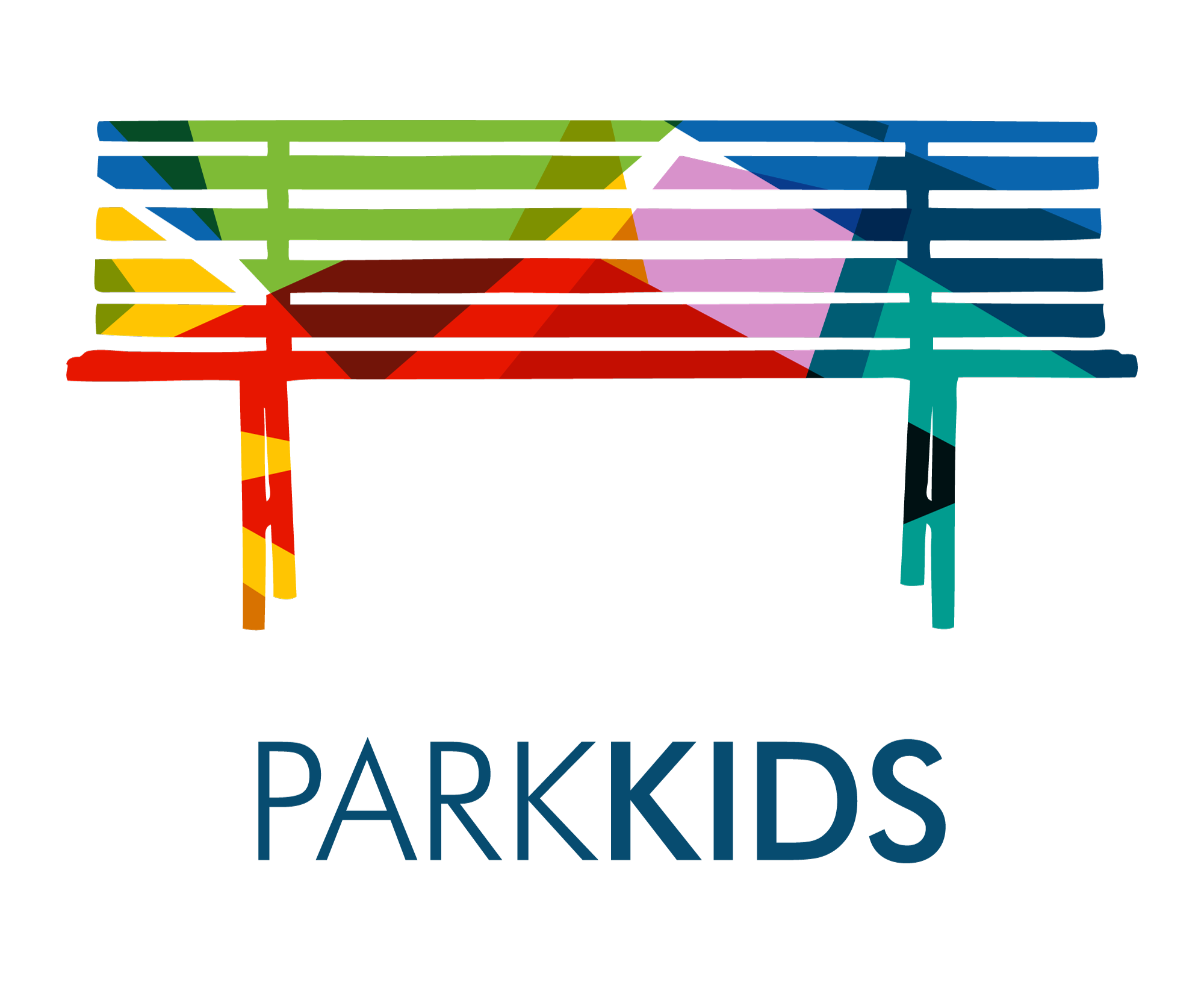
Park Church approached us about creating a logo for Park Kids, their children’s ministry. The logo needed to be a clear sub-brand of the main Park Church brand for two reasons. First, because it passes the trust that parents already have for Park Church down this important ministry of Park Church. Second, because it demonstrates that their children’s ministry is an important part of the church as a whole—that Park Kids is “of” Park Church. This may seem obvious, but historically in the American church, children’s ministries are easily “siloed,” hidden in other parts of the church, staffed by a separate team, and given a different, unrelated brand. Using the “bench” element of Park’s main brand and similar typography, we have a brand that both references and represents its “parent” brand.

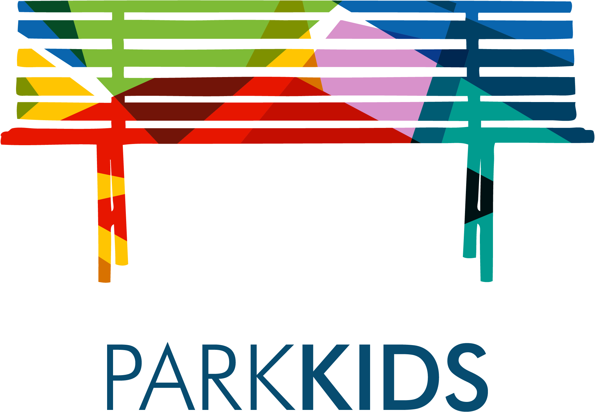
Now for the fun stuff about this brand. Park Church is a very arts-focused church. Whereas it’s not unusual for a church to feature music as a form of worship, Park Church seeks to demonstrate how the whole realm of human creativity is useful for experiencing our creative God and worshiping Him. For this reason, our Park Kids logo is deeply colorful, playful, and expressive, while balancing an abstract, asymmetrical jumble of shapes inside the outline of the Park bench.
The rhetorical value here is rich—kids of all kinds, who each experience God differently, can keep their uniqueness and blend with the uniquenesses of their peers, all under the direction of the bigger Park Church organization, through the teaching of the Gospel. They together make up a community and young congregation that’s deeply important to the rest of the church body!
Lastly—and admittedly by accident—a staff member at Park noticed that in the middle of the logo there was a sort of “mountain” shape. The large purple polygon meets negative space towards the top of the logo that creates a sort of snow cap. After this was pointed out to us, we did the work to make it a “useable” or “readable” part of the logo. It’s obviously pretty subtle, and we want it to stay that way and not become a gimmick. However, upon a little studying, the mountain pops out. This is rhetorically useful. Children growing up in Denver will see mountains as one of their first experiences of God’s majesty, and we know that as their childhood home rests in their hearts, they’ll have the opportunity to reflect on the greatness and creativity of their God. They’ll likely not remember this logo, but we do hope they’ll remember what they learned in Park Kids about the wonderful, loving God who both created the mountains and is willing to move them for the regard of even one of His little ones.


