Website • Park Church Church • June 2017
We set out to accomplish only a handful of things with Park Church’s new website: (1) ease of use, (2) minimalism, and (3) a really functional integration with Church Community Builder (CCB), the database Park Church uses for many things within the life of the church.
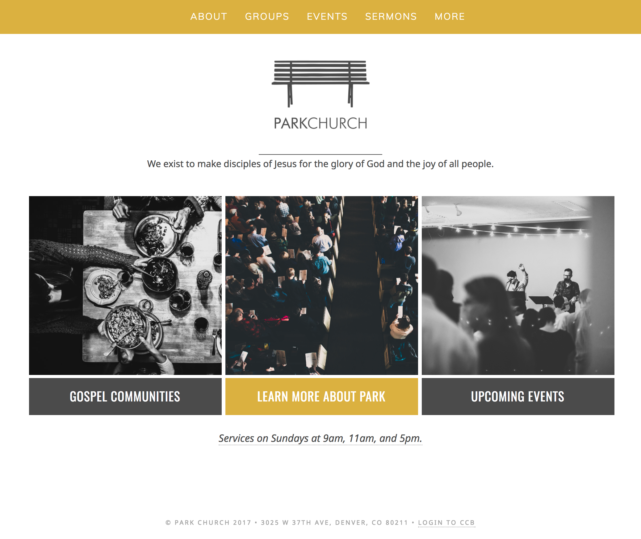
First, ease of use. For users, nothing should be interfering with the experience, and 90% of the info they’re looking for should be less than two clicks away. This required the front-end work of dialing in the site page flowchart, maximizing visual space, and knowing when to say yes and no to content. Additionally, we added more for the user by leveraging an HTTPS enviroment and getting sub-second page load times.
Second, minimalism. We found that the style we wanted was different than the huge-header-image, moving background, pop-up window experience that’s quite common. We wanted clean, less, and “really useable.” We found a direct correlation between tactfully “doing less” and creating an easy environment to use. Church websites have tons of content, so we were solving a puzzle of “how do we do less when there is tons of stuff that has to be on the site?” Pages therefore flow from minimal to content-heavy, but only as a user would expect and want.
The home page
Third, the robust CCB integration. The goal was that this new website would show the events, groups, forms, etc. that the Park Church staff was already managing on CCB. Why replicate things on the website? Though CCB does not provide any website integrations of their own, they do provide an API. Staring with a plugin called CCBPress, we re-styled and re-coded thing after thing to make the imported CCB “records” look and behave the way we wanted. The result is a website that does not need to be updated at all on a regular basis, save for sermons. This creates an incredible ease-of-use for the team, in that they just need to keep their respective parts of CCB up-to-date, something they were already doing. Although anyone could have a login, only one staff member uses one, in order to posts sermons. This the website can be entirely out-of-mind for all but one staff member.
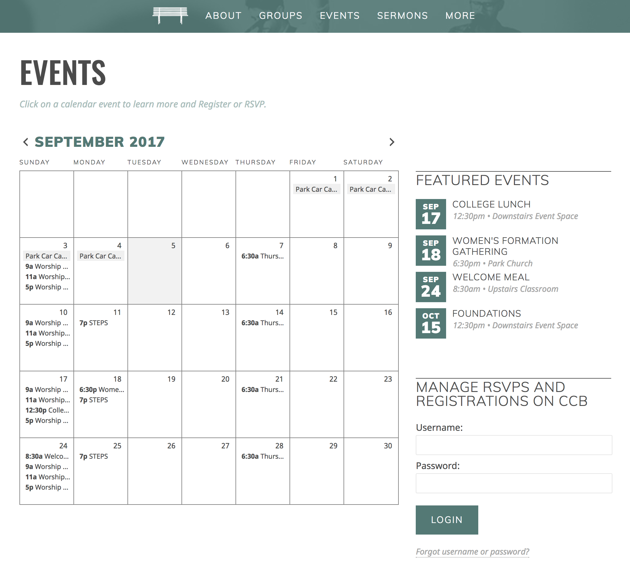 The events page
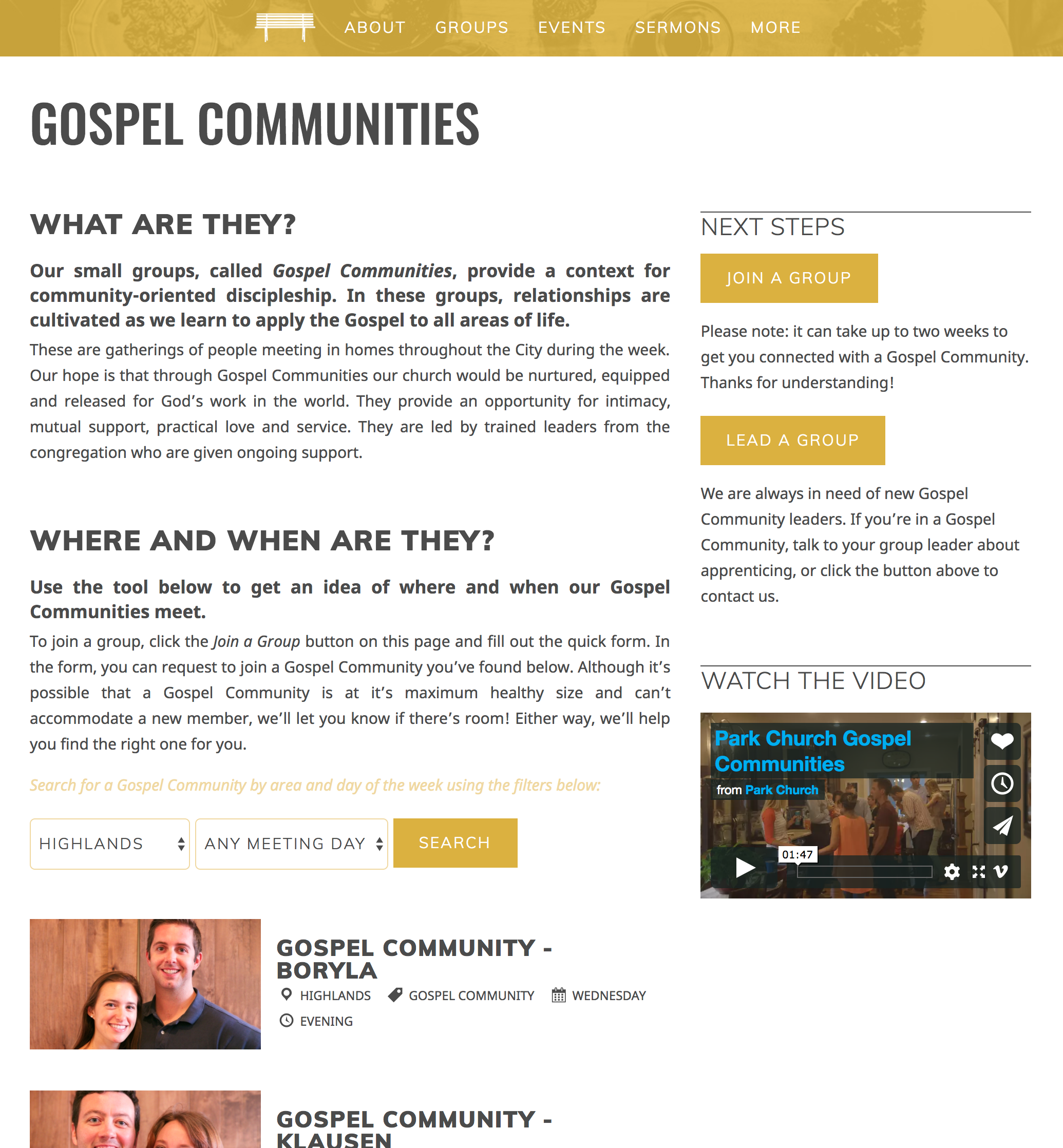 The small groups page
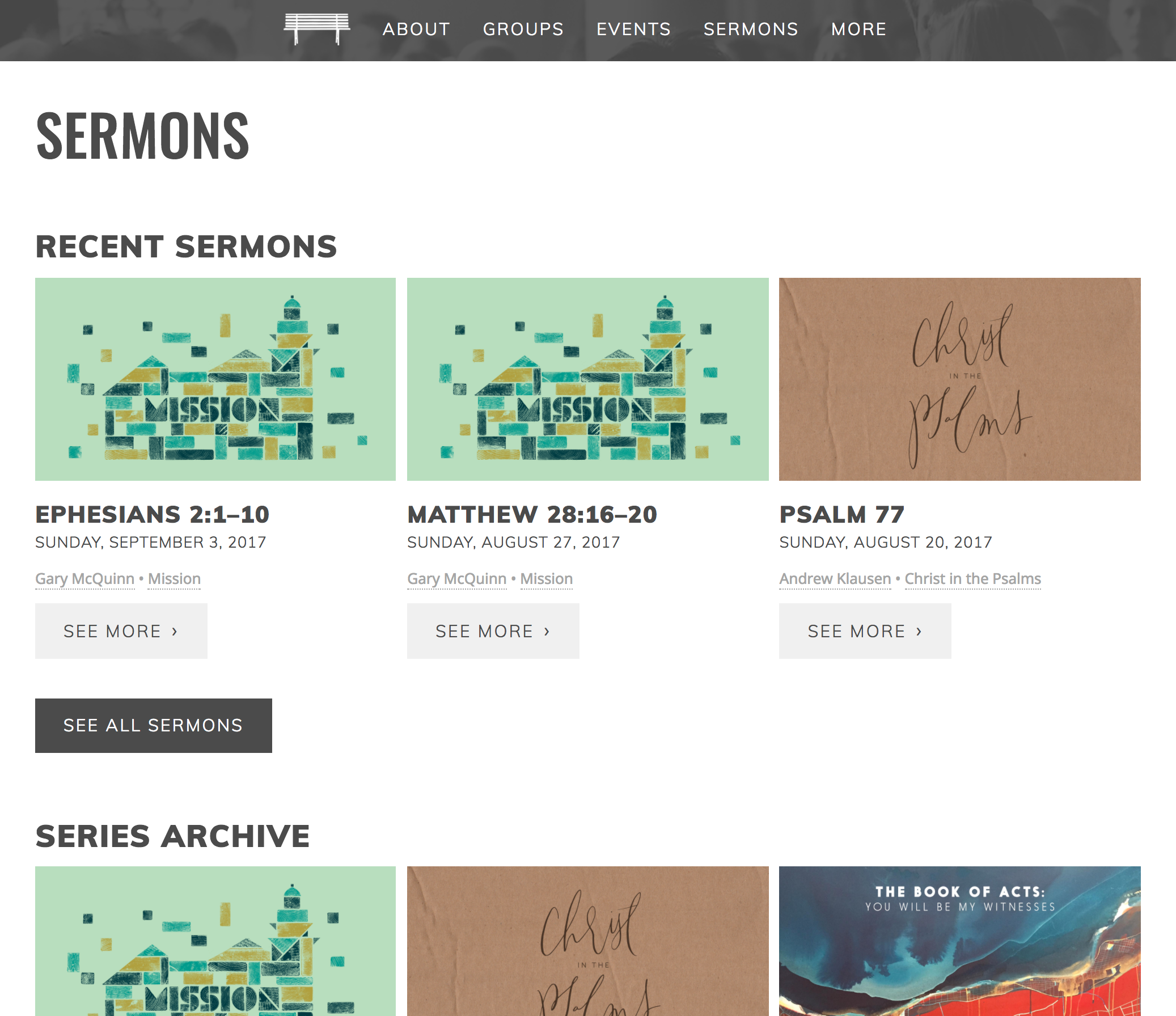 The sermons page
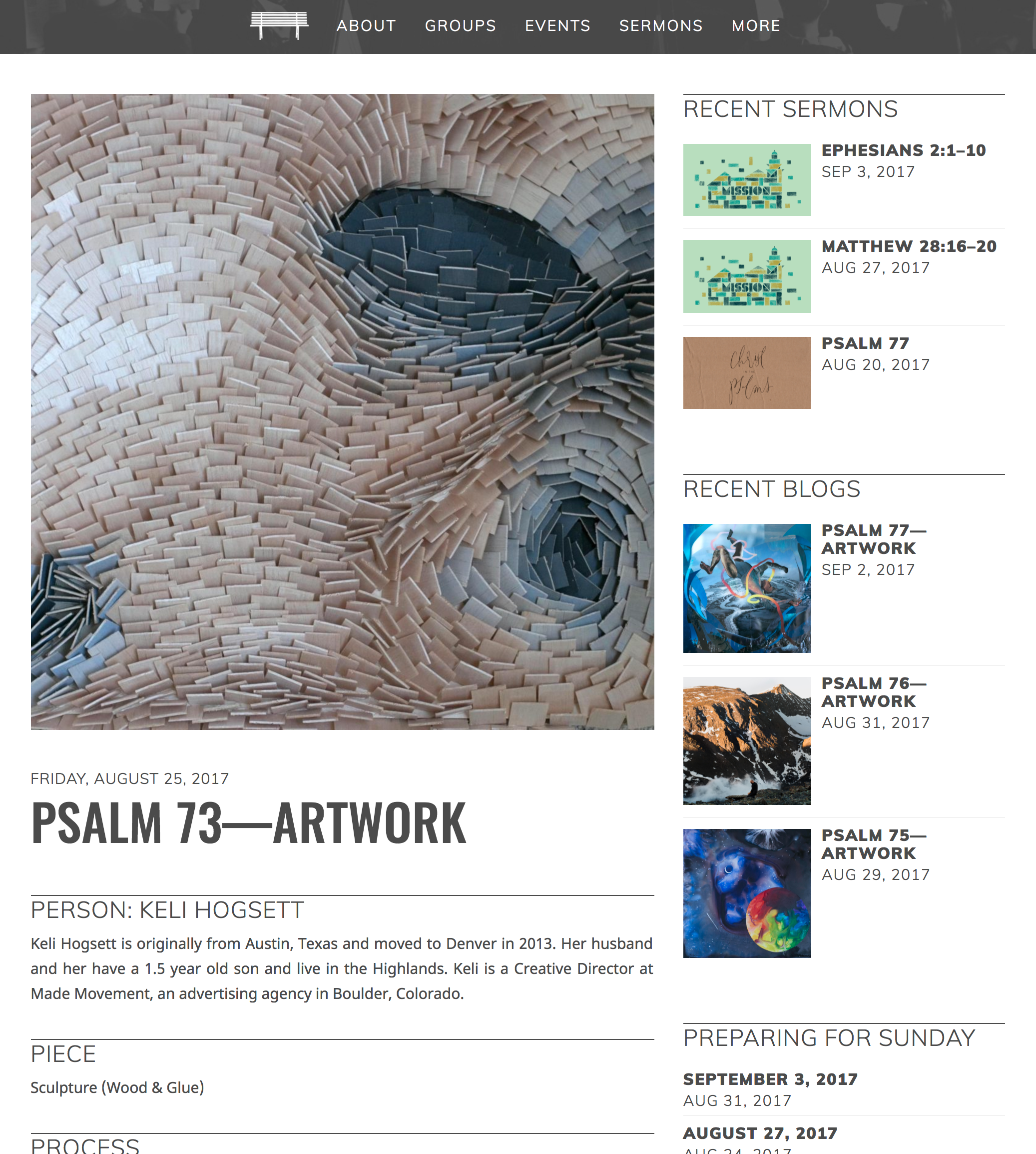 A blog post
We’re grateful to have had the opportunity to take this project, and we’re pleased with the outcome. Click on any of the images above to vists the page represented and begin browsing the actual site.


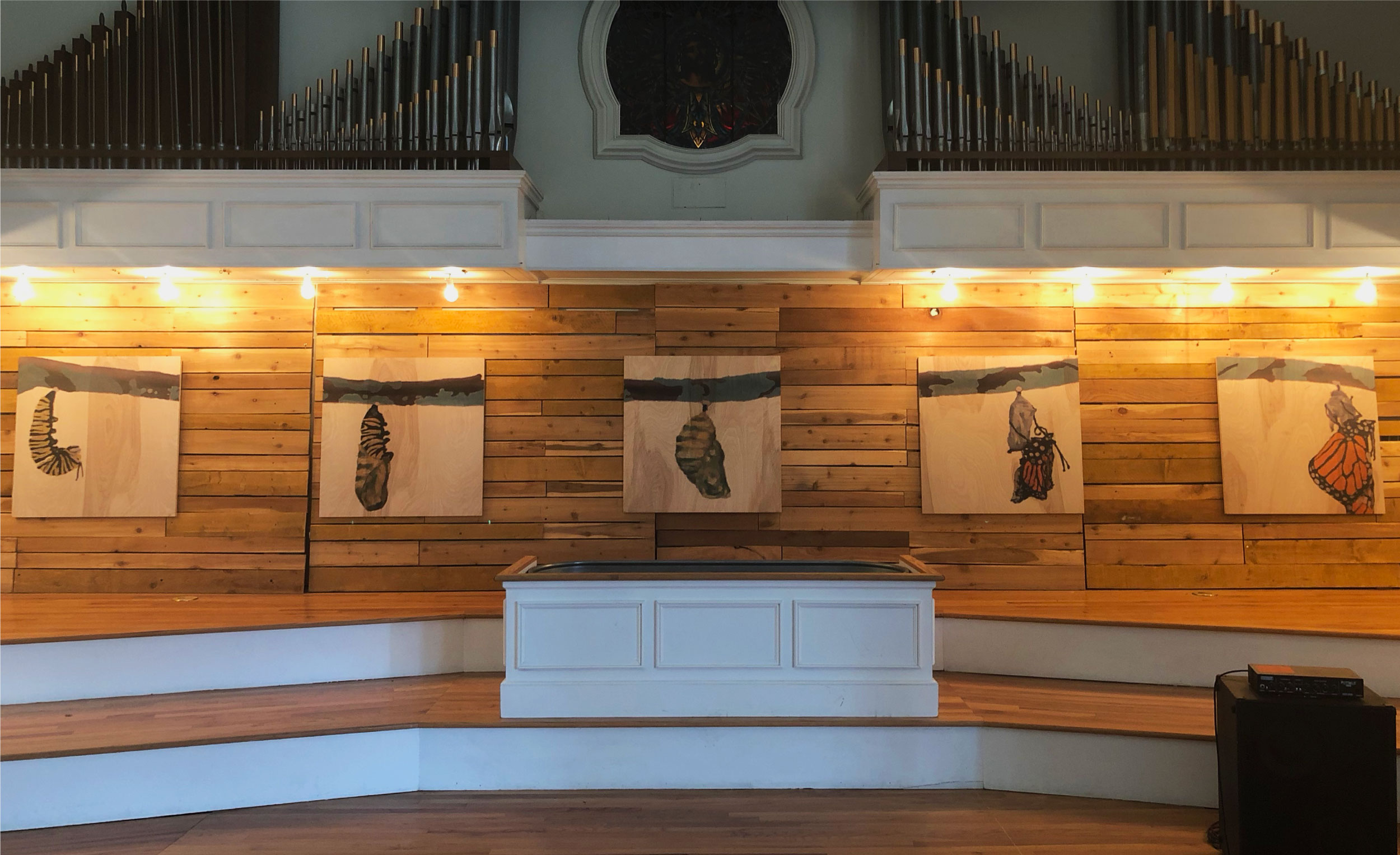
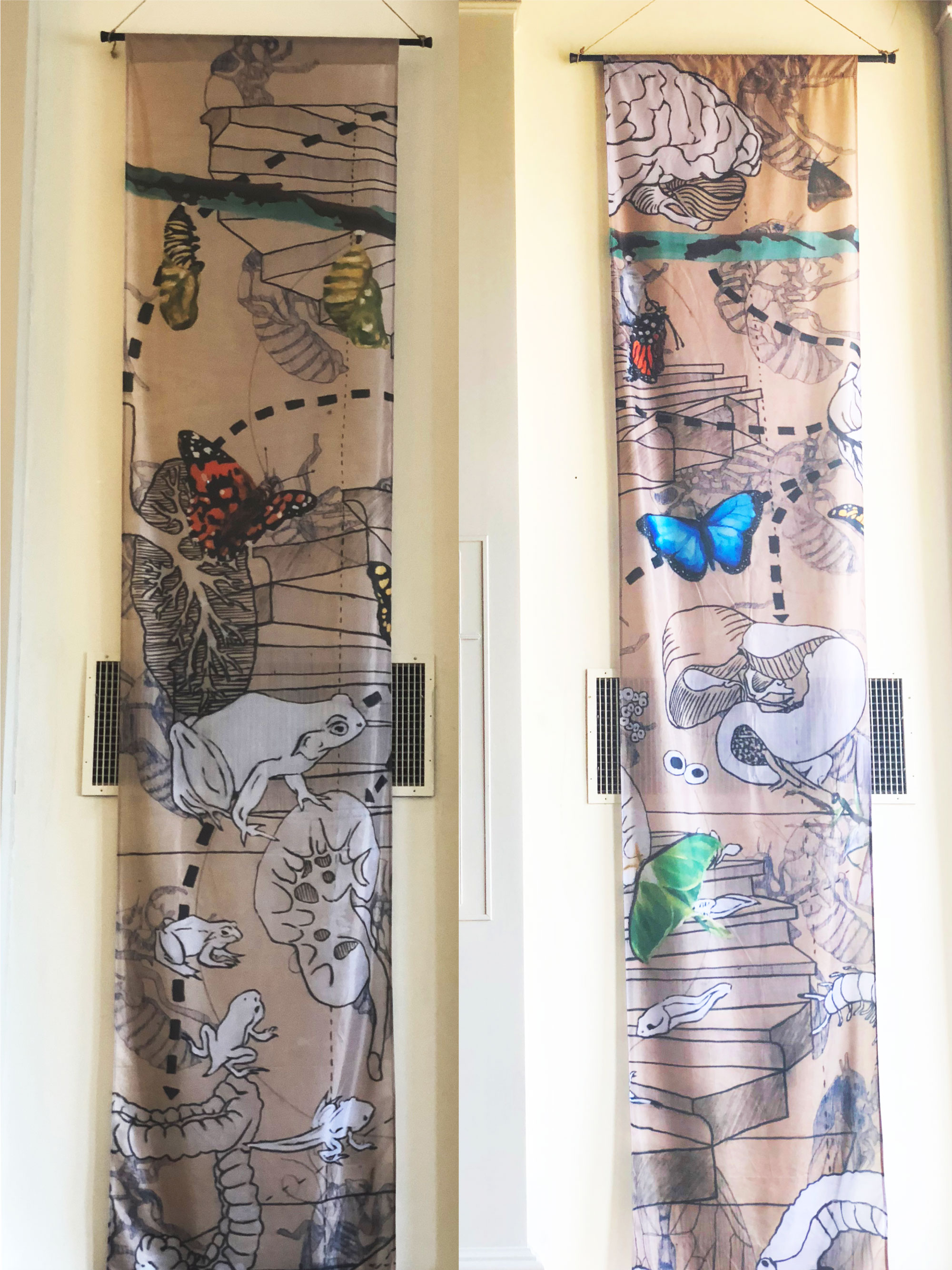


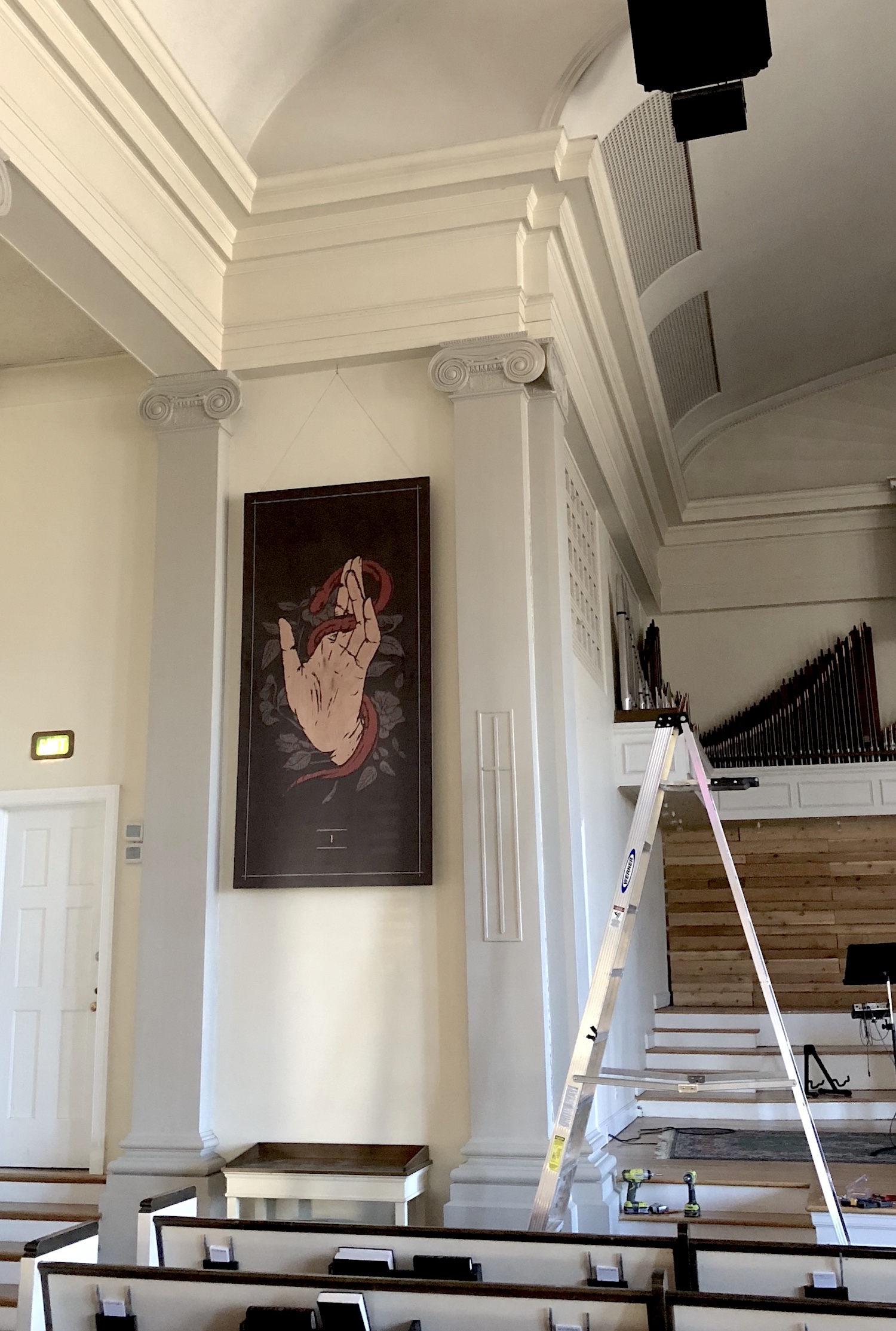 Part I After Installation
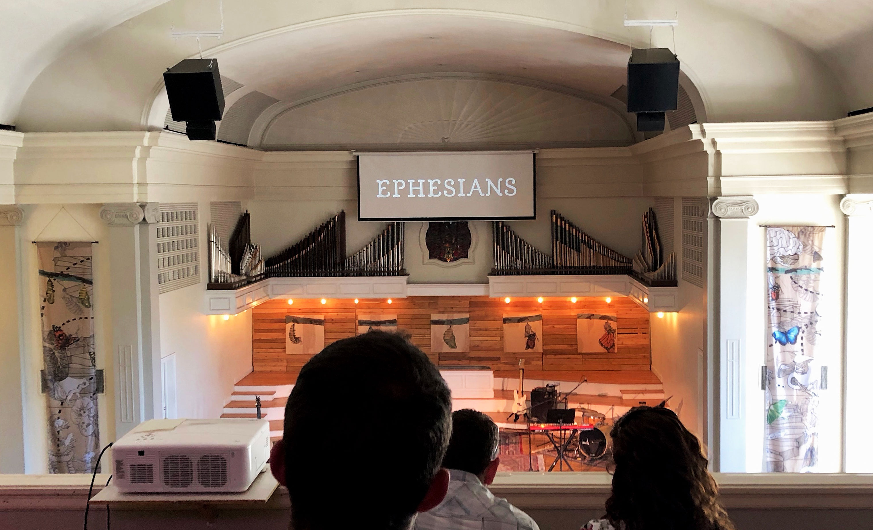
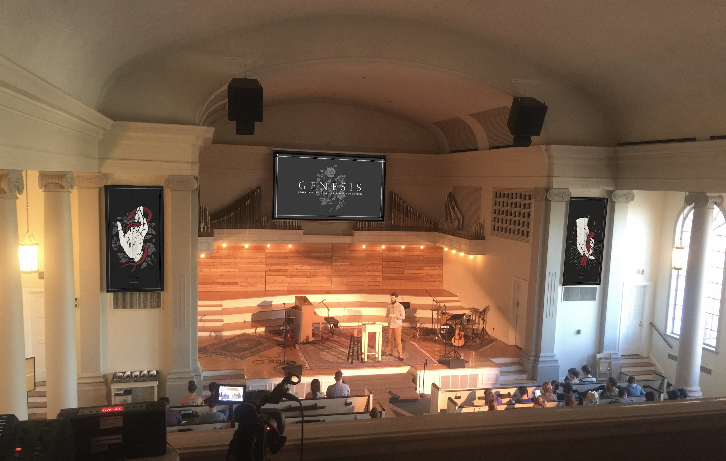 A Preliminary Mockup of The Stage