Posted on

Calvary Englewood Easter

EVENT ARTWORK • Calvary Englewood • April 2020

Though Easter 2020 was one for the record books (raise your hand if you had to Google “how do I live stream?”), we so enjoyed working with Calvary Englewood on their artwork for the weekend.

Balancing brightness and blurriness led us to this vibrant blend/smashup of photography by Josep Martins (the wall art), and Scott Webb (the palm branches).


Posted on

Fall at Trinity

Event Artwork • Trinity Church Denver • September 2018

Similar to Summer at Trinity, this artwork for Trinity Church Denver works to tie together a series of events for the season of fall. The focus of those events is a deepened, rooted community. To depict this, we used the imagery of a campfire. Yes that’s a really “fall” thing to do, but we love how campfires symbolize a warm place to huddle together, sharing stories, food, beer, laughs.

Vision For LIfe

Posted on

World Food Fair

Event Artwork • Willow South Lake • August 2018

Willow South Lake takes a Sunday each year to celebrate the different cultures represented within its community through the avenue of food. This is awesome. This is our second year doing the artwork for the event. Looking through their demographic breakdown by country, we took flags from the countries represented in their church body and made them appear “painted” on the dinner plate in focus. Thanks to Christopher Jolly for the original image!

Vision For LIfe

Posted on

Summer at Trinity

Event Artwork • Trinity Church Denver • May 2018

Artwork for a series of events, seeking to tie the events together throughout the summer across publications. Lightening the image with the same green as the “Summer at Trinity” mark was a fun way to make the image feel nostalgic and warm without just being some kind of Instagram filter. Additionally, the flourishes from the S and T make a subtle, circled trinity mark, pointing to Trinity Church’s insanely pretty brand by Alyssa Beck.

Vision For LIfe

Posted on

Vision For Life

Event Artwork • Fellowship Denver • April 2018

This series of classes at Fellowship Denver explores key cultural and theological topics to show how Jesus gives meaning to all of life. Our artwork for the event needed to be simple and flowy, not representing one idea too firmly. The use of the Venn diagram subtly argues that it’s the overlap of Jesus and all of life (seeing all of life in the context of Jesus) where we find meaning.

The image below representes the first installation of Vision for Life, focusing on the topic of justice and generosity.
Vision For LIfe

Posted on

Dwell Church Easter 2018

Event Artwork • Dwell Church Denver • April 2018

We illustrated a dark woods with an otherworldly glory emanating from what appears to be its exit. A slight curvature of tree branches suggests the round mouth of a tomb, but using the woods instead of a stone tomb allows the viewer to read other “resurrections” into the artwork. Christ’s victory over death implies His victory over all other things.

To create the piece we used two photographs, one from Mico Polča (the woods) and the other from Luis Vaz (the painted wall).

Posted on

Word-Filled Women

Event Artwork • Park Church Church • January 2018

Word-Filled Women is a ministry workshop in partnership with The Gospel Coalition.

The flowers are the incredible work of Keep Floral, and the incredible photography of those flowers is by Melanie Fenwick. One thing we never grow tired of is working with other artists. To tell Melanie and Keep Floral the ideas that were in our heads and then see these photos was just way too cool.

The idea was to communicate the strength of one rooted in the Gospel for bearing fruit in ministry. The flowers have a unique firmness and radiant health to them, and there’s also a subtle context of being held in their grower’s hand. Lastly, in doing artwork for a women’s event, there’s a risk of portraying a generalized femininity that speaks a stereotypical word. We’re proud of this artwork because it’s literally pink flowers, yet so far from something “girly.”

Word-Filled Women

A few other photos from the Keep Floral/Melanie Fenwick shoot:

Posted on

Summer Kids Club

Event Artwork • Fellowship Denver • March 2017

Summer Kids Club is a partnership between Fellowship Denver and Hope In Our City (a nonprofit that serves the refugee community in Denver). It’s a six-week activities program in the Sun Valley neighborhood for kids from Hope In Our City, Fellowship Denver, other churches, and the kids in the neighborhood themselves.

The artwork is fun, bright typography with a pattern of icons in the background, each representing one of the six weeks of Summer Kids Club. We aimed to catch the eyes of both the kids and their parents as the event is publicized leading up to its first week, starting in June.

Who Are We?

Posted on

Abide With Me

Event Artwork • Park Church • March 2017

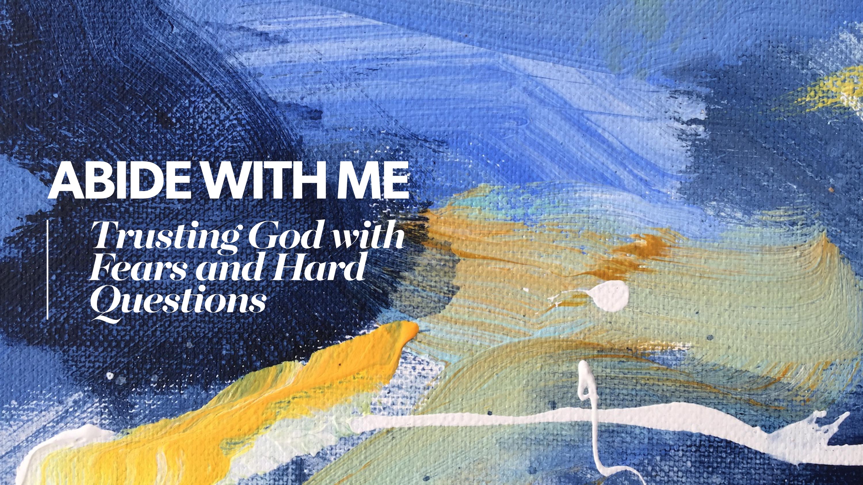
We directed this artwork for a conference Park Church is hosting in March. We’ve long admired the painting of Jennie Lou Pitts, and we were crazy excited to plan and execute this artwork with her.

Although we do like the lettering we did for this artwork—the tension and conflict created support the words themselves: Greatest Fears and Hardest Questions—but the beauty is clearly in Jennie’s painting.

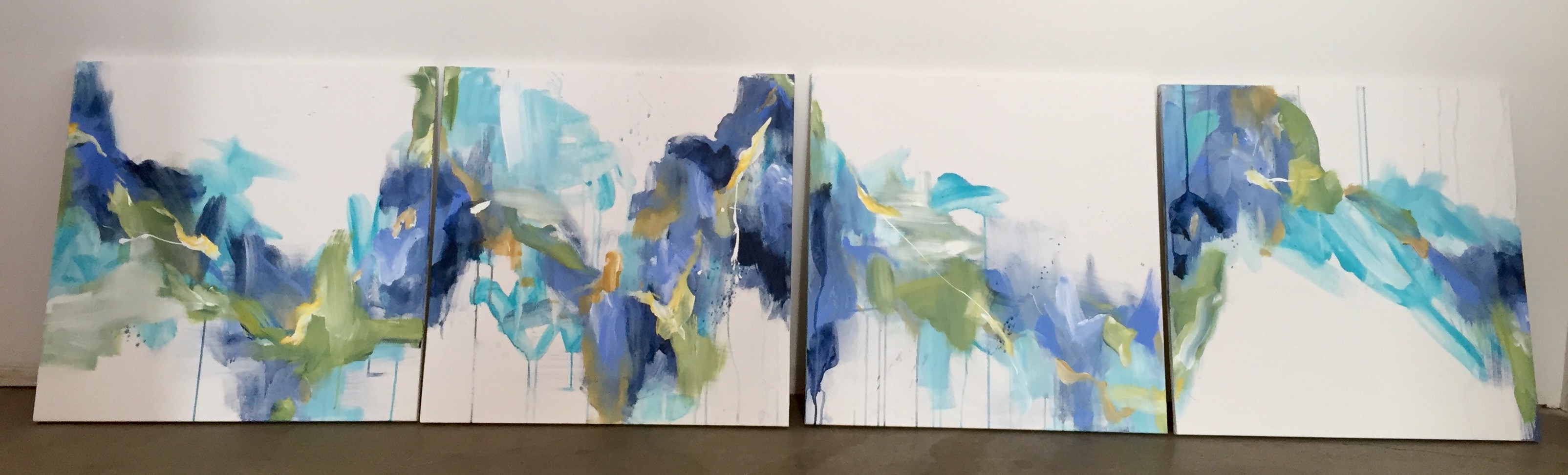
What you’re seeing in the main digital artwork is a zoomed-in shot of one little part of the entire, four-part painting. When zoomed out (see image below) the big picture shows much more; more elegance, more brightness, more completeness. The rhetorical value of this contrast for a conference on trusting God in the middle of hardship goes a long way. Viewers will first see the dark colors, the grit and texture of the canvas, and the hint of white, all symbolizing grief and Paul’s “this present suffering” in the moment. However, when viewers arrive to the conference and see the four enormous pieces on the wall, they’ll recognize the smaller section but understand it in context of the big picture. It’s a small way to symbolize the big-picture we learn to see when we experience anything—even suffering—in light of the glory of the hope of the Gospel.

Learn more about Abide in Me at parkrenew.org/abide-with-me.

Who Are We?
Who Are We?

Posted on

Thorns and Thistles

Event Artwork • Park Church • March 2017

We directed this artwork for a conference Park Church is hosting in March. The lettering was done by Andrew Miller, whose work we’ve really come to love. As complex as the issue of suffering is, he elegantly depicted the beauty of it without making it a thing too “soft.” We thought the little thorns were nifty.

For the artwork, we chose the off-white color and black and white photo to depict some of the complicated messages introduced by the event’s subtitle, The Power of Christ for Grace in Weakness. The image is some zoomed-in shot of a waterfall. It’s soft and graceful, but immensely powerful. One feels that they can be crushed by it just as easily as they can be thrilled by it. Suffering is usually a lot more “crushing” than “thrilling,” but for those who are in Christ, the implications of His power for grace in our weakness is not only thrilling, it’s staggering. In 2 Corinthians 12:9, Paul writes, “He said to me, ‘My grace is sufficient for you, for My power is made perfect in weakness.’”

Learn more about Thorns and Thistles at parkrenew.org/thorns-and-thistles.

Who Are We?