Posted on

Life On Mission

Sermon Series Artwork • The Heights Church • July 2018

Life on Mission at The Heights Church is a series exploring the teachings of Jesus on mission-living from the book of Matthew. We had three concepts for the series and loved all of them. The visual argument options are many when Jesus teaches with vivid metaphor after vivid metaphor—it was really fun. The piece we ended up with is this visualization of the one lost sheep apart from the other 99, whom the Good Shepherd spares no expense or effort to rescue (Matthew 18). The off-center positioning of the words and the shape of the rest of the “flock” draw an invisible diagonal line, working to move one’s eyes directionally from the flock to the missing sheep.

Vision For LIfe

Posted on

Who Is Jesus?

Sermon Series Artwork • The Heights Church • February 2018

This artwork for The Heights was done by Bruce Butler.

The idea of the Who is Jesus? series is to take a look at the myriad messages we’ve heard about the person of Jesus and distill them with the Word of God, seperating myths and cultural additions from the truth. Bruce illustrated this by taking several pictures of Jesus that depict Him in different styles (and with skin colors, for that matter) and creating a “composite” image that completes a fractured face, referencing the shape of a crown.

This is what we nerd out about as designers and church communicators—marrying the artistic to the rhetorical. We’re grateful for Bruce as a partner and for this excellent example of our goal in designing for the Church.

United

Posted on

United

Sermon Series Artwork • The Heights Church • January 2018

United is an annual sermon series on The Heights’ three core values as a church—Gospel, Community, and Mission.

To depict these three elements, we used three images and chopped and blended and such to create this. The plant represents “rootedness” in the Gospel (Eph. 3) and our corresponding flourising (Ps. 1). The birds on power lines represent a Community bound together by His powerful energy (Col 1:29). Lastly, the image of the city representents Mission, showing part of Manhattan that is both distinct (known) but also indisctinct (unkonwn, not “here”), attempting to demonstrate that our mission field as believers is local, semi-local, and global.

United

Posted on

Colossians

Sermon Series Artwork • The Heights Church • September 2017

We’ve been vibing with this grungy text thing this summer. The team at The Heights was clear that they just wanted the words Colossians: Full & Free over a simple background. As many times as we’ve made artwork that fits in this vein, we specifically love how this one came out! There’s a lightness here that keeps up with the dirt in the lettering—a hopefully-fitting illustration for their arguments from the book of Colossians.

Who Are We?

Posted on

Summer in the Psalms

Sermon Series Artwork • The Heights Church • June 2017

The Psalms are emotionally deep and wide. They feel like “despair” as often as they feel like “victory.” They teach us to bring the full range of human emotions before God in our worship, regardless if we feel more Psalm 22 than Psalm 118.

To illustrate that for the first year of Summer in the Psalms, an annual series at The Heights that will work psalm-by-psalm, week-by-week through the whole book over many years, we liked the idea of a messy expression, something inky, unique and nonlinear. The incredible Joel Filipe of Madrid has shared some really excellent work of his via Unsplash (thank you!), and his abstract series is mind-blowing. Although we added/edited much to fit the application, these images paved the way.

In another attempt to illustrate the diversity of the Psalms and what they teach us about our relationship to God, we made a different version of the artwork for each of the three weeks. You can see all of them below.

Click here to listen to sermons from Summer in the Psalms.

Who Are We?Psalms 1–3

Who Are We?Psalms 4–6

Who Are We?Psalms 7–9

Posted on

The Heights Brand Update

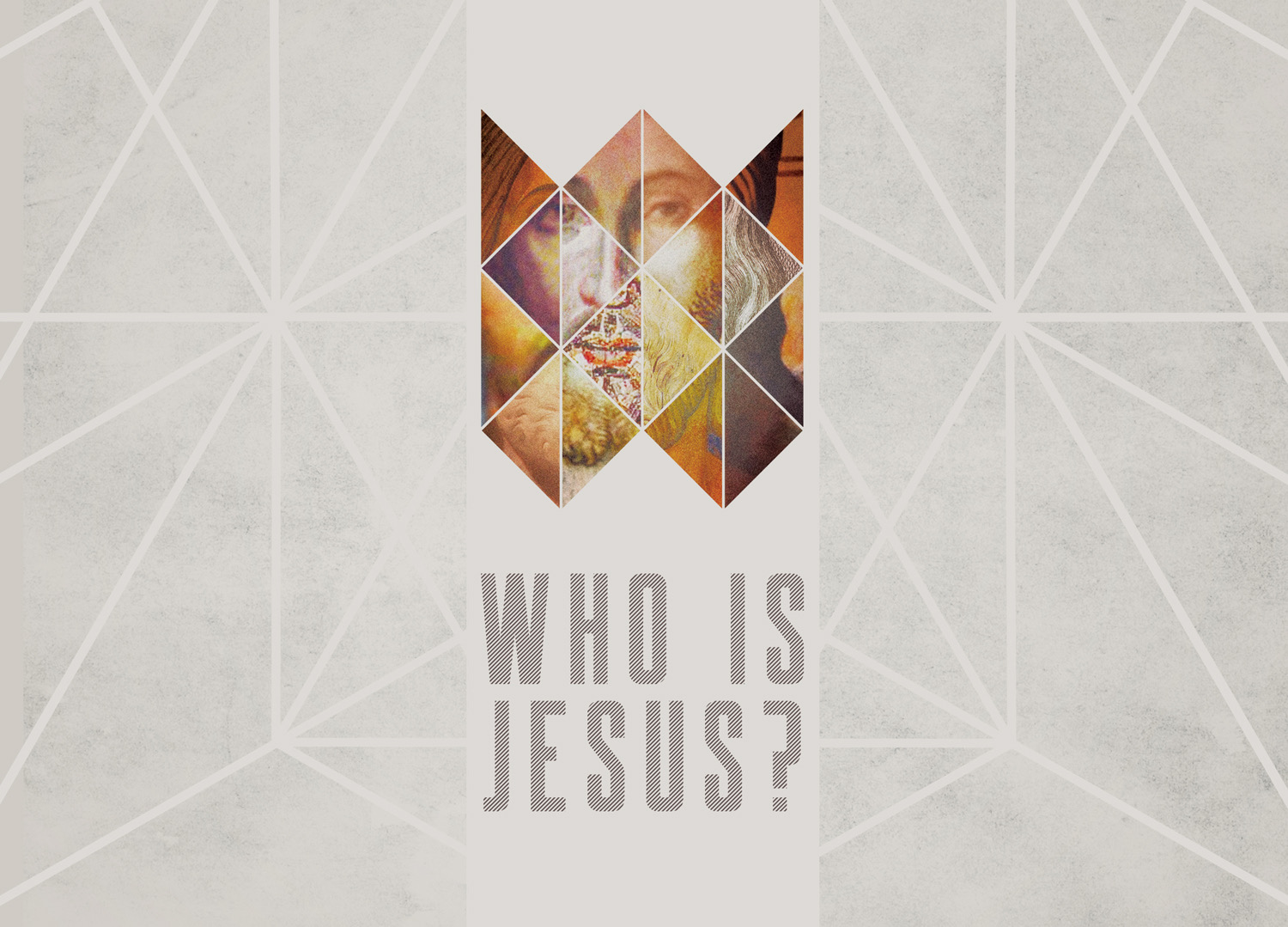
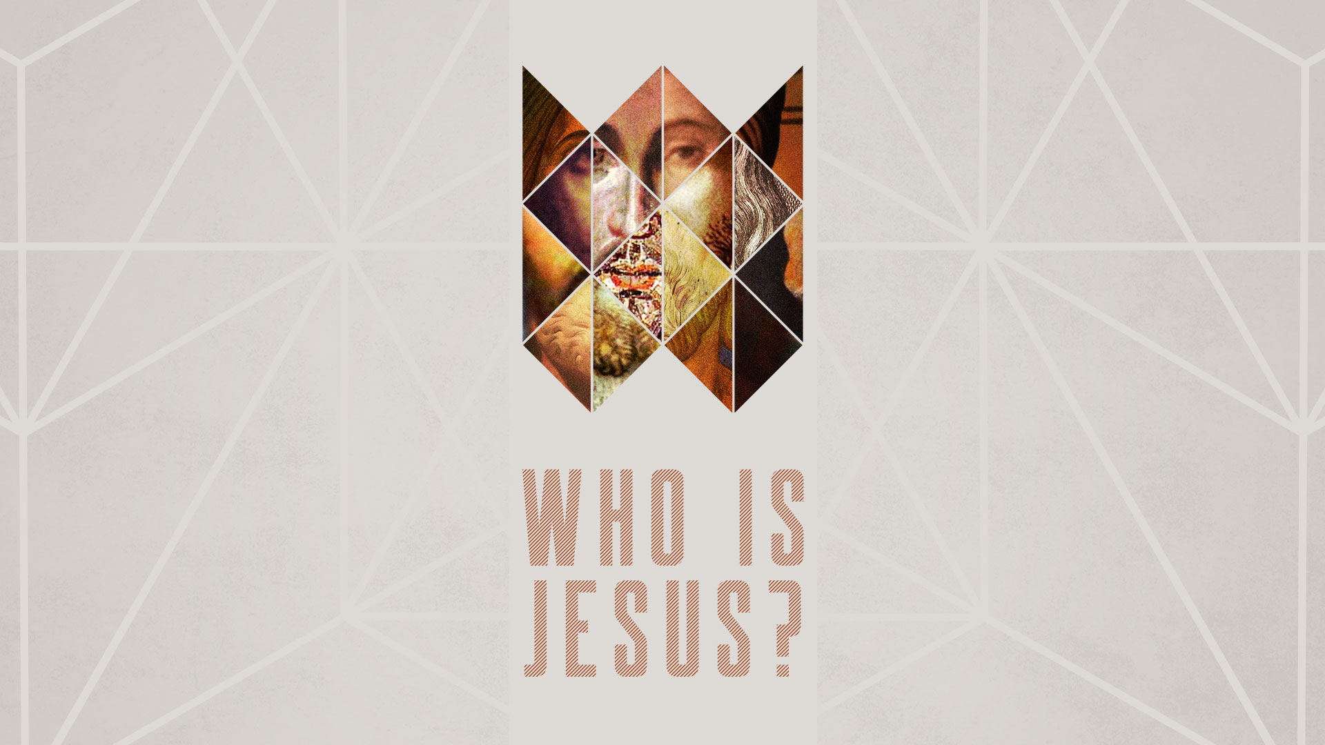
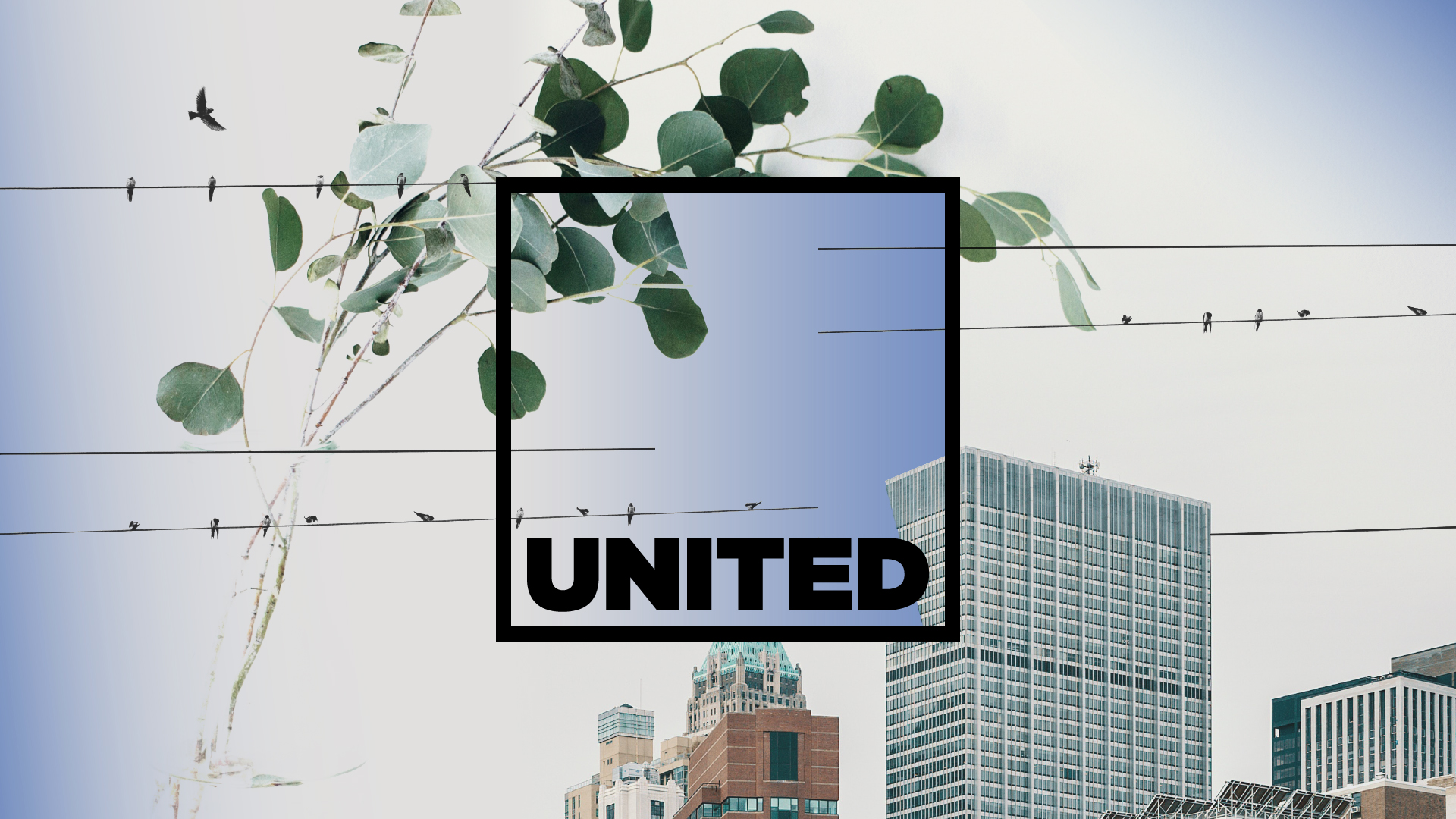
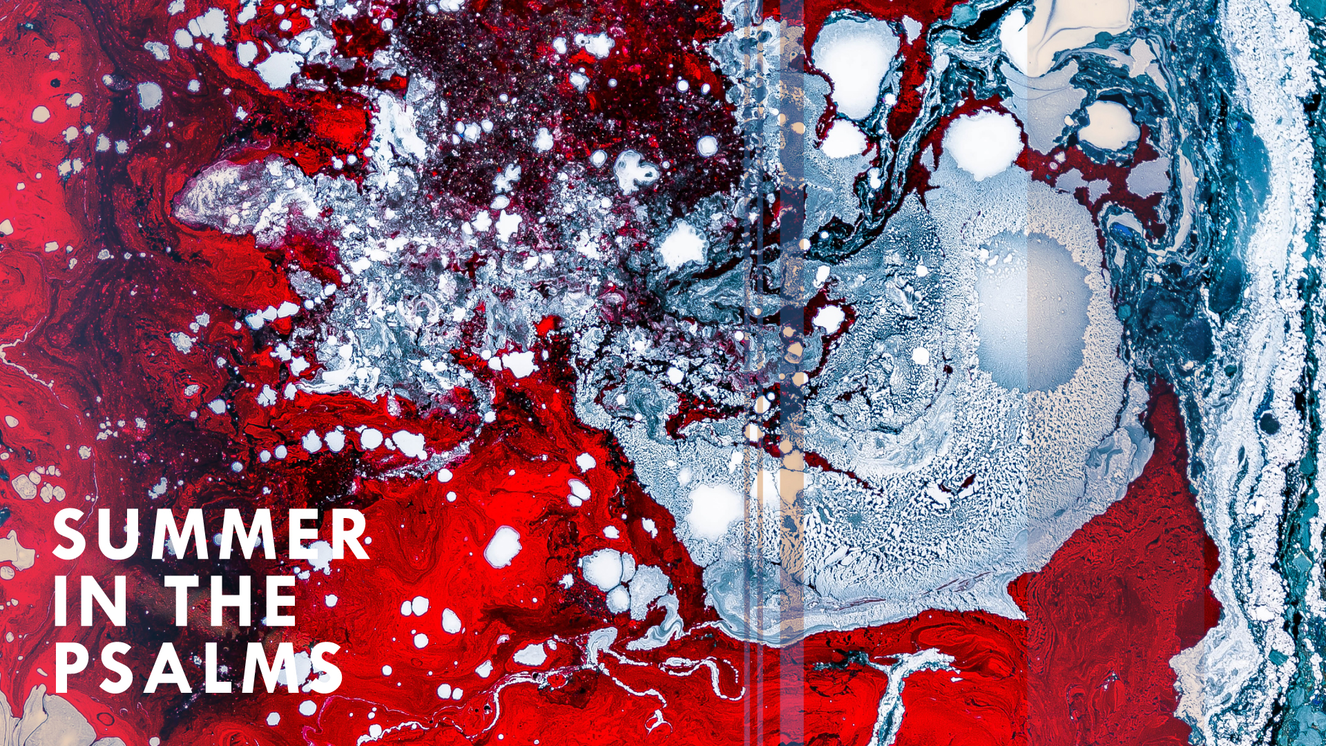
Branding • The Heights Church • October 2016

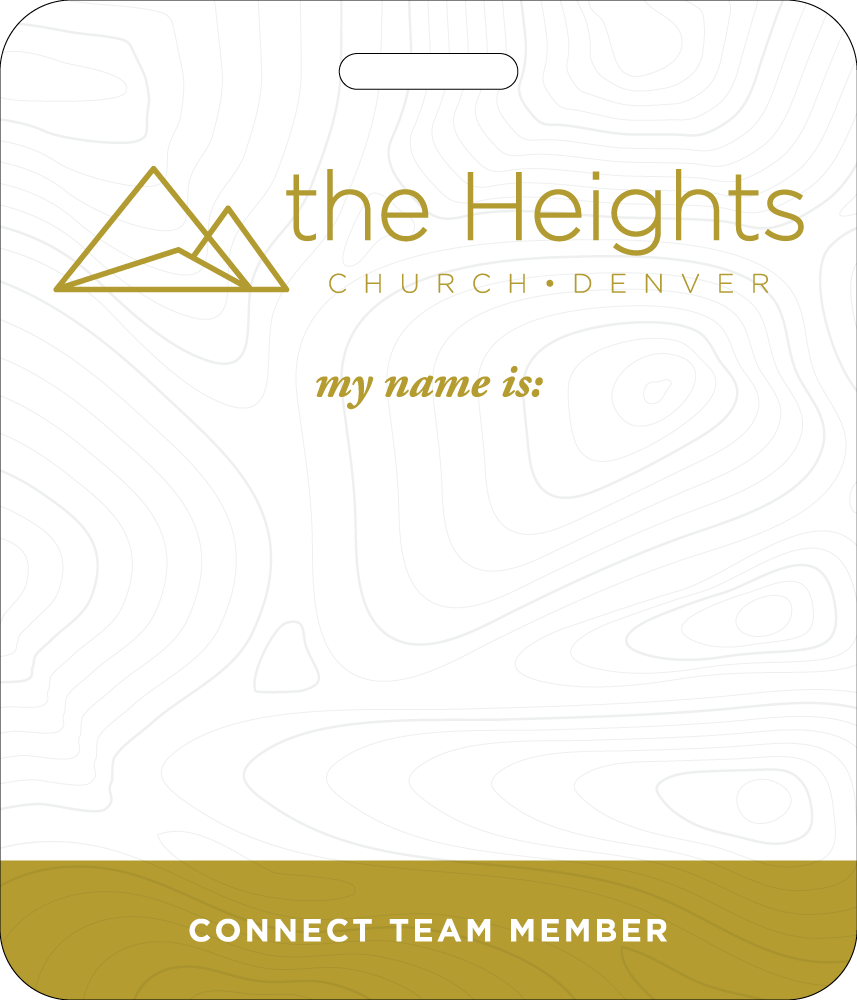
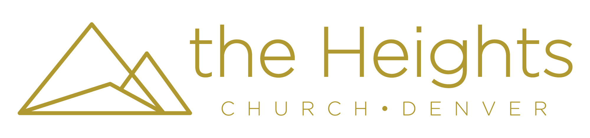
Art /Rhetor has had the joy of working with the Heights Church during the early phases of their launch. Towards the end of 2016, with regular Sunday services coming up in just a couple months, they decided to adjust their logo to communicate some new things. They loved the typography and colors created by the designers they worked with before us, but the icon part of the logo (the mountains) wasn’t standing out or doing enough to catch eyes or create recognition.

We’re really proud of what we came up with. In a city like Denver, where mountains are in three out of four organization’s logos, it’s hard to break away from “easy” designs and stuff that people have already done. Admittedly, even the minimalism-and-polygons approach is not that unique, but as our client’s favorite idea, we’re so pleased with where we took it. We love the cognitive dissonance created by the first mountain being “opaque” in a way, with the two mountains behind it being “transparent” and in uncertain order.

Rhetorically speaking, mountains are an easy way to see the glory of God. It’s not only that they’re really big and have remarkable ecosystems and you can see them from hundreds of miles away, it’s that they show us how small we are. Why is it good to know that you’re small? Why do so many people crave being in the mountains? One answer—my favorite answer—is that the greatness of our God is magnified to us as we realize our smallness, and the even greater cognitive dissonance of “Yet He knows me perfectly and loves me even as He loves His own Son” awakens my heart and affections in an even wilder way than the mountains themselves.

Additionally, like every good gift that God has given us, the mountains are a lovely thing to look at, yet they do their true and full work for us when we look through them, seeing the work and the grandeur and the dangerous, expansive God Whose hands formed them. For this reason, and because we are in great tension with this principle, the mountains are both opaque (the front one) and transparent (the back ones).

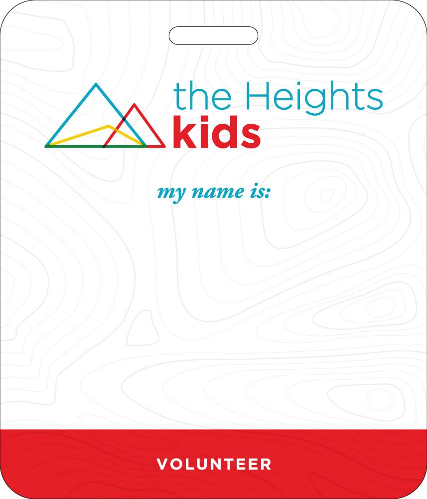
After completing this update to the Heights’ brand, they asked us to create a unique version of it for their children’s ministry, The Heights Kids. Using primary colors and a bolder, slightly-softer version of their main brand’s , we created a fun, more-approachable sub-brand that references the main brand while working a lot better for kids.

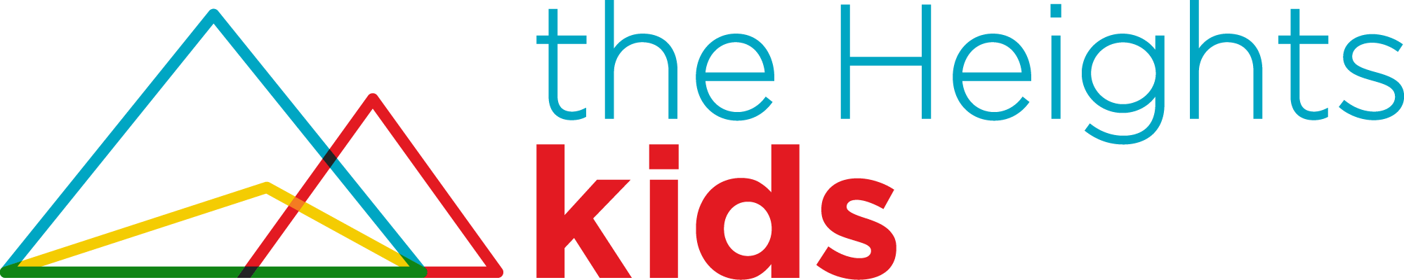
Rhetorically speaking, we believe that every child is different, and that a children’s ministry must be engineered to teach the Gospel to all kinds of kids. Furthermore, one of the coolest things about children’s ministry (and church community in general, for that matter), is that the Church does more than just accommodate kids and adults who are different than each other. These difference create a context where we can see the Gospel through each other’s eyes and gain perspectives we’d be blind to if just left in homogeneity. For this reason, the mountains in this logo are almost all on the same “plane” in the depth-of-field (it appears more 2D than 3D), and new colors are formed where the mountains each overlap—the multiplication of the two colors. For example, the entire base of the blue mountain and yellow mountain combine to make a shared, green base. On the one hand, it’s fun and inviting, but on the other hand, it’s a picture of what happens when we expereince the Gospel together.

To demonstrate how the main brand and the sub-brand interact, here are two nametags we designed for the Heights side-by-side.

Posted on

Serve Denver

Event Artwork & Tee-shirt Design • The Heights Church • April 2016

Our first job for The Heights church was a branding and tee-shirt design project for Serve Denver, a service project happening in the Summer of 2016. Our goal was to avoid the standard “Denver” design tropes. while using something of the city in the artwork.

Walk in the Light Artwork