Posted on

Romans

Sermon Series Artwork • Trinity Church Denver • September–December 2019

Trinity’s Romans series puts the world in context of the rule of God, demonstrating that His order and rule is its good, bringing chaos into peace.

Read about the individual parts to the series below:

Part i/iii • September 2019

Romans presents us with a chaotic world of man’s rebellion and a promise of glorious, peaceful order in the good reign of Christ. To illustrate this, we composited two images: (1) the ceiling of a cathedral that shows a lot of the narrative (the photo is of Cathedral Basilica of St. John in Hungary, taken by Viktor Forgacs), and (2) a slightly-blurry and over-exposed picture of stars (taken by Fonsi Fernández). Lastly, thin and almost imperceptible lines cross the piece every which way.

In short, three rhetorical layers: man’s perception of the story (the classical basilica painting), God’s incalculable universal dominion under which we find ourselves (the stars), and the perfection of his structure and order therein, visible to those who seek it (the lines). Taken together, we hope to hint at the cosmic scope of this story and the grandeur and contrast of God’s ordered world.

Part ii/iii • December 2019
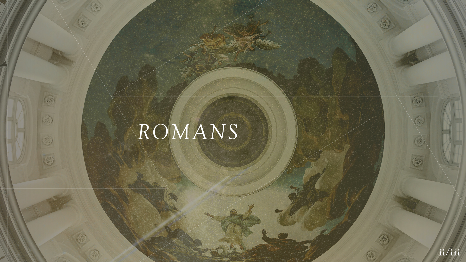
Picking up where Pt I left off, we now see the focus shift to Christ in Pt II. The basilica (now Gustaf Vasa in Sweeden, taken by Liuns Mimietz) depicts the Transfiguration of Christ, where it’s made explicitly clear that the Law and the Prophets bear witness to Christ—He is their fulfillment. In the Pt 1 image, the ceiling and outer ring around the painting were darker, but now the sun is coming in and clarity is being added to man’s perception of the story. The color has warmed from blue to gold, and the stars have intensified; the plan is becoming more visible (photo by Juskteez Vu). A clear, brightest star is seen streaking across the sky, pictured in the artwork next to Jesus and parallel with one of the lines that represent God’ perfect order.

Seen as one, we hope to illustrate how Jesus connects the dots, bringing resolution and searing hope into the narrative. The narrative is for Him and about Him; He is the bringer of God’s good order in that He fulfills God’s plan, and in Him we can see this plan and marvelously find ourselves in it with Him at the bright center.

Posted on

Christ in the Psalms

Sermon Series Artwork • Park Church • May 2019

Every summer at Park Church since 2012, 10–12 weeks are spent in the Psalms. They’ve gone Psalm-by-Psalm, week-by-week, and this summer (2020) will see week 100 of the series, that is, Psalm 100.

In all 100 weeks of this series, there have been only three artwork projects that have represented Christ in the Psalms through what has been two years’ worth of Sundays. This has been an intentional rhythm: coming back each year to the same artwork and the same rhythm, seeing the same mini-liturgy for Ordinary Time. When Park decided to retire the beautiful, simple Meagan Tidwell calligraphy that represented 2014–2018, it felt like a really big deal. We knew that the new artwork could be displayed for as many as 50 Sundays.

I’m no small fan of Jacob Boyles. You may know him from the diverse and ongoing artwork initiatives of Elevation Worship, but he’s left his mark as far as Denver, where the immortal Steuben’s restaurant even has a logo of his. In particular, his album artwork for Hallelujah, Here Below is a mind-blowing monoline piece that pulls from several places in Scripture and challenges the eyes with pleasing riddles. It’s a dreamboat of an art piece.

We reached out to Jacob for Christ in the Psalms, and directing this project alongside his work was truly a career highlight for us:

Christ in the Psalms 2019—Title Slide

The Process

We started in a conference room in Denver with a gargantuan list of images from the Psalms that represent or illustrate Jesus. After deliberation, several failed attempts at categorization, and no small amount of reading, we gave Jacob a list of 15 images, from which to choose 10 to illustrate for the main piece (see above).

From there, Jacob also illustrated two large banners, one for Psalm 1, and another for Psalm 150. These bookend banners hang along the sides of the front of the sanctuary, framing the stage all summer. They illustrate both the grand arc of the Psalms and the grand arc of Scripture itself:

Posted on

Exodus

Sermon Series Artwork • Park Church • January 2019

Illustration by Christian Robinson.

In 2018, we worked with Christian Robinson for Park Church’s Genesis series. The response was such that deciding to work with him for the follow-up series, Exodus, was easy.

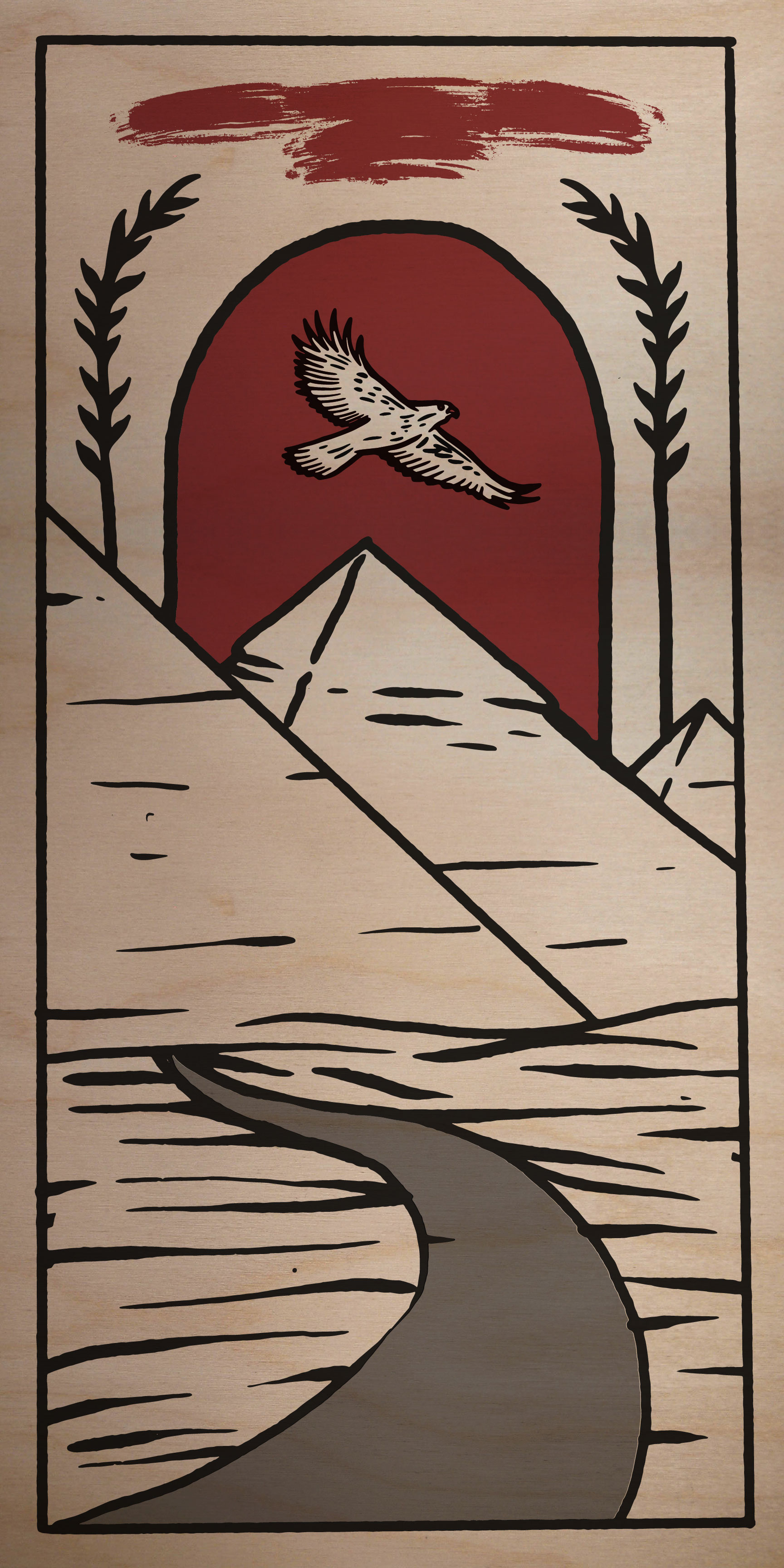
The two main pieces symbolize two of the main narrative arcs of Exodus: Part I depicts man-made mountains (the pyramids), stalks of wheat (representing Israel’s brick-making slavery), an eagle flying overhead (Ra, or the perceived dominion of Egypt’s gods), and the road out. Part II depict the mountain of God which He Himself made (Sinai), the glory coming down on the mountain, and Mosts holding the tablets and his staff.

Part III depicts the crossing of the red sea, and serves as a “bridge” between parts I and II, illustrating the climax of the story and the penultimate moment of Israel’s rescue by Yahweh.

To display the artwork, we printed Parts I and II on 4×8 foot sheets of birch to hang in the Park Church sanctuary (see photos below). We also printed Part III on a 6×4 foot birch panel to be displayed in the lobby.

Posted on

Ephesians

Sermon Series Artwork • Park Church • September 2018

Oil painting and illustration by Benjamin Rogers.

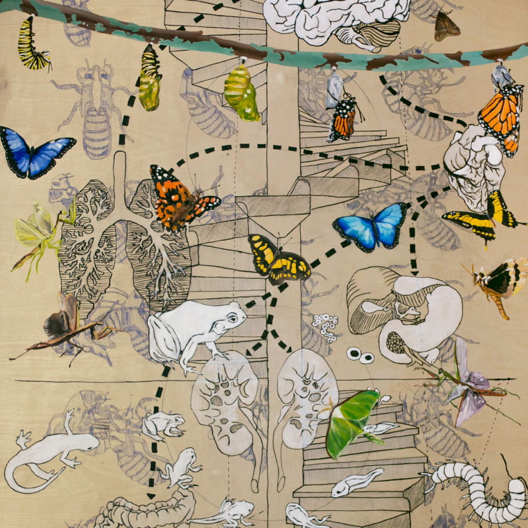
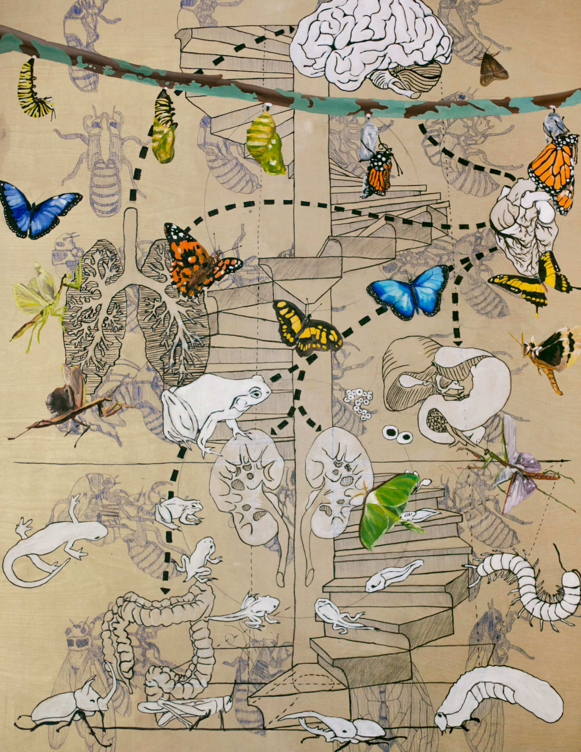
One of our largest and most involved projects this summer was directing artwork for Ephesians at Park Church. We commissioned the incredible Benjamin Rogers to create an original piece for the series, and within the piece he placed several diversely-illustrated arguments from the Scripture. There’s too much of interest to share here—please see the artwork essay at parkchurchdenver.org to learn about all the goodness here!

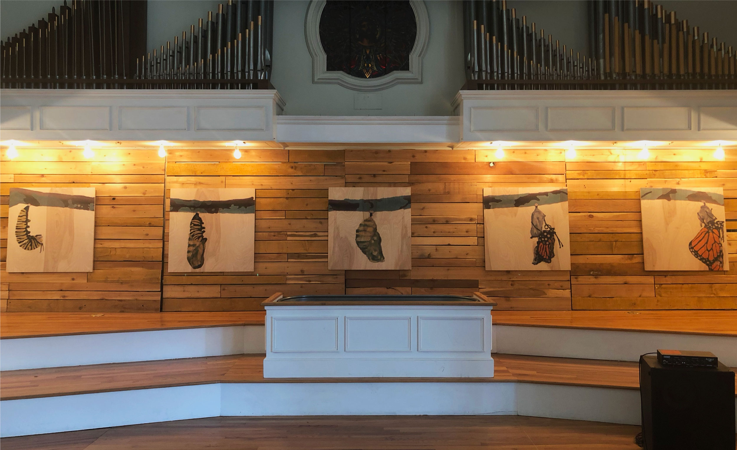
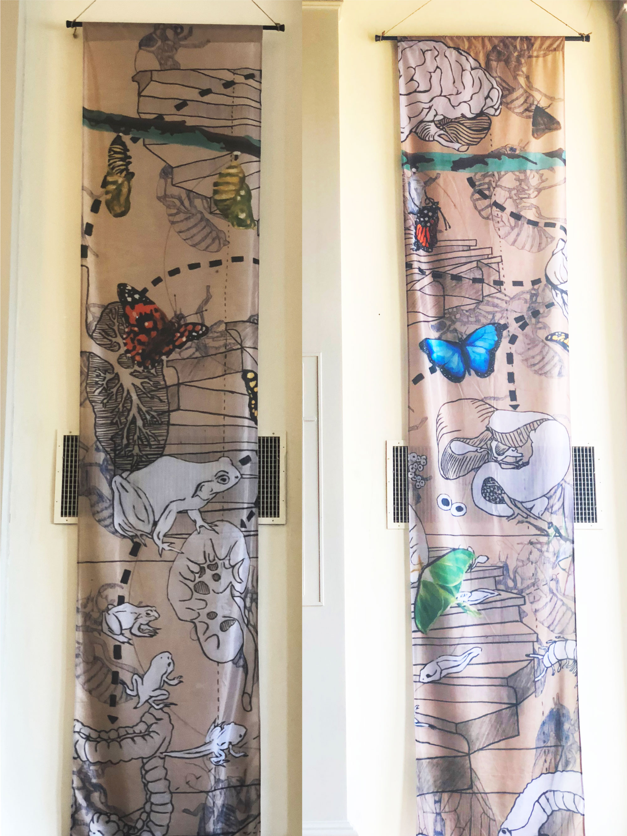
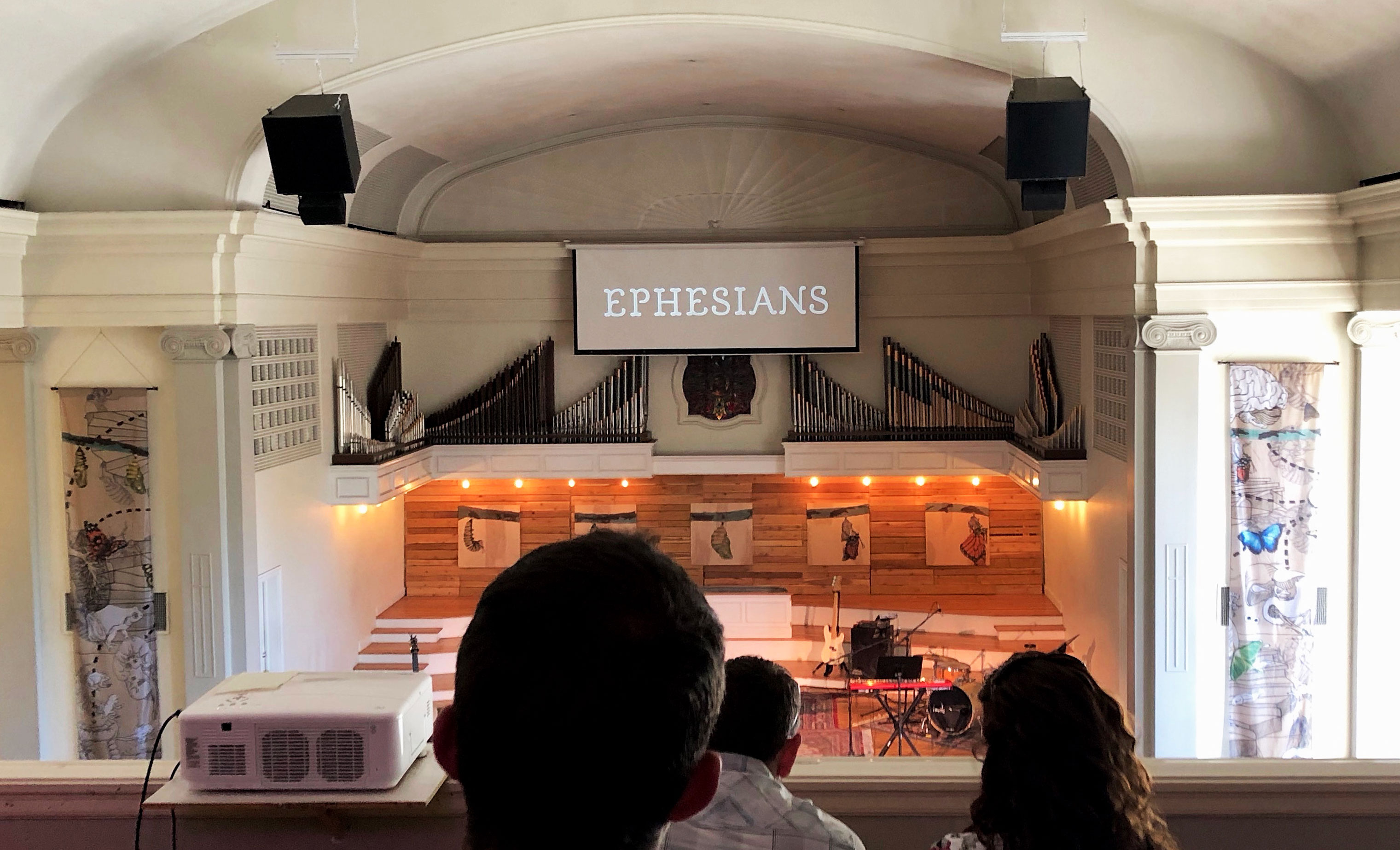
On our end, we took photos of his artwork and created two 3×15′ banners and five 3×3′ wooden panels for the stage at Park Church, in addition to creating the logotype.

The complete, original painting and illustration

The five 3×3′ wooden panel prints

The two 3×15′ banners

The complete Park Church stage from the balcony, including the “Ephesians” logotype

Posted on

Ten

Sermon Series Artwork • Trinity Church Denver • September 2018

In their fall series on the Ten Commandments, Trinity Church Denver is working to depict this familiar topic not as “rules that inhabit us,” but as a framework that gives us life because of the work of Christ. To argue this visually, we contrasted the traditional understanding of the Ten Commandments—rigid and lifeless stone—with an in-Christ understanding of bright, approachable, vivid life—the watercolor floral wreath. Additionally, since Christ is the key to enjoying a life under God’s good rules, we added a notch to the “T” as a pointer to the Rock cleft for us; the stone struck in the wilderness to give us life.

Vision For LIfe

Posted on

Life Together

Sermon Series Artwork • Fellowship Denver Church • August 2018

Fellowship Denver is working through Romans 12 this August, exploring what a life of service informed by the Gospel looks like. In all their artwork, Fellowship has a unique, simple-geometric style that we love. Starting from that inspiration, we were shooting to communicate the link between the historic church and the modern church, almost to say, “This life of Gospel-service has always been who we are.”

The top hand symbolizes the historic church (in a first-century robe), while the bottom hand symbolizes the modern church (see the Apple Watch? If that’s too extra, try to just see a normal watch). The triangles around the outside of the work can symbolize two things: (1) the individual pieces that fit together in seemingly-random ways to make the whole (Rom. 12:4–5), and (2) a service informed by the Trinitarian God, whose three members eternally serve each other.

Vision For LIfe

Posted on

Life On Mission

Sermon Series Artwork • The Heights Church • July 2018

Life on Mission at The Heights Church is a series exploring the teachings of Jesus on mission-living from the book of Matthew. We had three concepts for the series and loved all of them. The visual argument options are many when Jesus teaches with vivid metaphor after vivid metaphor—it was really fun. The piece we ended up with is this visualization of the one lost sheep apart from the other 99, whom the Good Shepherd spares no expense or effort to rescue (Matthew 18). The off-center positioning of the words and the shape of the rest of the “flock” draw an invisible diagonal line, working to move one’s eyes directionally from the flock to the missing sheep.

Vision For LIfe

Posted on

Who Is Jesus?

Sermon Series Artwork • The Heights Church • February 2018

This artwork for The Heights was done by Bruce Butler.

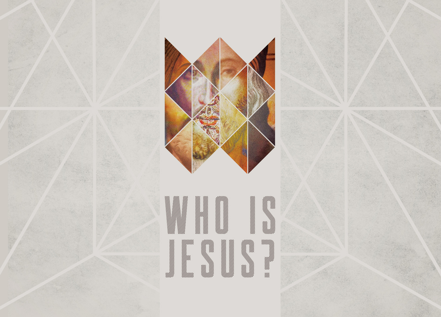
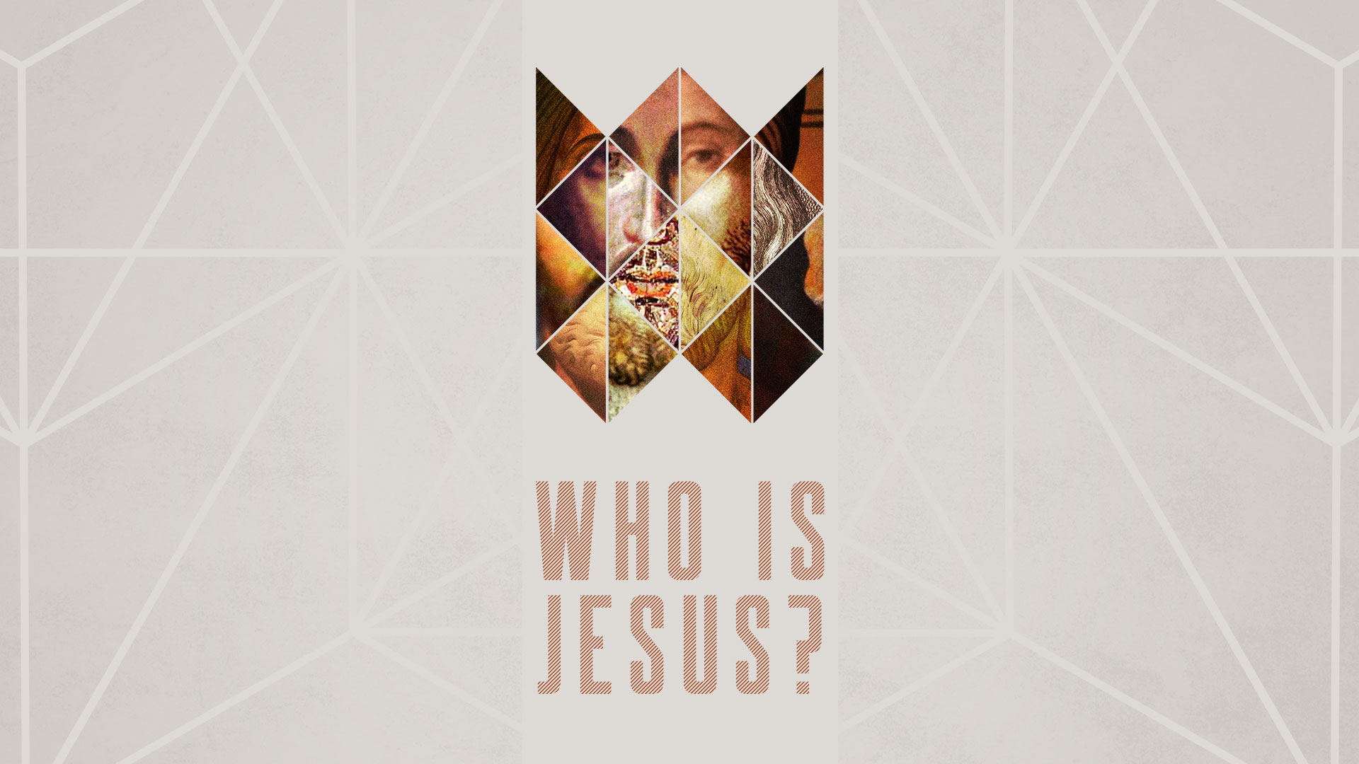
The idea of the Who is Jesus? series is to take a look at the myriad messages we’ve heard about the person of Jesus and distill them with the Word of God, seperating myths and cultural additions from the truth. Bruce illustrated this by taking several pictures of Jesus that depict Him in different styles (and with skin colors, for that matter) and creating a “composite” image that completes a fractured face, referencing the shape of a crown.

This is what we nerd out about as designers and church communicators—marrying the artistic to the rhetorical. We’re grateful for Bruce as a partner and for this excellent example of our goal in designing for the Church.

United