Posted on

United

Sermon Series Artwork • The Heights Church • January 2018

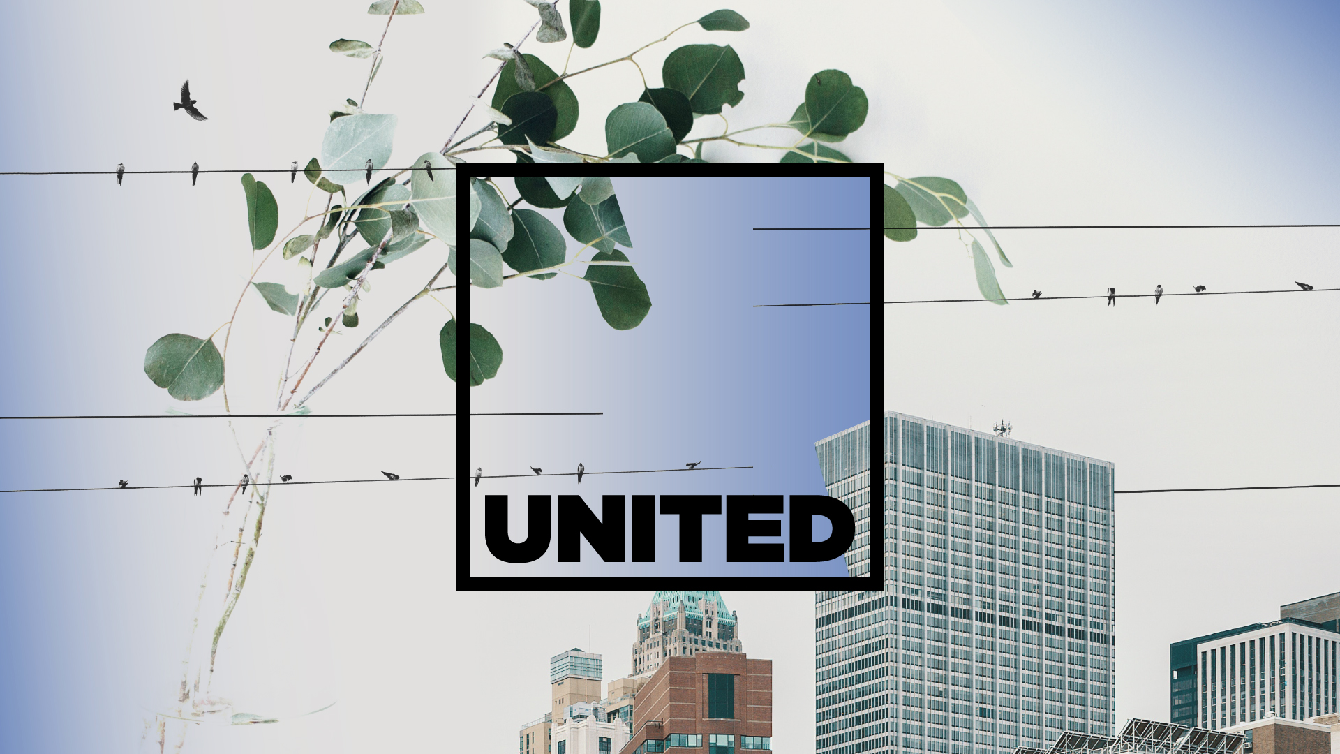
United is an annual sermon series on The Heights’ three core values as a church—Gospel, Community, and Mission.

To depict these three elements, we used three images and chopped and blended and such to create this. The plant represents “rootedness” in the Gospel (Eph. 3) and our corresponding flourising (Ps. 1). The birds on power lines represent a Community bound together by His powerful energy (Col 1:29). Lastly, the image of the city representents Mission, showing part of Manhattan that is both distinct (known) but also indisctinct (unkonwn, not “here”), attempting to demonstrate that our mission field as believers is local, semi-local, and global.

United

Posted on

Genesis

Sermon Series Artwork • Park Church • January 2018

Illustration by Christian Robinson.

We’re quite excited to share about this triptych we coordinated for Park Church. Christian is quite an excellent illustrator and working with him was real, real rad.

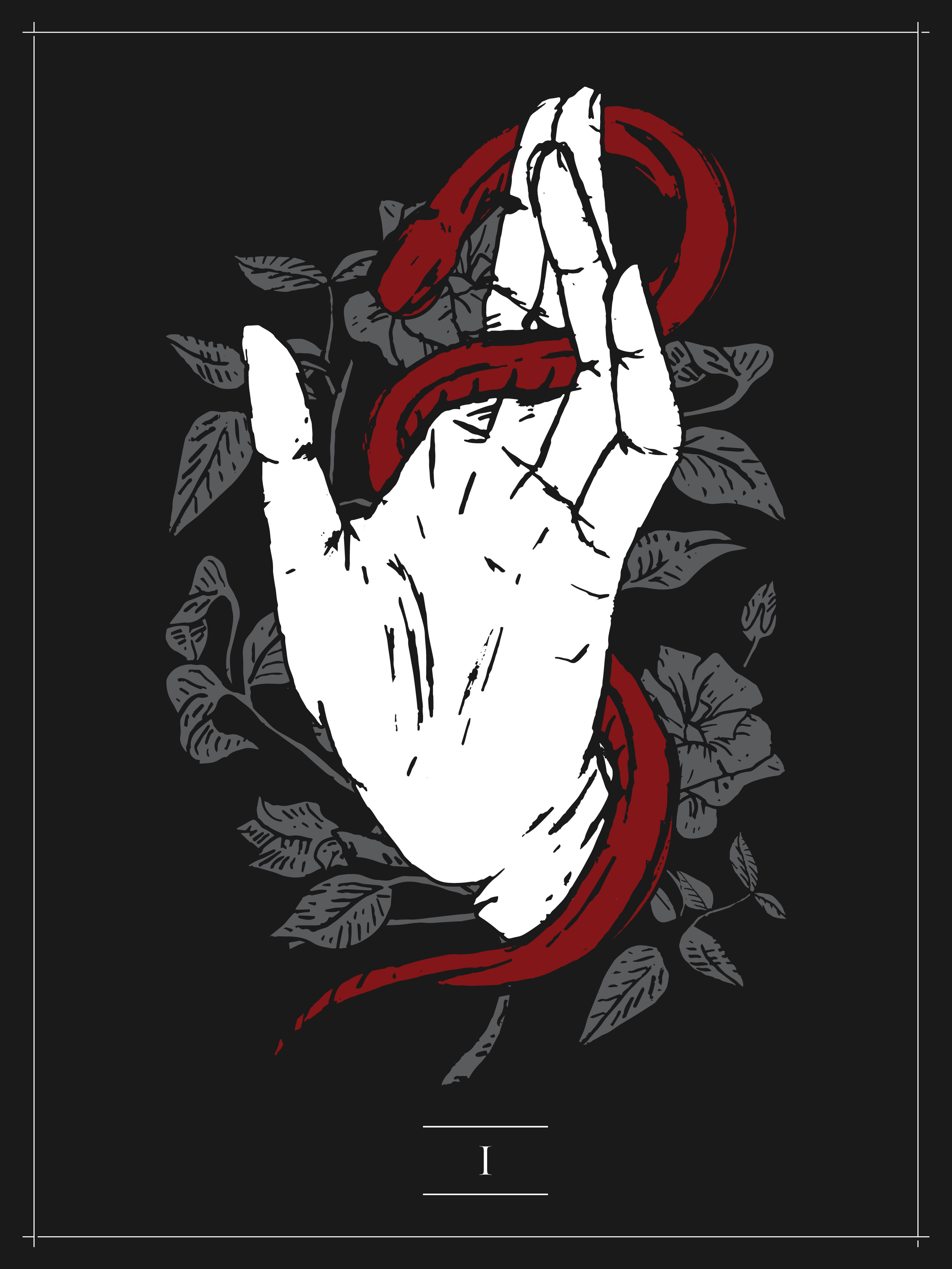
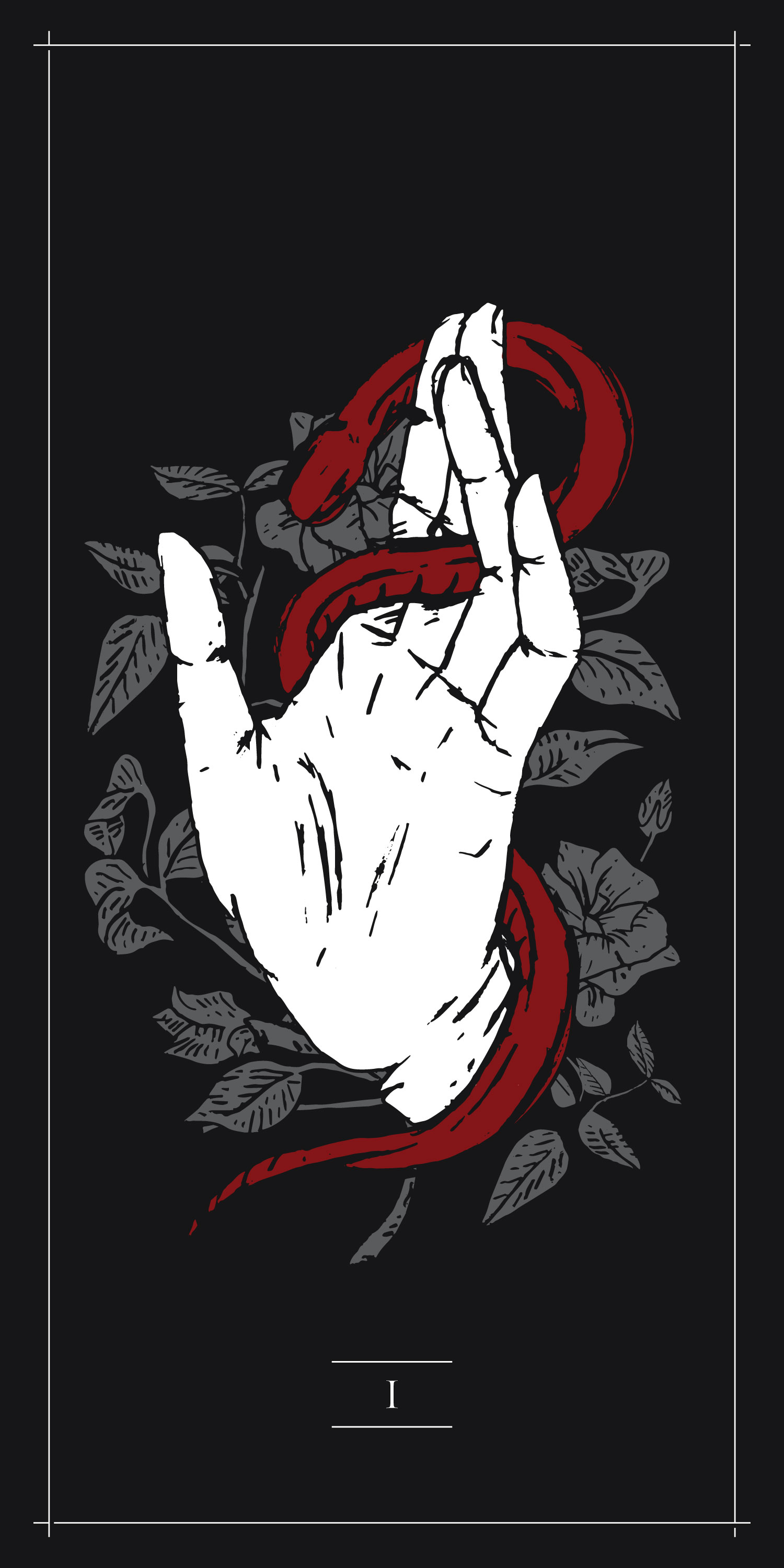
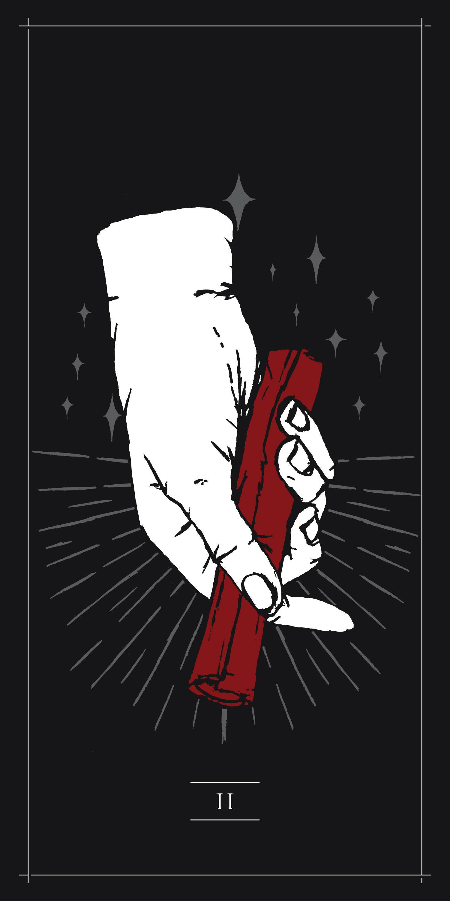
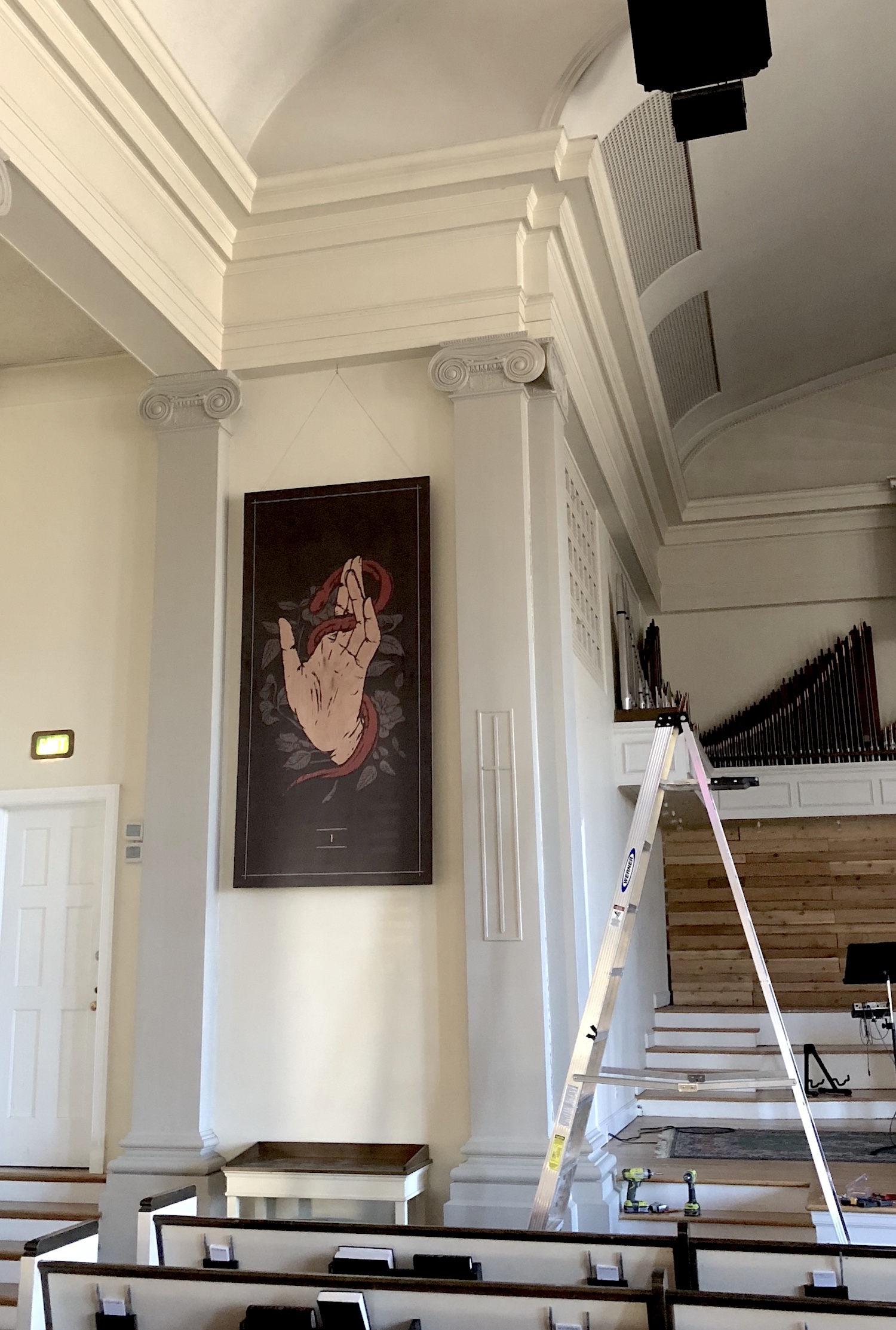
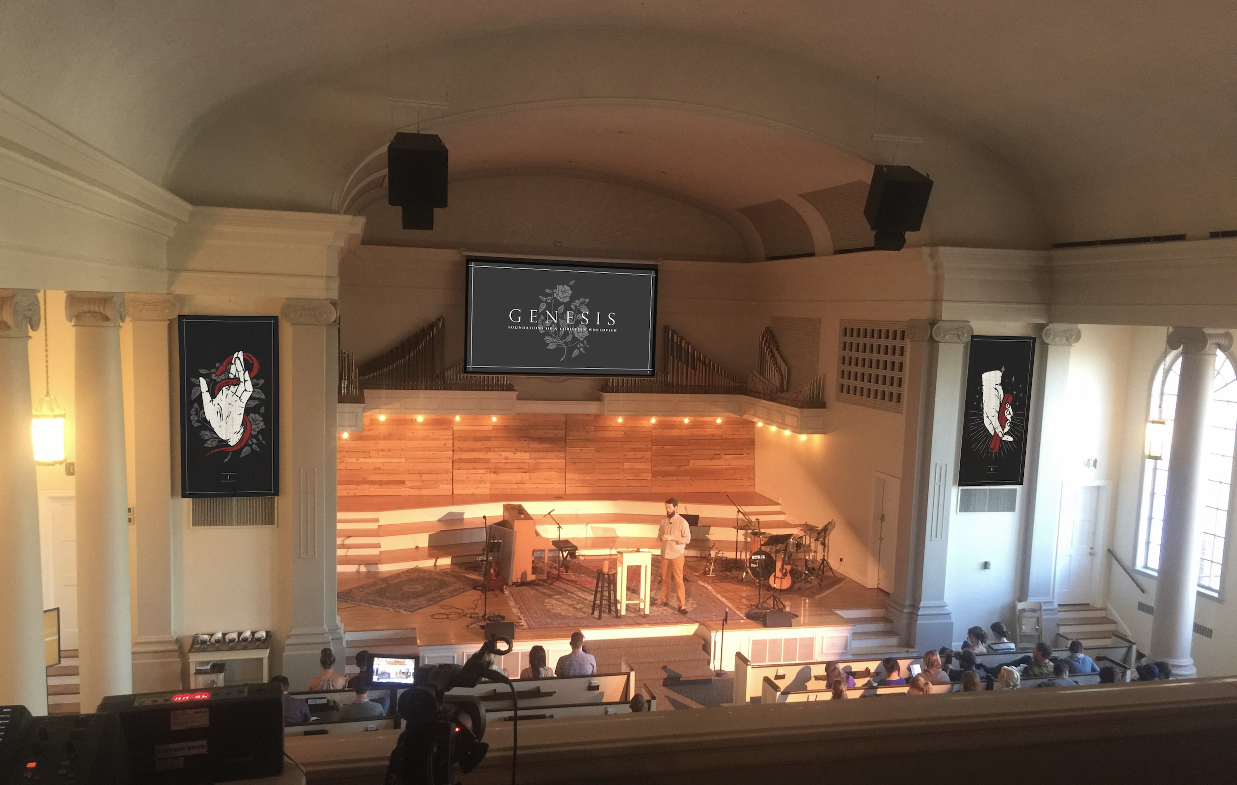
The two main pieces symbolize two of the main narrative arcs of Genesis: Part I depicts God’s creation of the world (the foliage) and its subsequent de-creation through mankind (the hand) as a result of satanic temptation (the snake) and human rebellion. Part II depicts God’s creation of a people (the 12 stars for 12 tribes of Israel) as God (the hand) comes to Abraham and makes a covenant (the scroll) with him and his descendants.

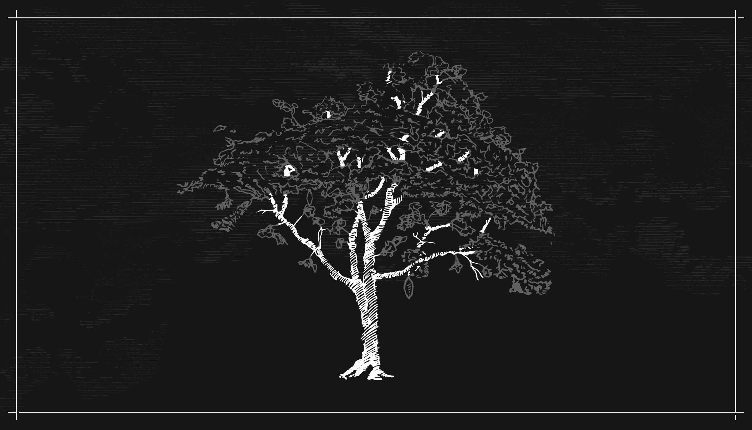
The third part depicts the Tree of Life, as described both in Genesis (in the garden) and in Revelation (in the holy city).

To display the artwork, we printed on two 4×8 foot sheets of birch to hand in the Park Church sanctuary (see photos below). A third peice is in process for the main lobby area, depicting the tree of life.

Parts I–III Digitally

Part I After Installation

A Preliminary Mockup of The Stage

Posted on

Insomnia

Sermon Series Artwork • Eastern Hills Community Church • December 2017

The image elicits the terrible feeling of staring at the clock and thinking intensely about something while you should be asleep. The irony hidden only one layer down is that, in the image, it’s clearly daytime. The things that “keep us up” are often either already resolved for us in Christ or are completely overshadowed by the greater comfort of Christ.

Insomnia

Posted on

Colossians

Sermon Series Artwork • The Heights Church • September 2017

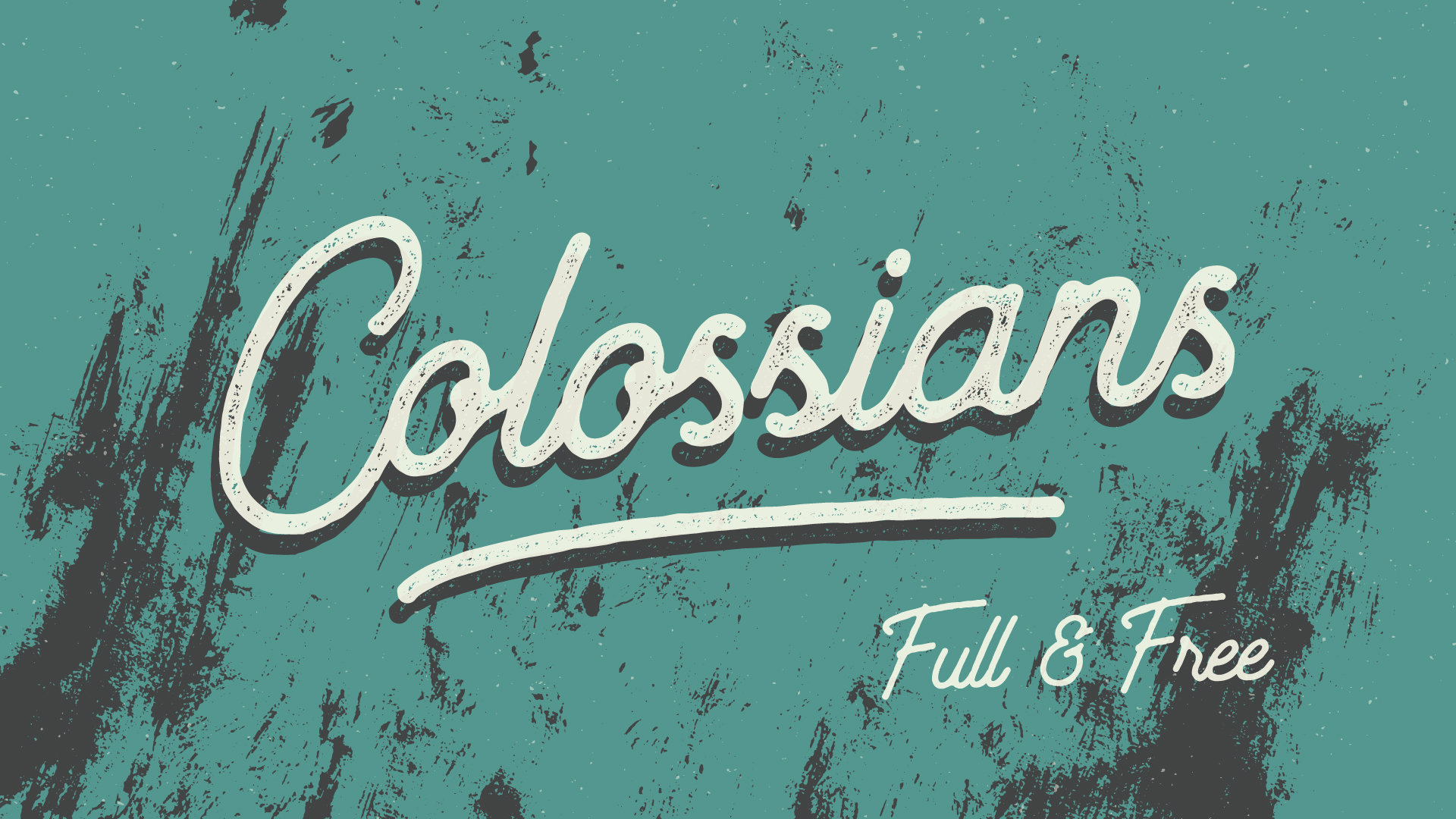
We’ve been vibing with this grungy text thing this summer. The team at The Heights was clear that they just wanted the words Colossians: Full & Free over a simple background. As many times as we’ve made artwork that fits in this vein, we specifically love how this one came out! There’s a lightness here that keeps up with the dirt in the lettering—a hopefully-fitting illustration for their arguments from the book of Colossians.

Who Are We?

Posted on

Worship

Sermon Series Artwork • Eastern Hills • September 2017

A vintage take on lettering and texture, seeking to communicate the “old” in a new way by showing “bright” grit, the “manual”/physical nature of worship both with the obvious rasied-hands and the hand-drawn letters.

Who Are We?

Posted on

Summer in the Psalms

Sermon Series Artwork • The Heights Church • June 2017

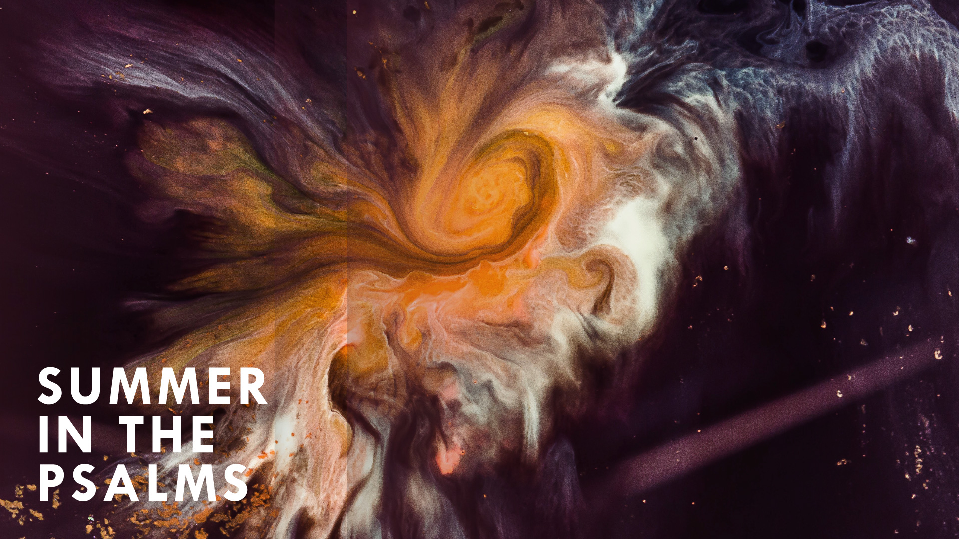
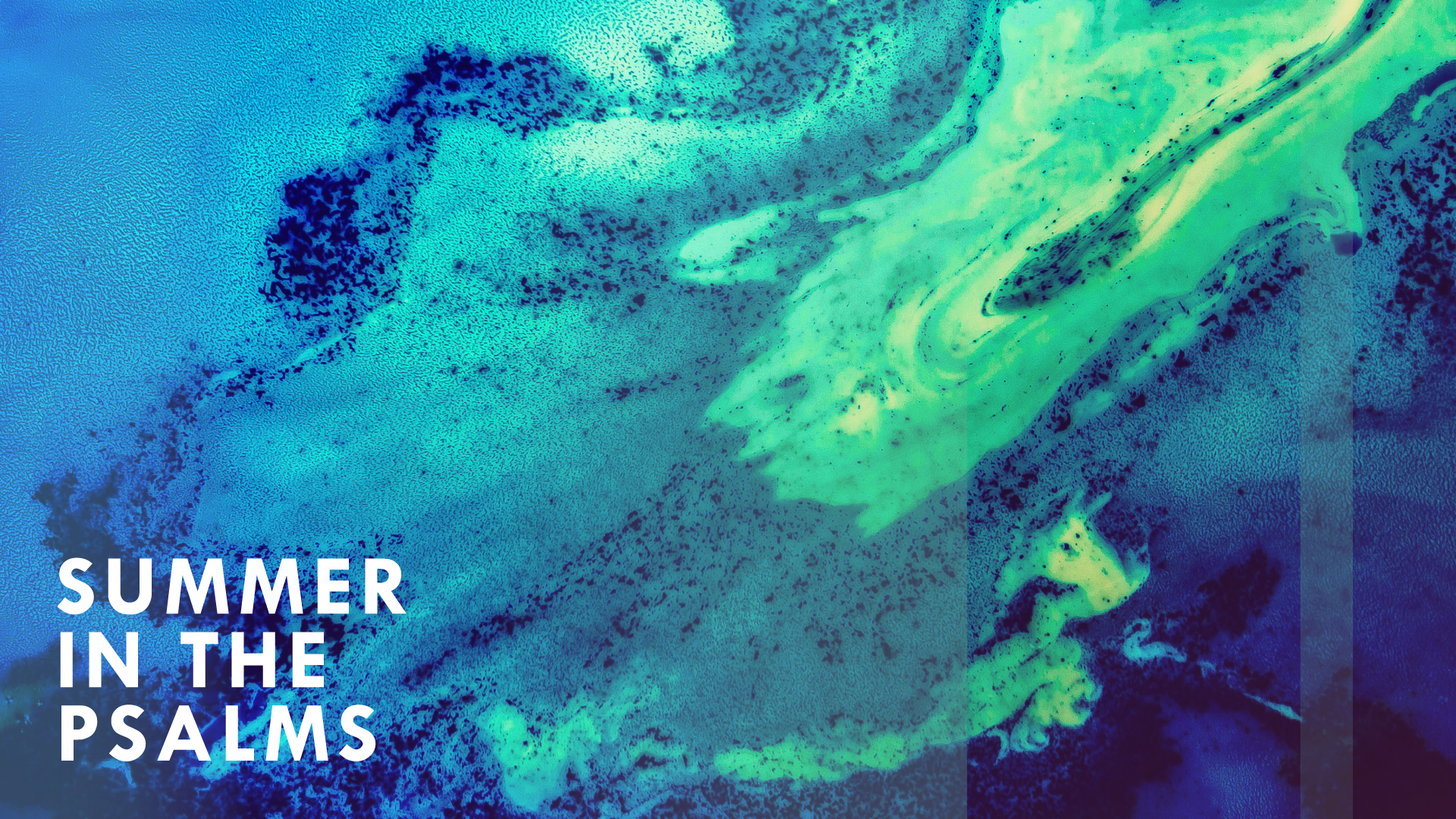
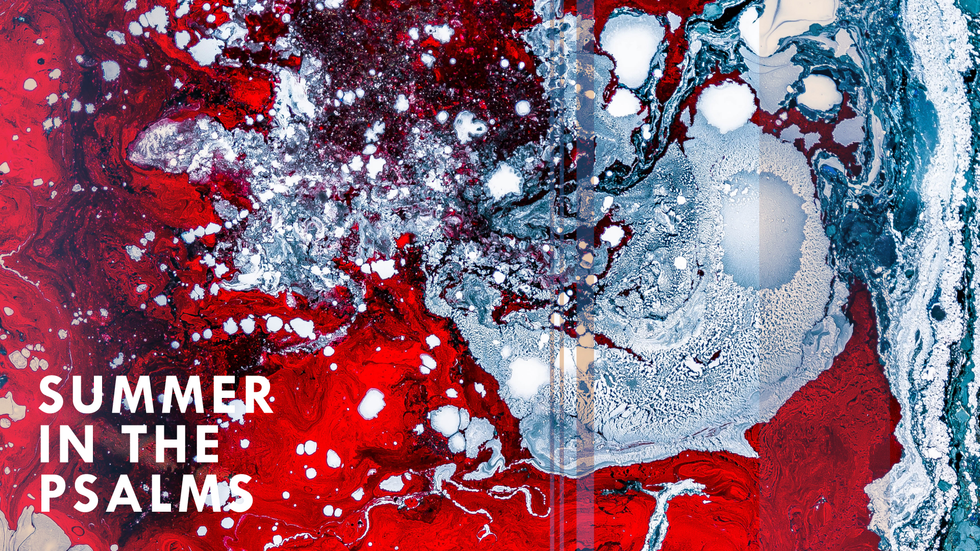
The Psalms are emotionally deep and wide. They feel like “despair” as often as they feel like “victory.” They teach us to bring the full range of human emotions before God in our worship, regardless if we feel more Psalm 22 than Psalm 118.

To illustrate that for the first year of Summer in the Psalms, an annual series at The Heights that will work psalm-by-psalm, week-by-week through the whole book over many years, we liked the idea of a messy expression, something inky, unique and nonlinear. The incredible Joel Filipe of Madrid has shared some really excellent work of his via Unsplash (thank you!), and his abstract series is mind-blowing. Although we added/edited much to fit the application, these images paved the way.

In another attempt to illustrate the diversity of the Psalms and what they teach us about our relationship to God, we made a different version of the artwork for each of the three weeks. You can see all of them below.

Click here to listen to sermons from Summer in the Psalms.

Who Are We?Psalms 1–3

Who Are We?Psalms 4–6

Who Are We?Psalms 7–9

Posted on

The Coming of the King: Advent & Christmas

Sermon Series Artwork • Park Church • November

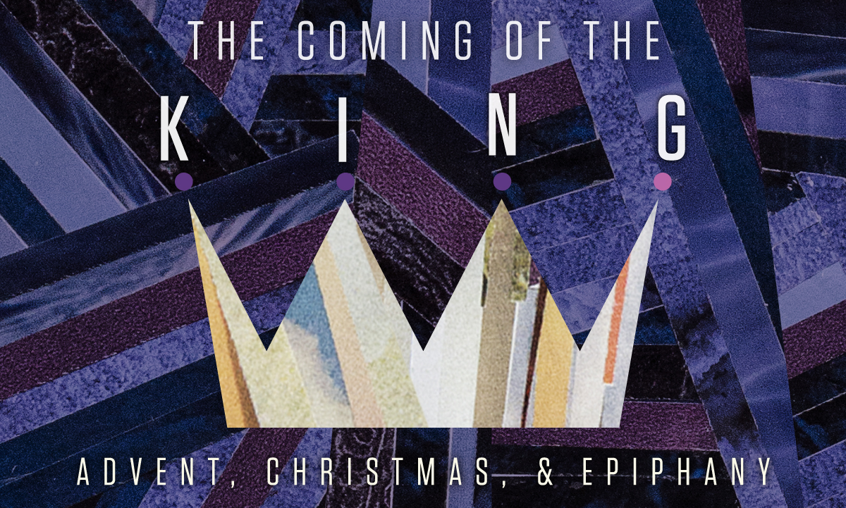
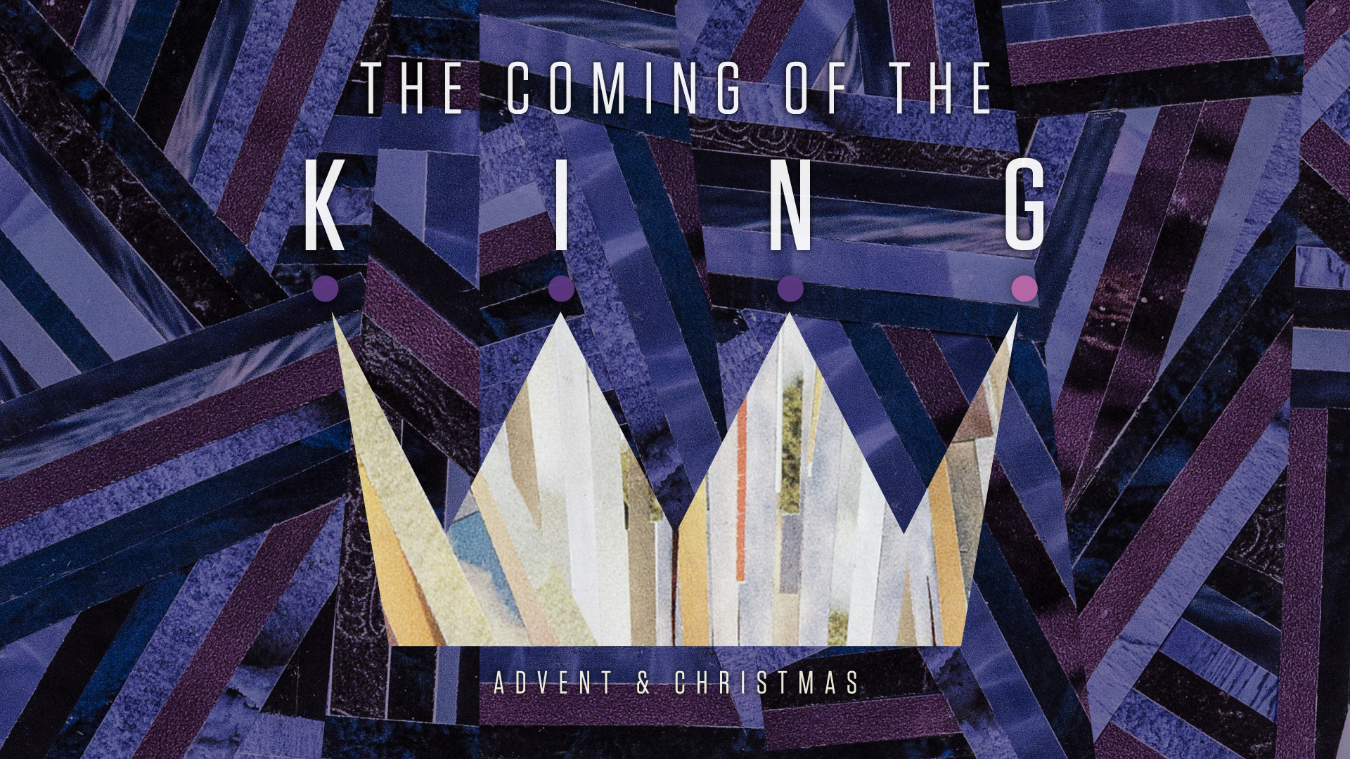
This is one of those projects where we point to our creative community and brag. Jeremy Grant is one of those artists that has a remarkable vision, incredible patience and work ethic, and out-of-his-mind talent. For Advent 2015, he created these collages for Park Church by hand—the purple background and the lighter filling of the crown. That year we took his artwork and simply added typography. For 2016, we re-mixed the artwork just a little for The Coming of the King, shaping the crown and again doing the typography.

We’re proud to share a project for which we supplied maybe only the last 10% of the work. Why? First, because collaborative artwork is powerful, and we seek to be able to carry any project to completion and implement it well across a church’s platforms. Second, because our creative community gives us incredible tools for creating unique, excellent artwork, and that’s something special we can offer (rather, I should say that’s something special about the people God has placed around us).

Rhetorically speaking, Jeremy designed these collages with intense symbolism. In all of his work, Jeremy is considering each strand he lays and what it’s communicating. We adore that about his work. In this peice,The purple, besides being a traditional color for Advent, is representative of the chaos and disorder into which Jesus was born—a disordered world He came to set straight by His love and His good rule. The collage that makes up the lighter filling of the crown is composed of images of sky and earth (the real world into which Jesus came), with streaks of red (representing His own blood that He would let men spill to accomplish His work) and streaks of purple (representing His cosmic royalty as true Son of God).
Who Are We?

Posted on

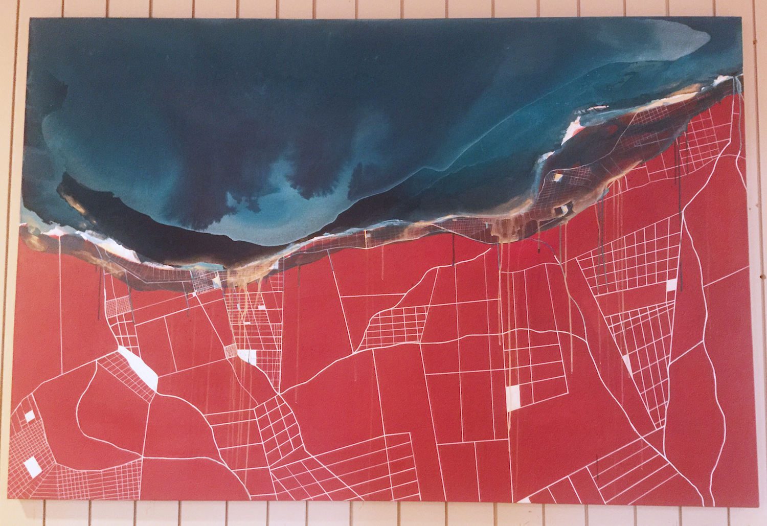
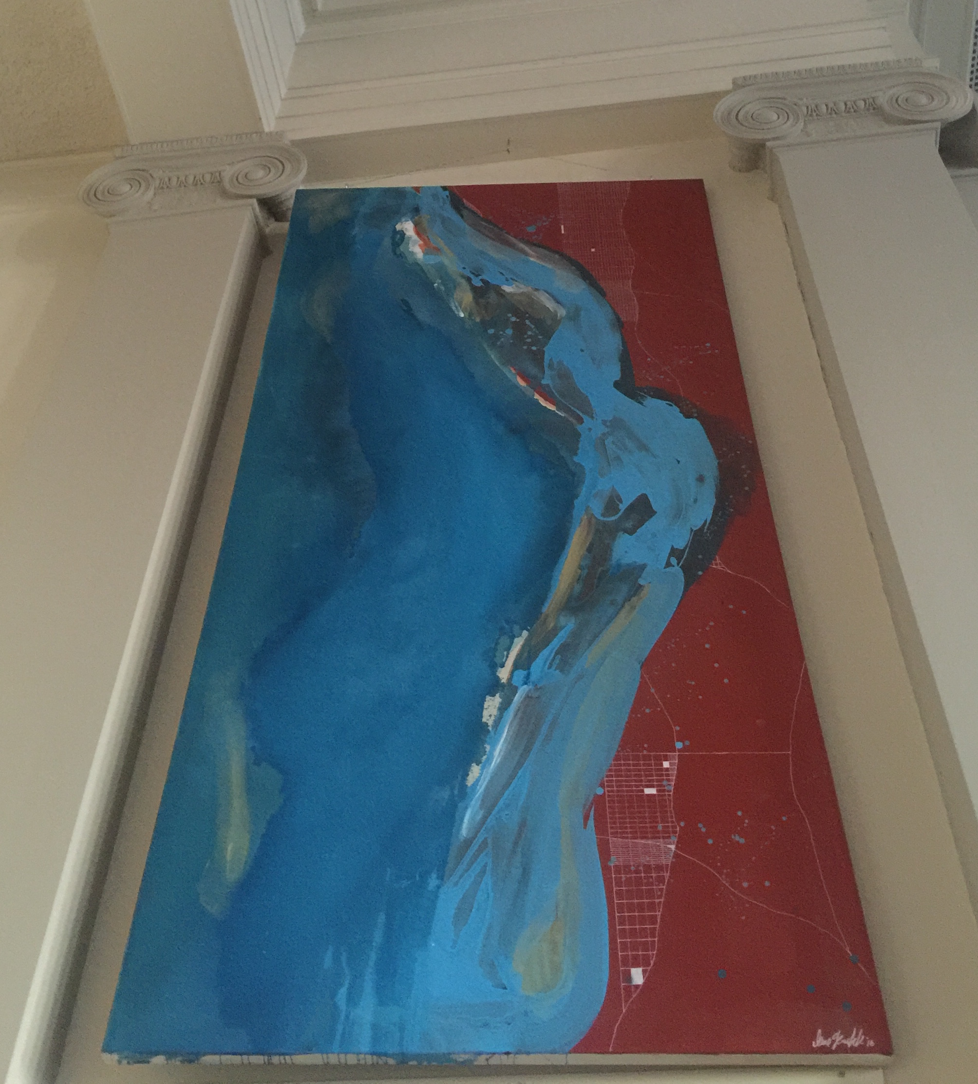
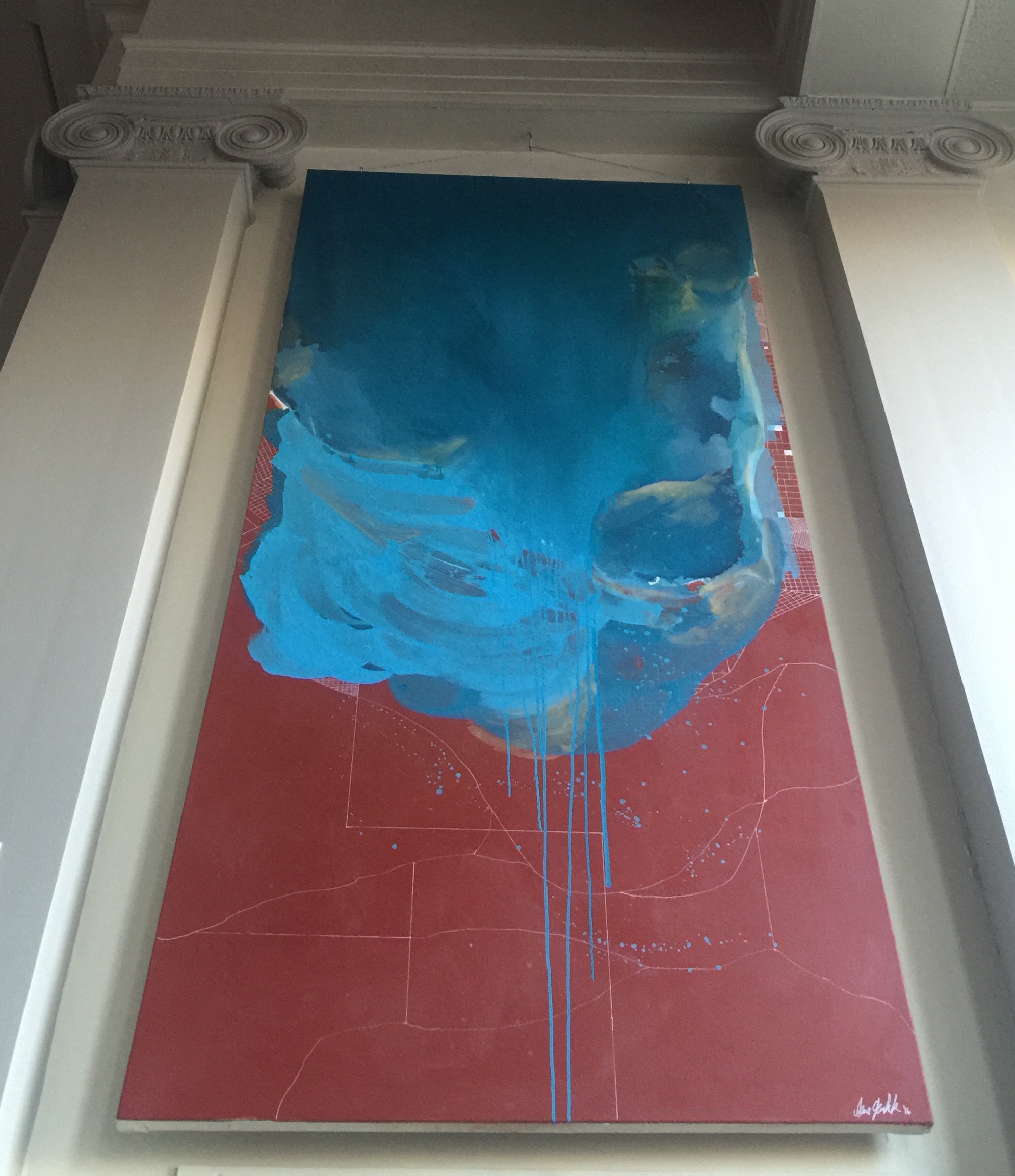
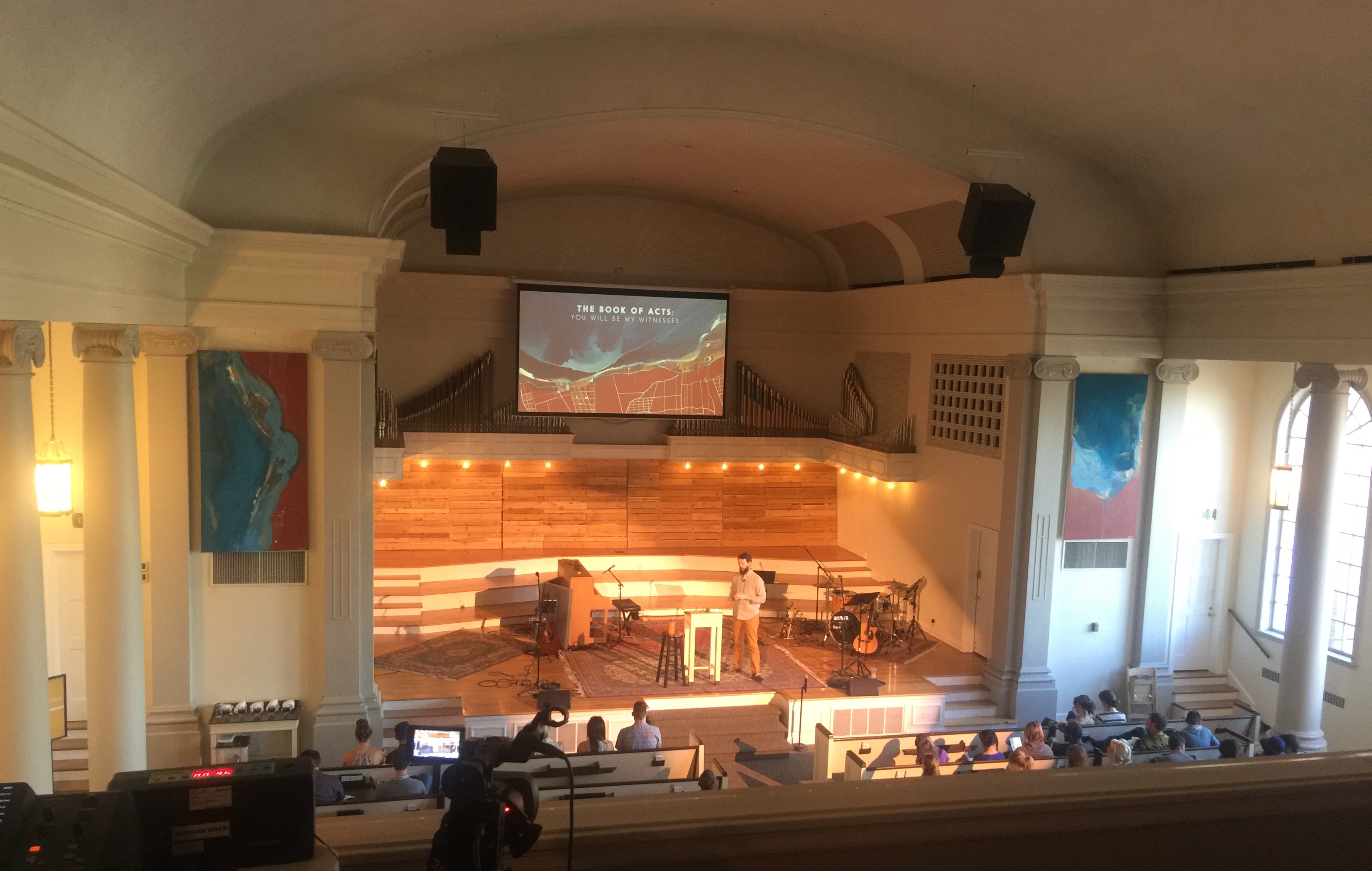
The Book of Acts

Sermon Series Artwork • Park Church • April 2016

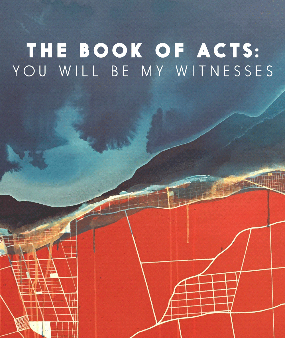
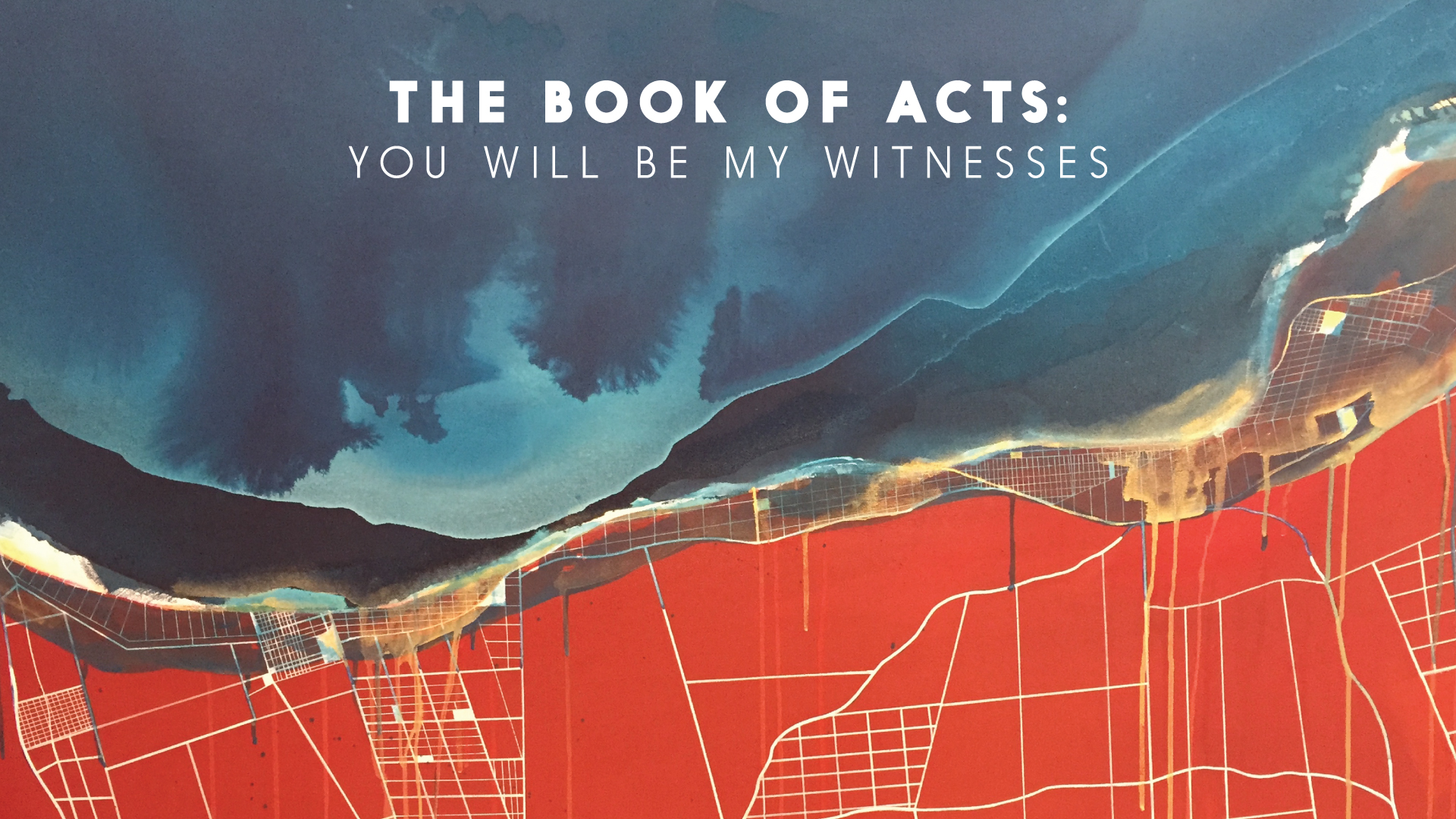
Painting by Lane Geurkink (Native Rambler).

Working with Lane is something we have always wanted to do. When we met up do discuss ideas for artwork for the book of Acts, we had the basic goal of illustrating the infiltration of the gospel into our world. Over the course of a week as we received pictures from her studio, it became clear that what she had created was amongst the most amazing art projects we’ve ever “directed.” The tension of the message of the gospel hitting our cities is so vividly illustrated. Art /Rhetor provided the oversight and typography, but really this piece is 99% Lane. This is one of those portfolio items that we share because we want to brag about our incredible creative community.

Walk in the Light Artwork

Walk in the Light Artwork

Walk in the Light Artwork