Posted on

Ten

Sermon Series Artwork • Trinity Church Denver • September 2018

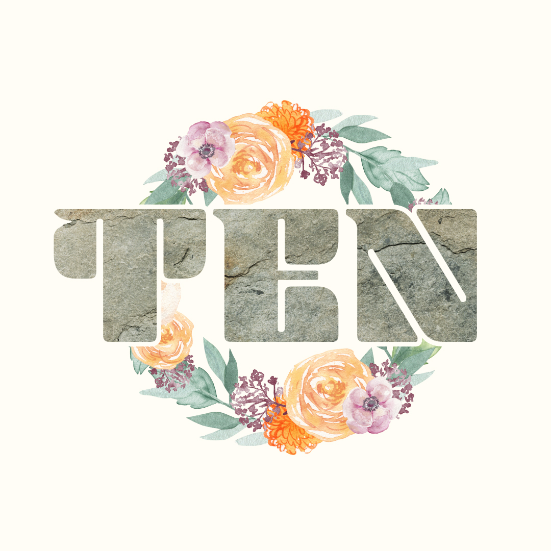
In their fall series on the Ten Commandments, Trinity Church Denver is working to depict this familiar topic not as “rules that inhabit us,” but as a framework that gives us life because of the work of Christ. To argue this visually, we contrasted the traditional understanding of the Ten Commandments—rigid and lifeless stone—with an in-Christ understanding of bright, approachable, vivid life—the watercolor floral wreath. Additionally, since Christ is the key to enjoying a life under God’s good rules, we added a notch to the “T” as a pointer to the Rock cleft for us; the stone struck in the wilderness to give us life.
Vision For LIfe

Posted on

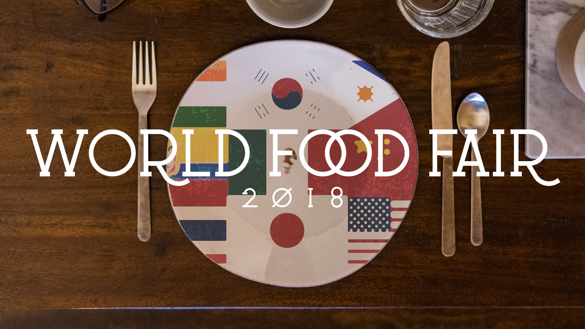
World Food Fair

Event Artwork • Willow South Lake • August 2018

Willow South Lake takes a Sunday each year to celebrate the different cultures represented within its community through the avenue of food. This is awesome. This is our second year doing the artwork for the event. Looking through their demographic breakdown by country, we took flags from the countries represented in their church body and made them appear “painted” on the dinner plate in focus. Thanks to Christopher Jolly for the original image!

Vision For LIfe

Posted on

Life Together

Sermon Series Artwork • Fellowship Denver Church • August 2018

Fellowship Denver is working through Romans 12 this August, exploring what a life of service informed by the Gospel looks like. In all their artwork, Fellowship has a unique, simple-geometric style that we love. Starting from that inspiration, we were shooting to communicate the link between the historic church and the modern church, almost to say, “This life of Gospel-service has always been who we are.”

The top hand symbolizes the historic church (in a first-century robe), while the bottom hand symbolizes the modern church (see the Apple Watch? If that’s too extra, try to just see a normal watch). The triangles around the outside of the work can symbolize two things: (1) the individual pieces that fit together in seemingly-random ways to make the whole (Rom. 12:4–5), and (2) a service informed by the Trinitarian God, whose three members eternally serve each other.

Vision For LIfe

Posted on

Life On Mission

Sermon Series Artwork • The Heights Church • July 2018

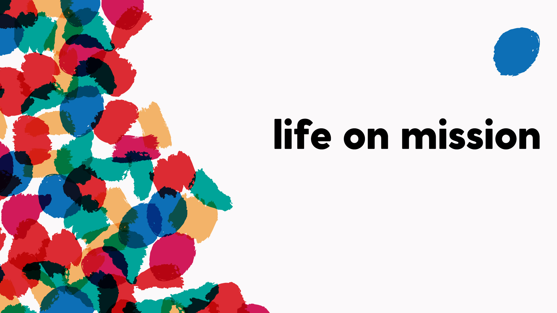
Life on Mission at The Heights Church is a series exploring the teachings of Jesus on mission-living from the book of Matthew. We had three concepts for the series and loved all of them. The visual argument options are many when Jesus teaches with vivid metaphor after vivid metaphor—it was really fun. The piece we ended up with is this visualization of the one lost sheep apart from the other 99, whom the Good Shepherd spares no expense or effort to rescue (Matthew 18). The off-center positioning of the words and the shape of the rest of the “flock” draw an invisible diagonal line, working to move one’s eyes directionally from the flock to the missing sheep.

Vision For LIfe

Posted on

Summer at Trinity

Event Artwork • Trinity Church Denver • May 2018

Artwork for a series of events, seeking to tie the events together throughout the summer across publications. Lightening the image with the same green as the “Summer at Trinity” mark was a fun way to make the image feel nostalgic and warm without just being some kind of Instagram filter. Additionally, the flourishes from the S and T make a subtle, circled trinity mark, pointing to Trinity Church’s insanely pretty brand by Alyssa Beck.

Vision For LIfe

Posted on

Vision For Life

Event Artwork • Fellowship Denver • April 2018

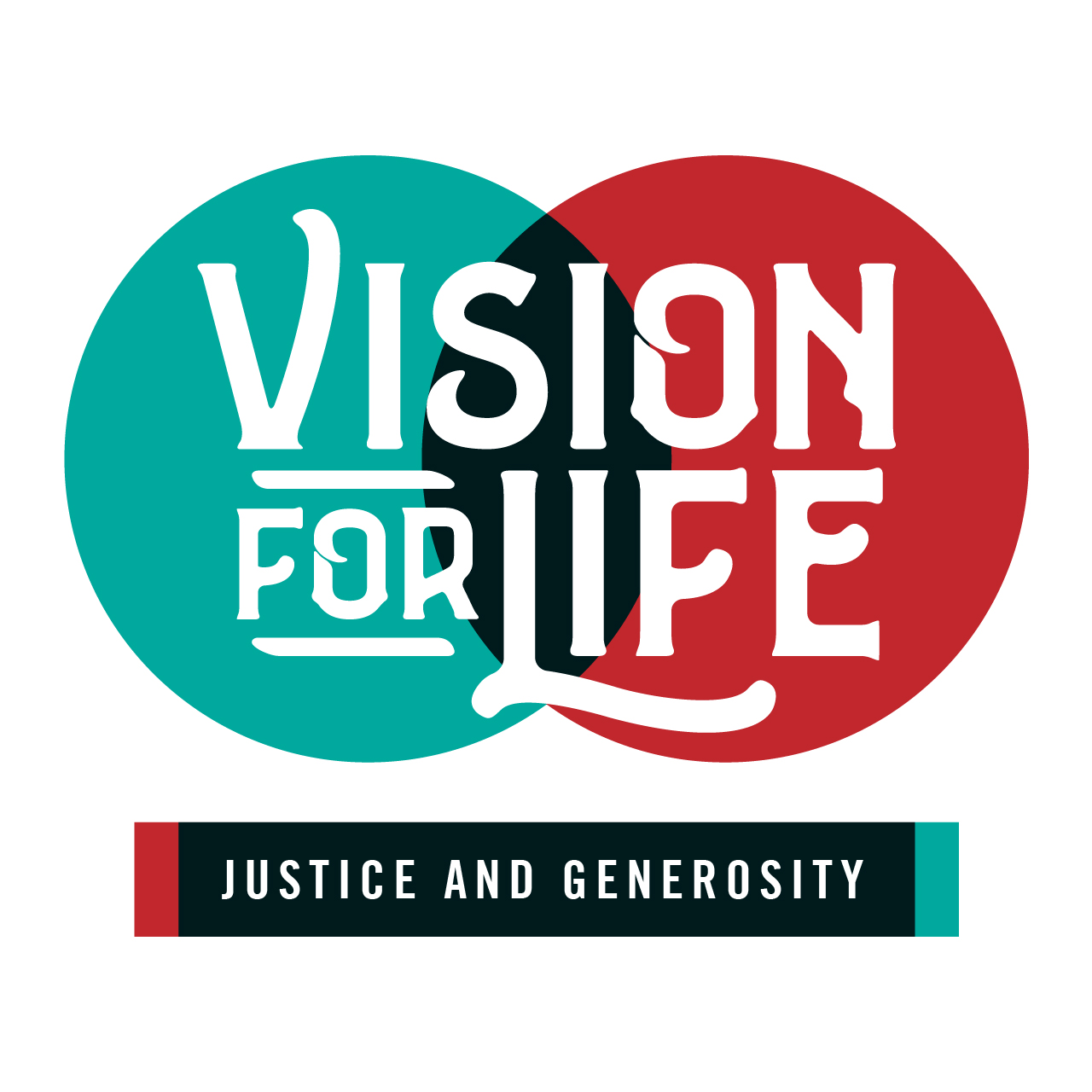
This series of classes at Fellowship Denver explores key cultural and theological topics to show how Jesus gives meaning to all of life. Our artwork for the event needed to be simple and flowy, not representing one idea too firmly. The use of the Venn diagram subtly argues that it’s the overlap of Jesus and all of life (seeing all of life in the context of Jesus) where we find meaning.

The image below representes the first installation of Vision for Life, focusing on the topic of justice and generosity.
Vision For LIfe

Posted on

Dwell Church Easter 2018

Event Artwork • Dwell Church Denver • April 2018

We illustrated a dark woods with an otherworldly glory emanating from what appears to be its exit. A slight curvature of tree branches suggests the round mouth of a tomb, but using the woods instead of a stone tomb allows the viewer to read other “resurrections” into the artwork. Christ’s victory over death implies His victory over all other things.

To create the piece we used two photographs, one from Mico Polča (the woods) and the other from Luis Vaz (the painted wall).

Posted on

Who Is Jesus?

Sermon Series Artwork • The Heights Church • February 2018

This artwork for The Heights was done by Bruce Butler.

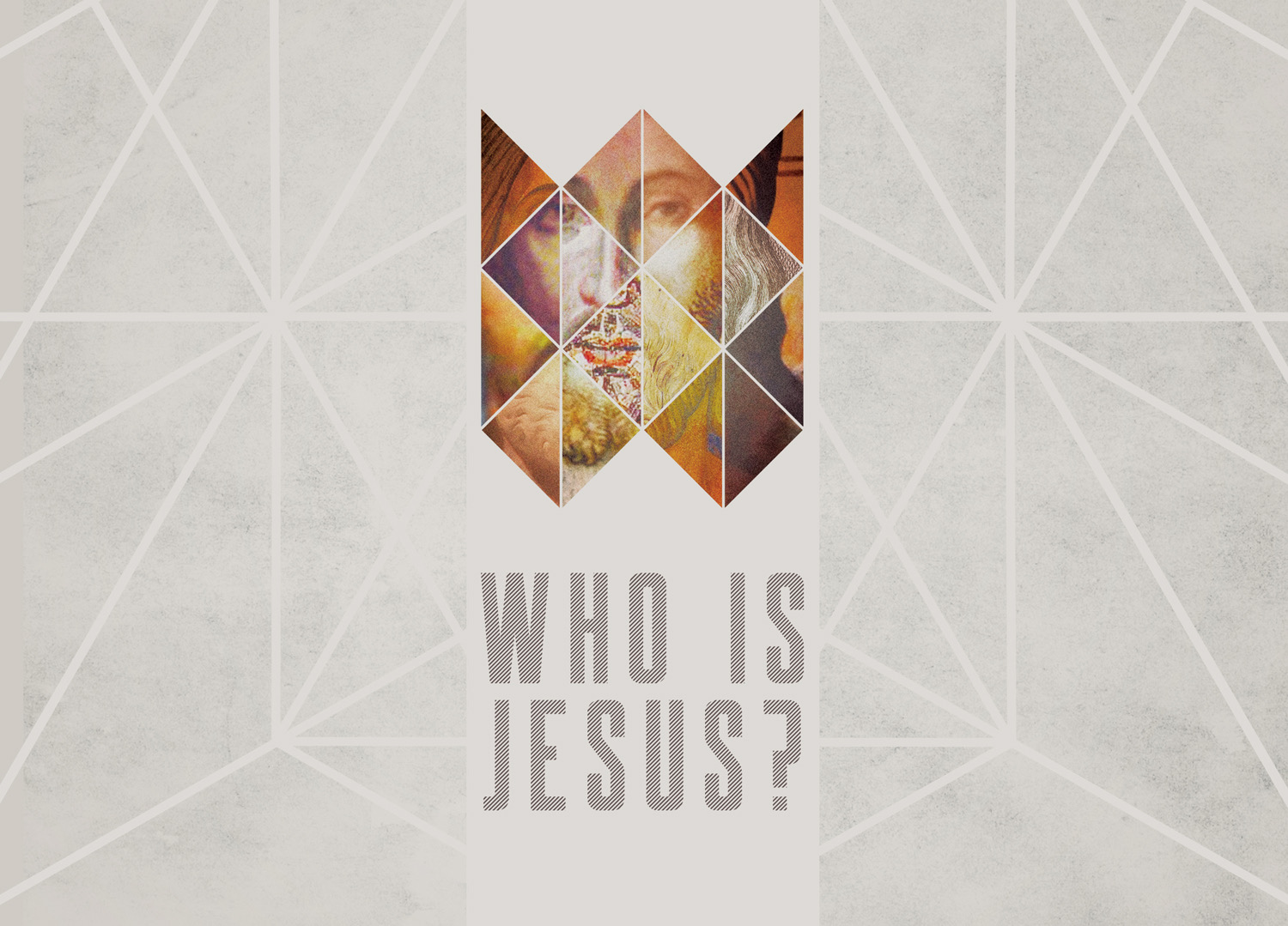
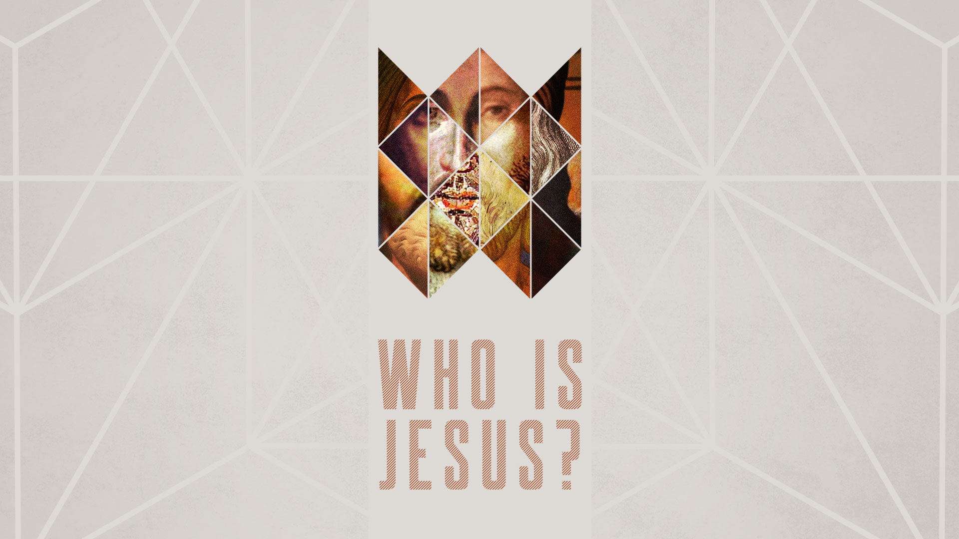
The idea of the Who is Jesus? series is to take a look at the myriad messages we’ve heard about the person of Jesus and distill them with the Word of God, seperating myths and cultural additions from the truth. Bruce illustrated this by taking several pictures of Jesus that depict Him in different styles (and with skin colors, for that matter) and creating a “composite” image that completes a fractured face, referencing the shape of a crown.

This is what we nerd out about as designers and church communicators—marrying the artistic to the rhetorical. We’re grateful for Bruce as a partner and for this excellent example of our goal in designing for the Church.

United

Posted on

Word-Filled Women

Event Artwork • Park Church Church • January 2018

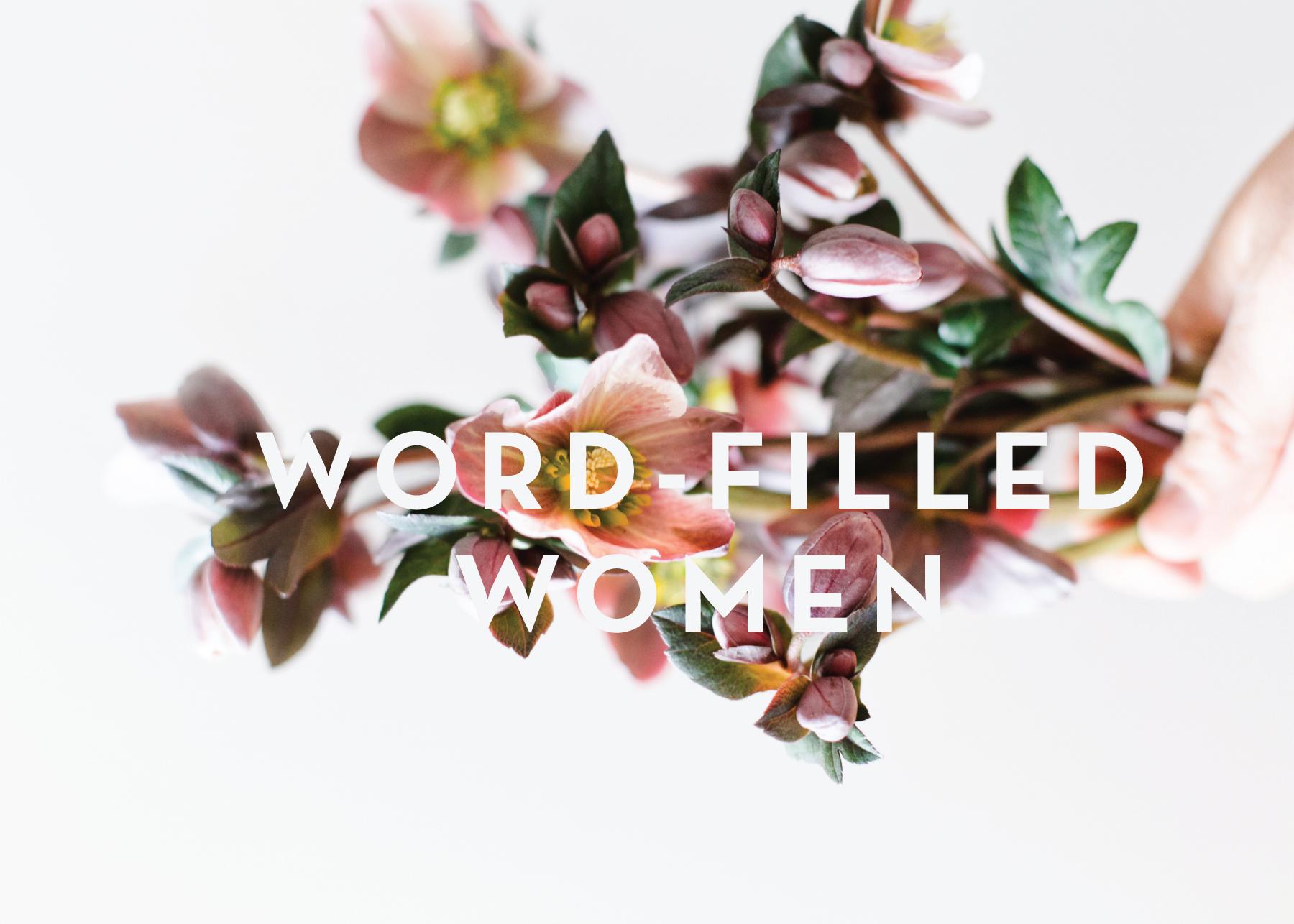
Word-Filled Women is a ministry workshop in partnership with The Gospel Coalition.

The flowers are the incredible work of Keep Floral, and the incredible photography of those flowers is by Melanie Fenwick. One thing we never grow tired of is working with other artists. To tell Melanie and Keep Floral the ideas that were in our heads and then see these photos was just way too cool.

The idea was to communicate the strength of one rooted in the Gospel for bearing fruit in ministry. The flowers have a unique firmness and radiant health to them, and there’s also a subtle context of being held in their grower’s hand. Lastly, in doing artwork for a women’s event, there’s a risk of portraying a generalized femininity that speaks a stereotypical word. We’re proud of this artwork because it’s literally pink flowers, yet so far from something “girly.”

Word-Filled Women

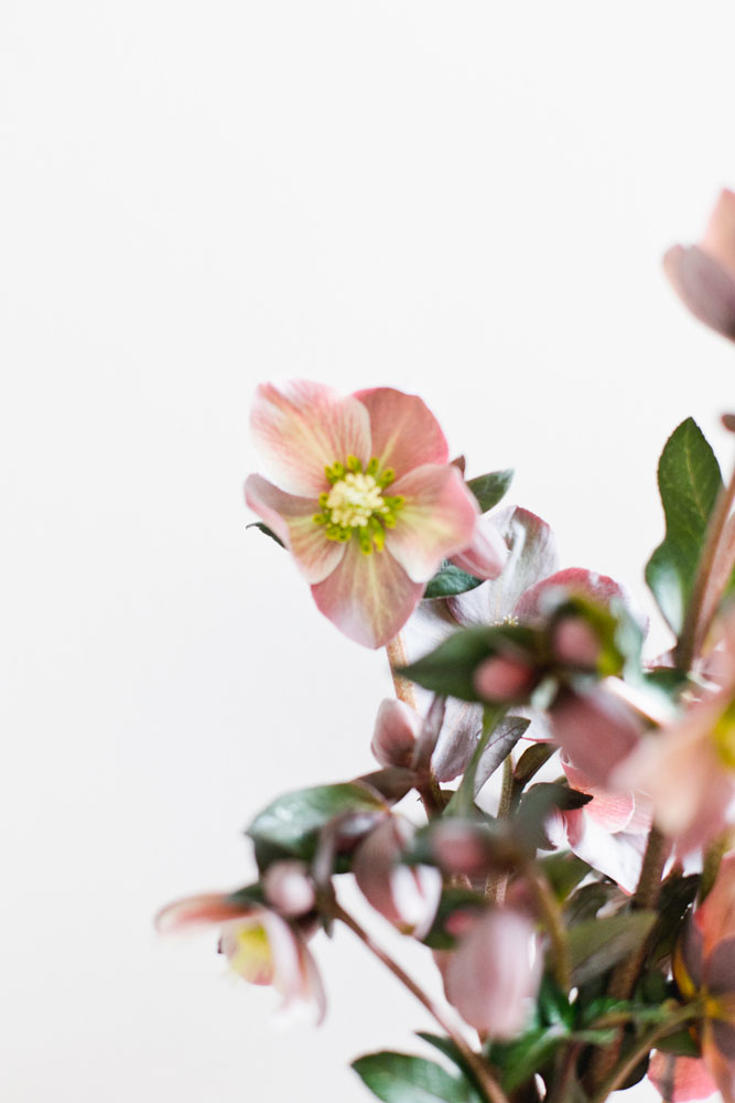
A few other photos from the Keep Floral/Melanie Fenwick shoot:

Posted on

United

Sermon Series Artwork • The Heights Church • January 2018

United is an annual sermon series on The Heights’ three core values as a church—Gospel, Community, and Mission.

To depict these three elements, we used three images and chopped and blended and such to create this. The plant represents “rootedness” in the Gospel (Eph. 3) and our corresponding flourising (Ps. 1). The birds on power lines represent a Community bound together by His powerful energy (Col 1:29). Lastly, the image of the city representents Mission, showing part of Manhattan that is both distinct (known) but also indisctinct (unkonwn, not “here”), attempting to demonstrate that our mission field as believers is local, semi-local, and global.

United