Posted on

Campus Outreach Denver

Website • July 2016

Campus Outreach is a well-established college ministry on campuses all over the country. We’re thrilled to have them expand to Denver! Their site had a whole lot of content, but the vision and clear brand identity made it such an enjoyable site to build. We’re proud of the way the image-heavy headers interact with the moderately-sized white spaces. We also built a few custom elements in this site that were new to us, but we’re thrilled with.

Visit codenver.org to see more.
Posted on

Serve Denver

Event Artwork & Tee-shirt Design • The Heights Church • April 2016

Our first job for The Heights church was a branding and tee-shirt design project for Serve Denver, a service project happening in the Summer of 2016. Our goal was to avoid the standard “Denver” design tropes. while using something of the city in the artwork.

Walk in the Light Artwork

Posted on

All Saints Bulletin Redevelopment

Publication • All Saints Church • April 2016

The old bulletin at All Saints (which we did on contract for them, pre Art /Rhetor in 2013), had lots and lots of content, unused space, and a tear-off section for prayer requests and collecting visitor info. We realized that we were printing things in their bulletin every week that didn’t need to be distributed that way, and it was causing us to use a ton of paper—with an expensive perforation! We were basically printing a contact card with every individual bulletin, most of which were being discarded after each service. There was also a ton of static artwork for a welcome section, core values, and contact information that we felt could be done more efficiently.

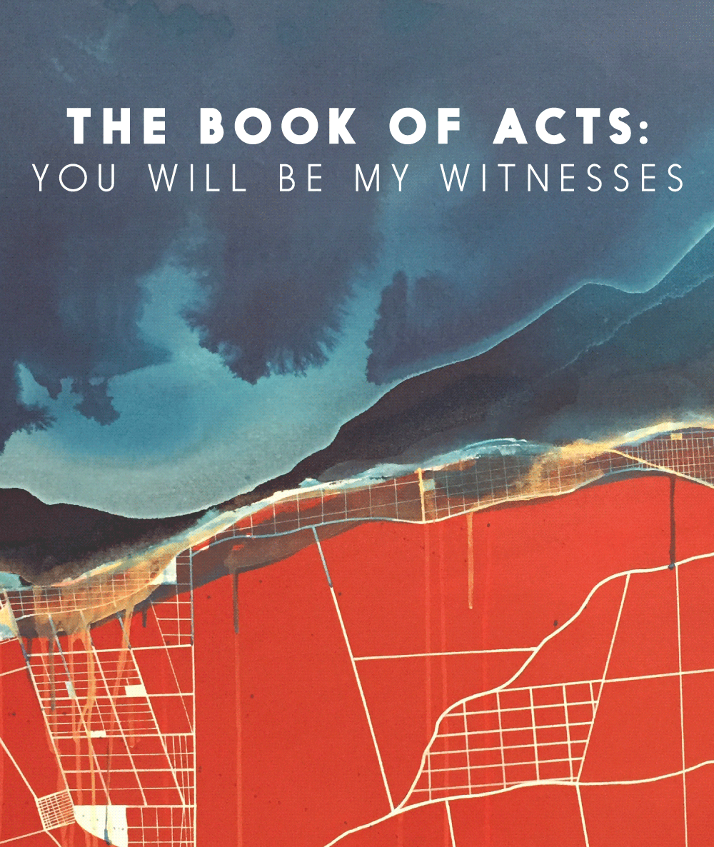
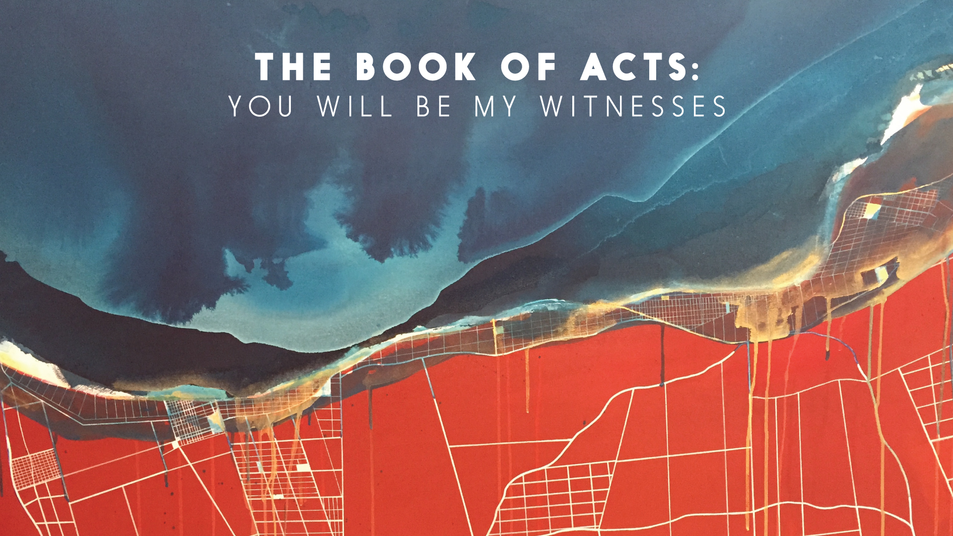
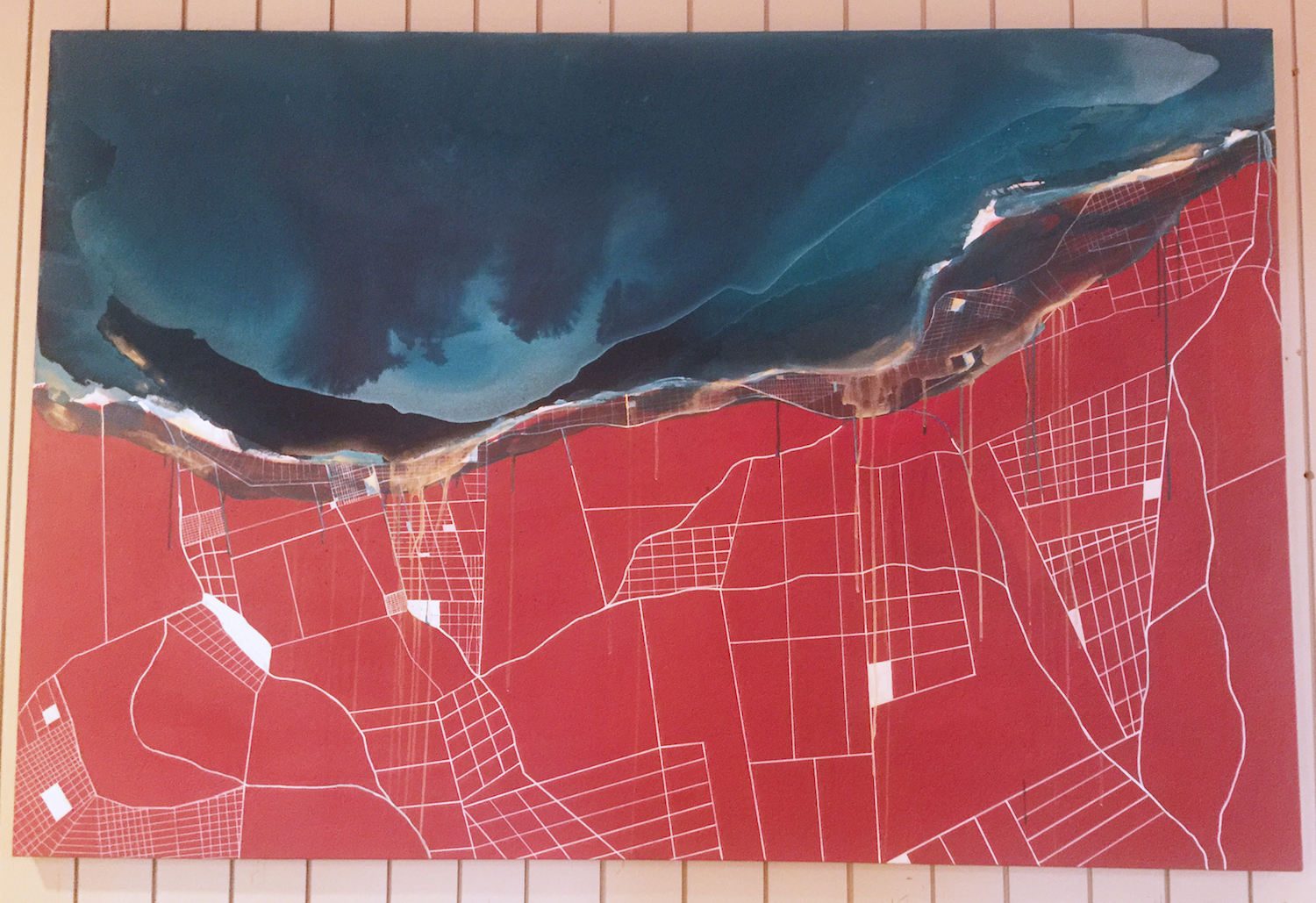
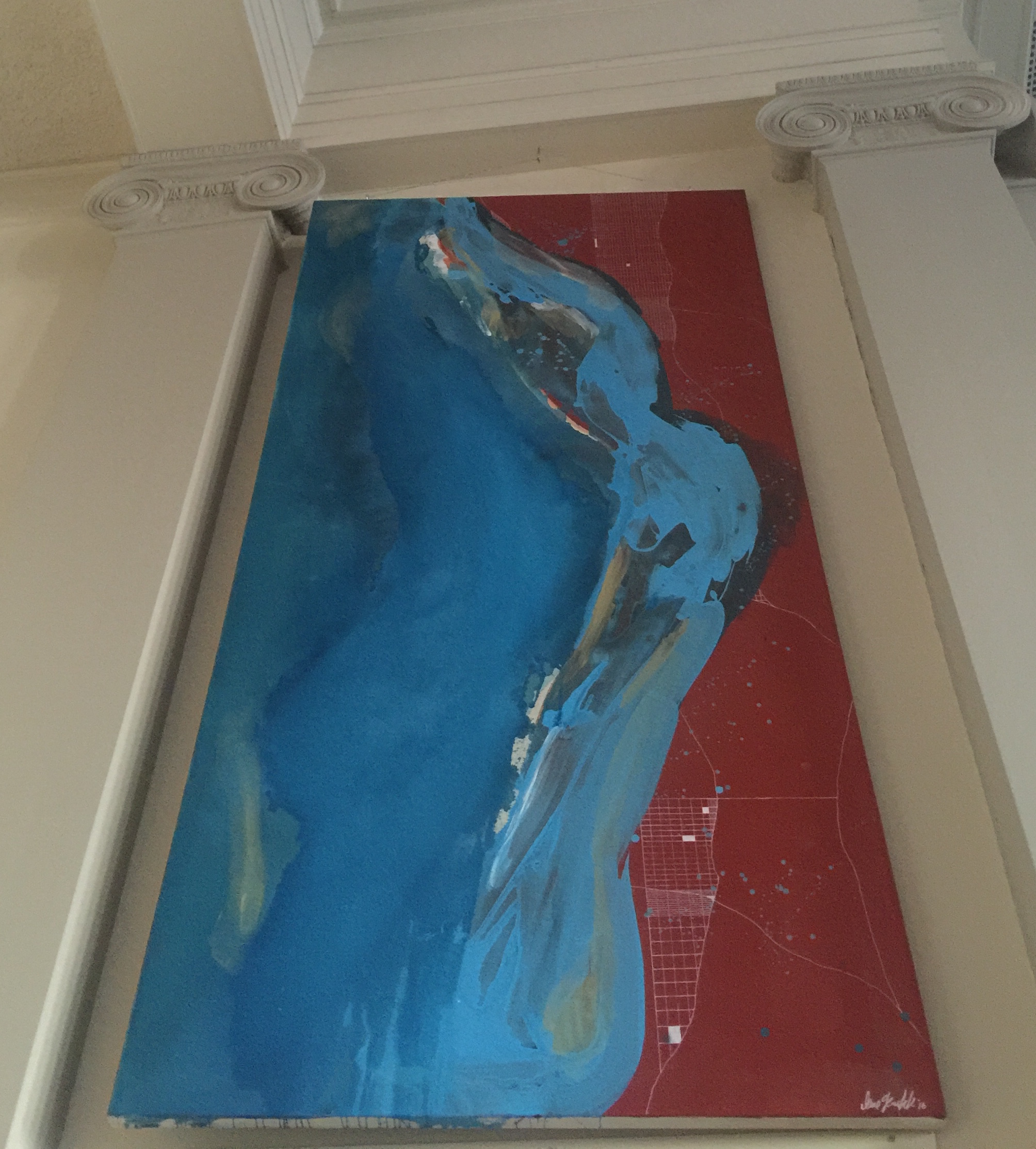
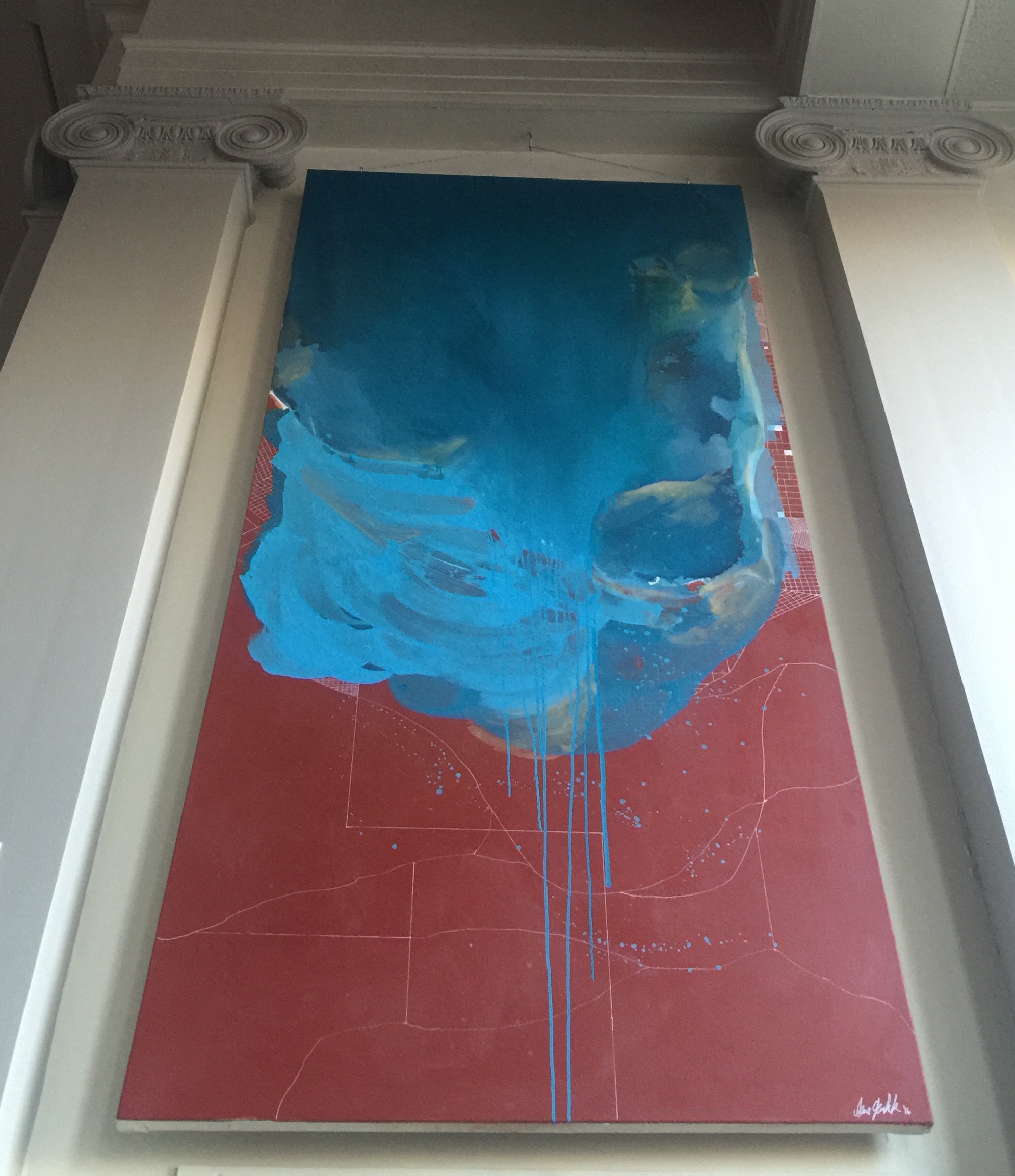
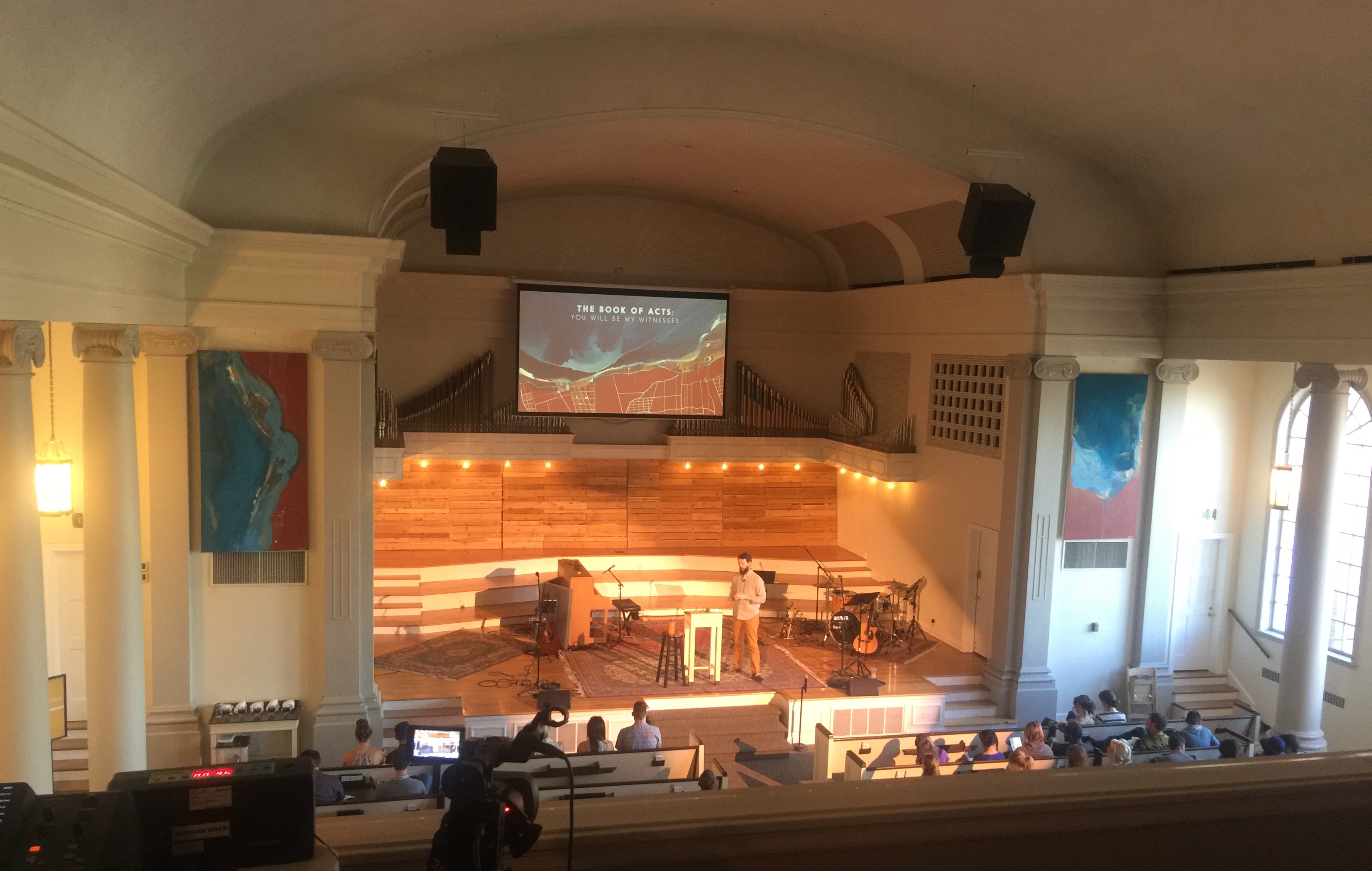
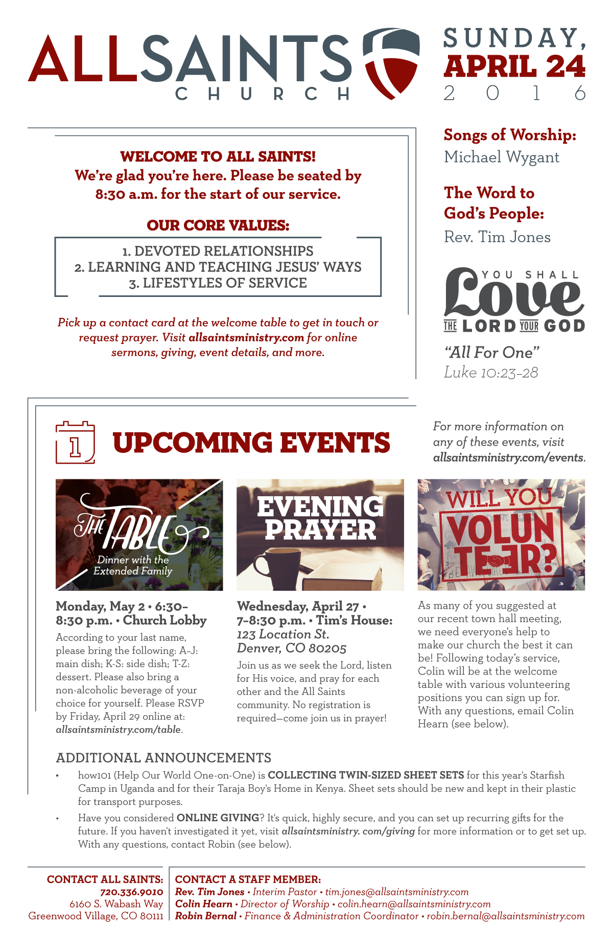
Our cost-saving, efficiency-enhancing solution was a single half letter-sized sheet. One side has all the “data” that a bulletin exists for: service details, upcoming events with artwork, core values/mission, contact info, etc. The other side is entirely sermon series artwork. Why would we do that when we’re trying to save space and costs? We believe that a lot of rhetorical work happens through artwork, engaging the heart of the community with the presented Word. We invest a lot of time into that artwork, and sending everyone home with a 5.5×8.5″ print of it is an active, equipping thing! The artowork is scriptural, hopefully really beautiful, and definitely based on what their church is currently learning together. We hope these bulletins wind up on fridges and pinned up at desks where people work, etc. Additionally, this artwork changes roughly once a month, so it’s dynamic and often gives that “Oh this is new!” feeling.

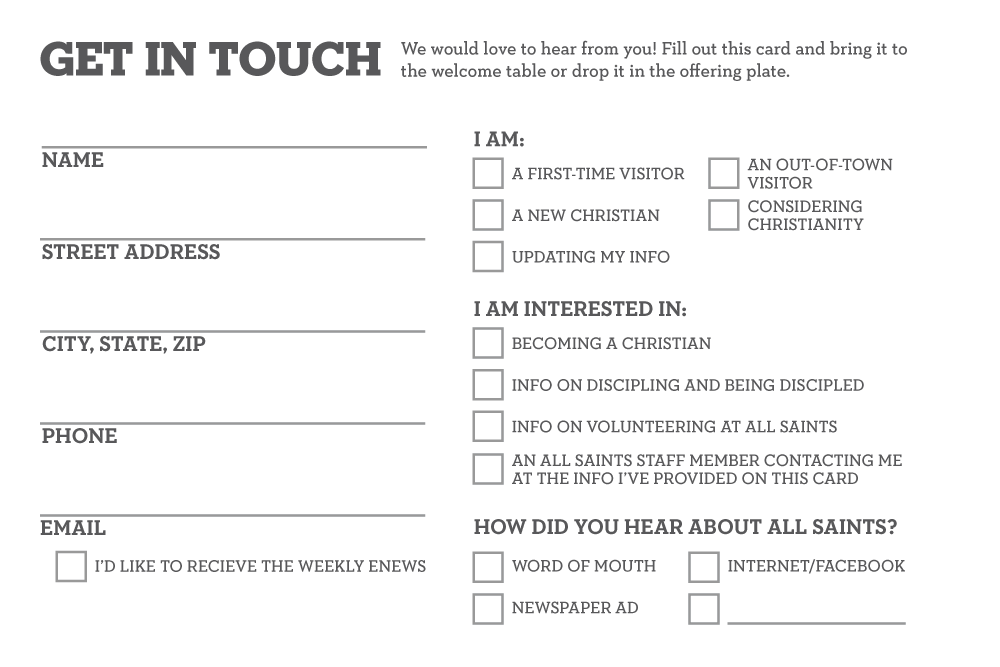
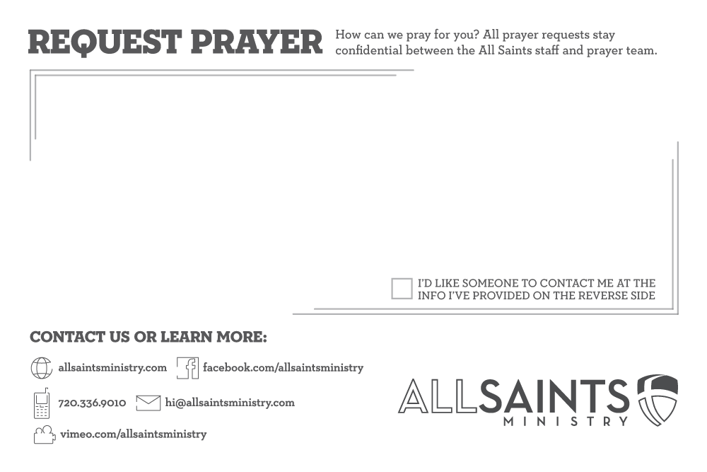
To preserve prayer request and visitor info collection functionality, we developed a new, matching prayer/contact card (see below), which we now have to print much more seldomly.

Image loading
Image loading
Image loading
Image loading

Click here to see a sample of All Saints’ old bulletin.

Posted on

The Book of Acts

Sermon Series Artwork • Park Church • April 2016

Painting by Lane Geurkink (Native Rambler).

Working with Lane is something we have always wanted to do. When we met up do discuss ideas for artwork for the book of Acts, we had the basic goal of illustrating the infiltration of the gospel into our world. Over the course of a week as we received pictures from her studio, it became clear that what she had created was amongst the most amazing art projects we’ve ever “directed.” The tension of the message of the gospel hitting our cities is so vividly illustrated. Art /Rhetor provided the oversight and typography, but really this piece is 99% Lane. This is one of those portfolio items that we share because we want to brag about our incredible creative community.

Walk in the Light Artwork

Walk in the Light Artwork

Walk in the Light Artwork

Posted on

Good Friday

Event Artwork • Park Church & Fellowship Denver • March 2016

The sobering thought of Christ actually being dead on our behalf—heart stopped, breathing stopped—is a hard one to actualize. Critical to our perfected joy at Easter is the understanding of the actual death of Christ, knowing that our sin required real blood for payment. I hesitated to send this to the leadership of Park Church and Fellowship Denver, feeling that it was too macabre. Their response was, “The cross is macabre.”

Posted on

Bailey T. Hurley

Branding & Website • March 2016

Our first full branding and website build as Art /Rhetor leaves us proud and excited for the future.
Visit Bailey’s new blog here.

The goal was a bold femininity, with a script look that was still entirely readable. In the search for Bailey’s color palette, what stuck the most was the natural “watercolor” blending of blues, greens and yellows.


Posted on Leave a comment

Created to Create

Event Artwork • Park Church • November 2015

On an extended freelance contract with Park Church in Denver, I (JD) was asked to direct the artwork for Created to Create: Imaging God in a Storied World, a symposium featuring authors Any Crouch, N.D. Wilson, and singer/songwriter Andrew Peterson.

The hand-lettered logotype is by Christian Robinson and the photography is by Leah McEachern. So why put this in our portfolio if I just arranged the letters and picked a couple colors? This was a special project for me because I had the joy of brainstorming something really dreamy to me and then collaborating with the two creatives needed to make it happen.

One of the things we’re excted about at Art /Rhetor is our Creative Concierge service. We love our creative community, and are pumped to help you find the person with the perfect artistic touch for your project.